emma delon, kitchen & bath | design & consultation
Branding & Identity
Branding & Identity
This is a freelance corporate identity project for a local independent kitchen & bath designer here in the Triangle area of NC. Many conversations and sketches went into this one. Since the owner, lead designer, etc., is also my wife Caroline Shillito I had a very personal stake in the process.
Our first step was to come up with the name: emma delon, which I suggested as it’s both interesting yet suitably generic should the business end up going in a different direction. Not coincidentally the name is derived from each of our middle names.
The basic idea was to convey the designer’s attention to detail, keen eye for design, and her grounding in sustainable design principles. I finally discovered a sacred geometry symbol, known as the “Seed of Life”.
We agreed on Futura Std Book as her main typeface for its clean geometric lines. Setting the type in all lowercase conveys friendliness and approachability as does the green and blue color scheme. This logo then became the basis of the rest of the company’s branding and corporate identity.
The following is ©2012 emma delon, LLC and is used with permission.
The following is ©2012 emma delon, LLC and is used with permission.
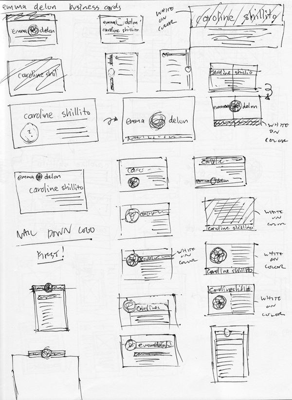
Logo Development - Sketches
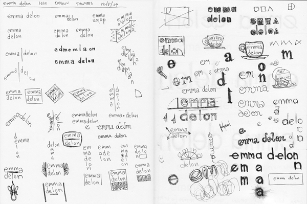
Logo Thumbnails
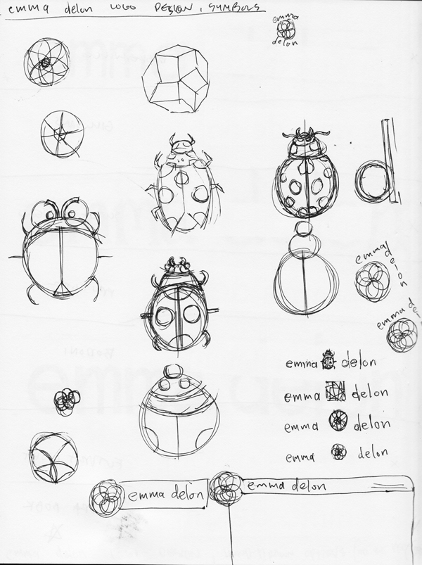
Symbol Sketches
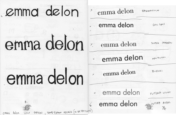
Type Explorations
Logo Development - Concepts
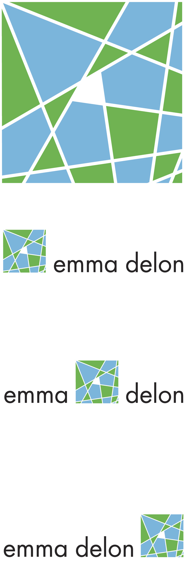
A geometric abstract logo idea.
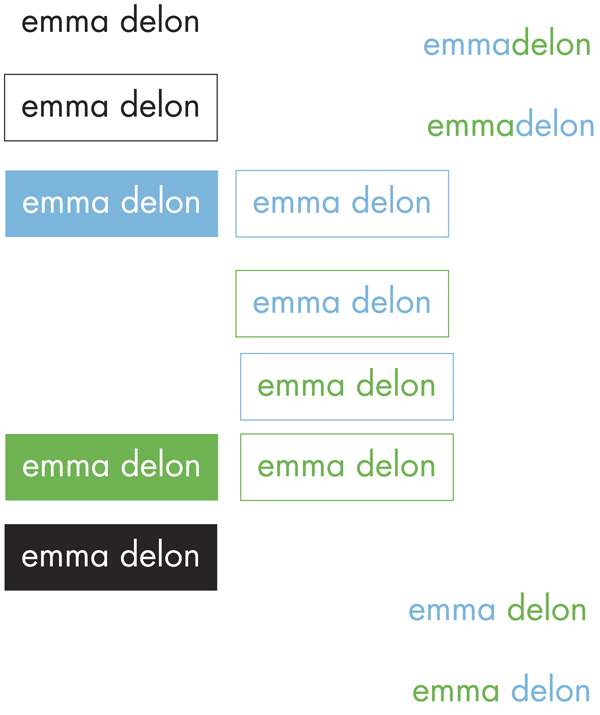
Variations on a type only logo.
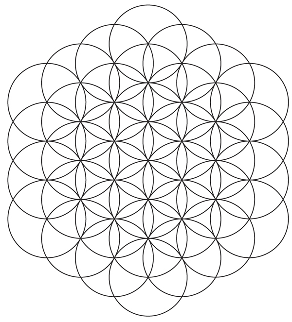
The “Flower of Life” symbol, from which the “Seed of Life” used in the final logo, is derived.

The emma delon symbol.
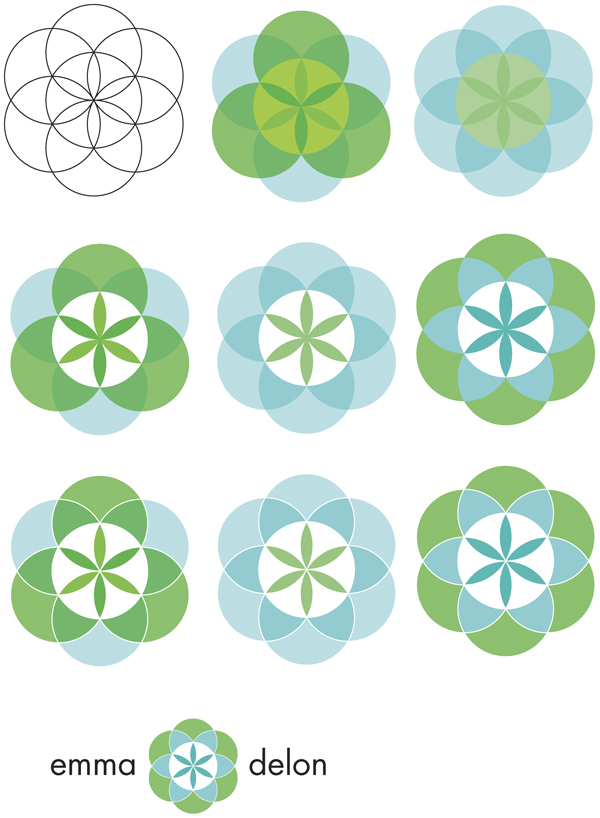
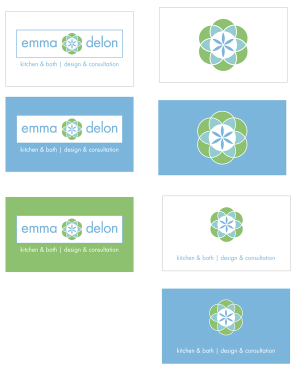
Color variations.
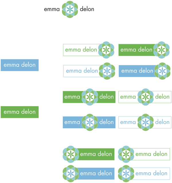
The final idea was to combine the symbol and the type only logo ideas.

The Final Logo.
Corporate Identity - Business Card
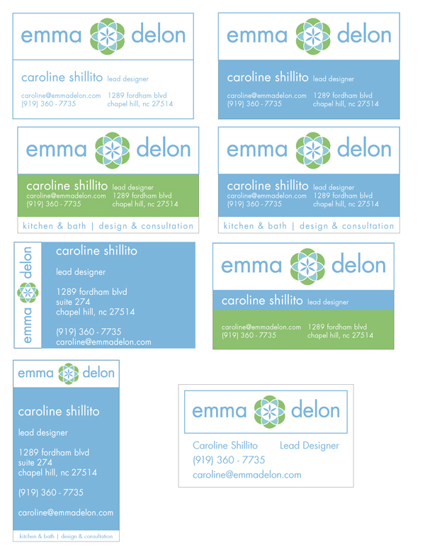
With the logo finished it was time to create the business card. Leveraging the brand colors and type there were really only a few options for its design. Or so it seemed at first.
I went through many concepts; some were very conservative, while some were much more out there. The final design skewed more towards the conservative end, but that fit in with the brand as designed so far. In collaboration with my wife, we realized that her potential future clients, while wanting innovative design solutions, were also looking for comfort and utility in their projects.
Creating a more staid business card design also makes the information more accessible, which makes the business seem more accessible, and therefore, more comfortable. The logo's “Seed of Life” symbol carries all the subtext of innovation that the brand needs.
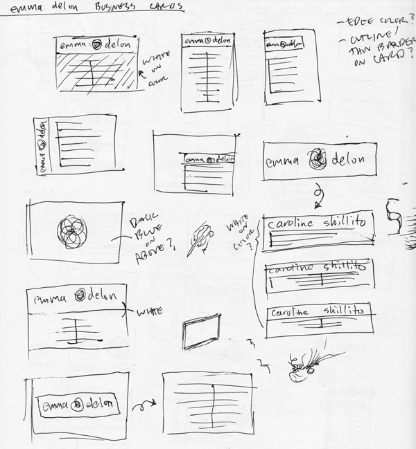
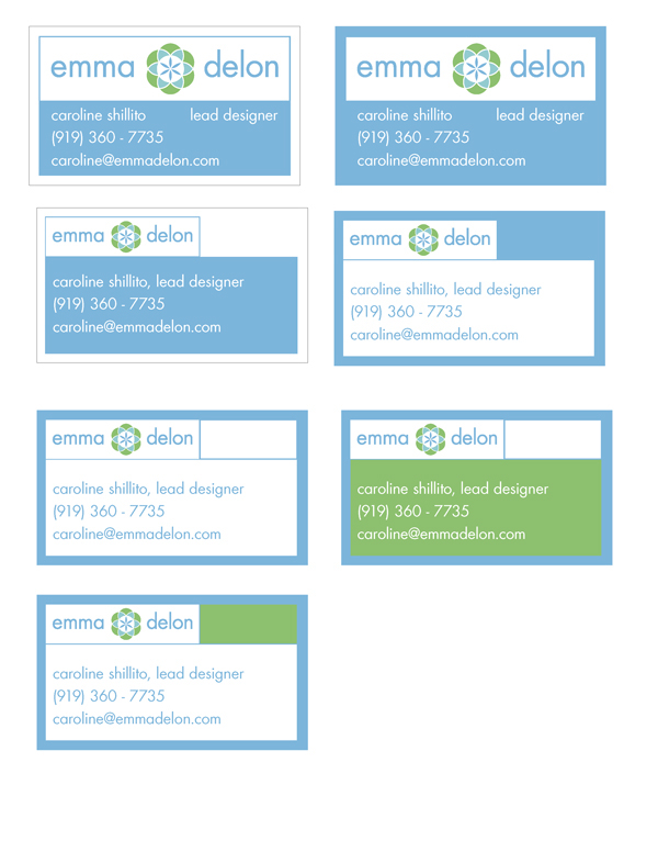
Business Card Thumbnails
Concepts for Card Front
Concepts for Card Back
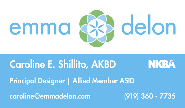
Final Card Front

Final Card Back
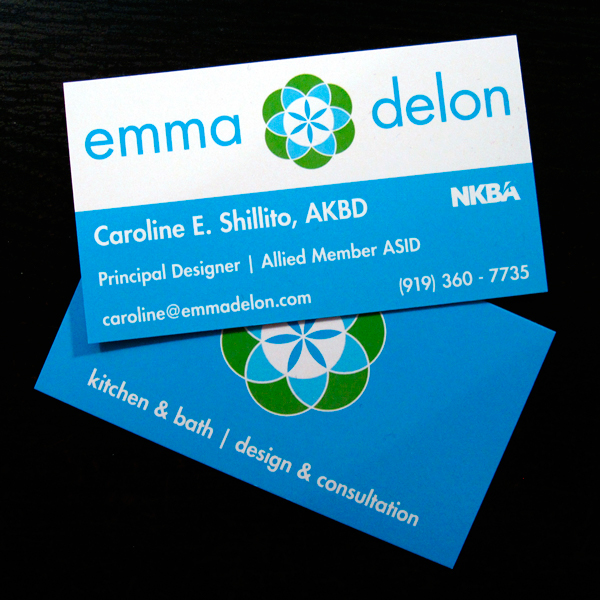
The Printed Cards
Corporate Identity - Collateral Materials
The following is a collection of collateral materials created for emma delon. These projects represent extensions to the existing company brand. As you'll see, the emma delon brand lends itself well to many applications.

First Advertising One Sheet
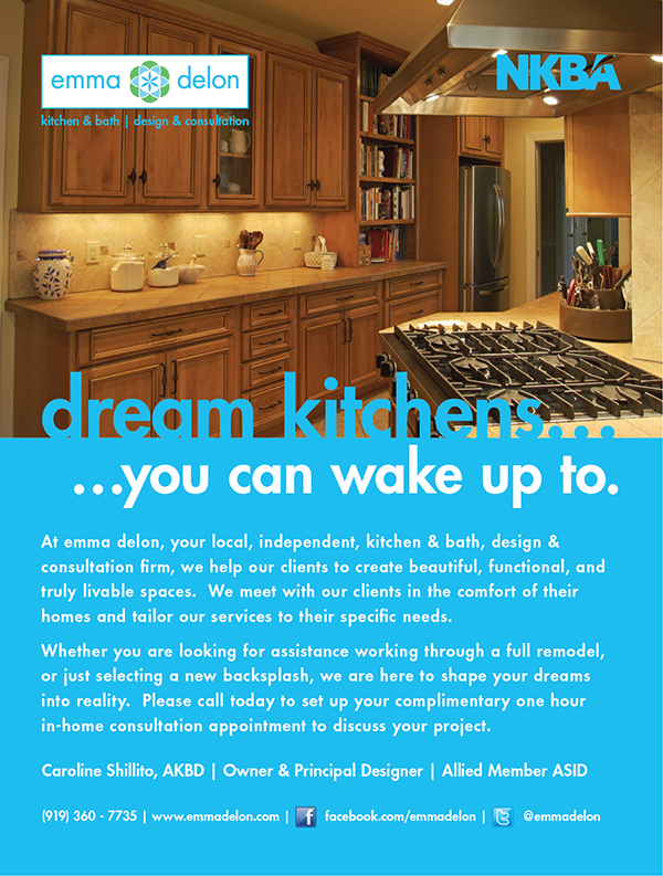
Second Advertising One Sheet

A duotone ad created for a local Harris Teeter grocery store wine bag. Ink color was dictated by the store.
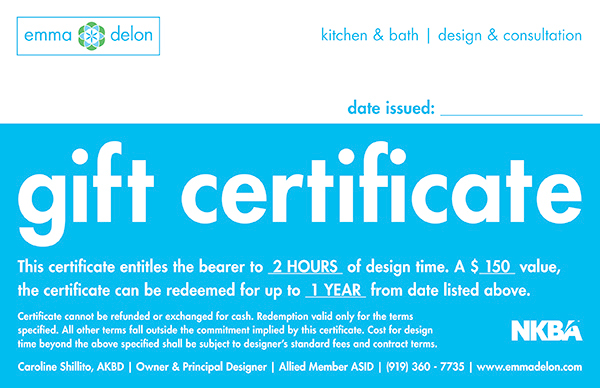
A half sheet gift certificate.

Layout for a sign to be displayed on clients’ lawns.
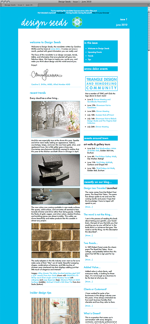

Design Seeds, an email newsletter distributed through Campaign Monitor. Screenshot from the web version in Safari.


Custom social media icons.
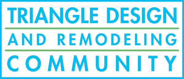
Logo for a local Meetup group founded by emma delon, referencing the brand colors and style while remaining a separate identity.
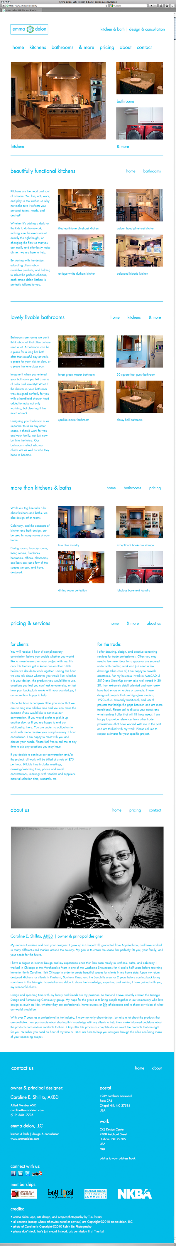
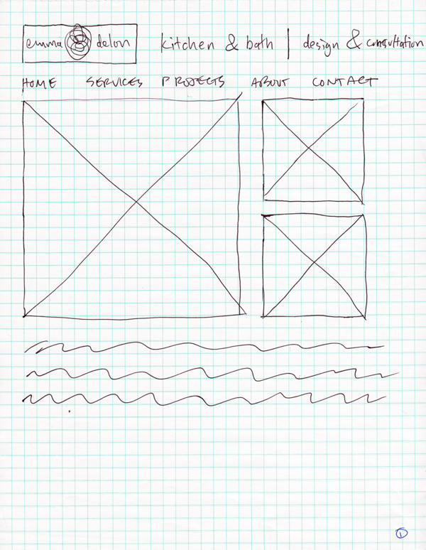
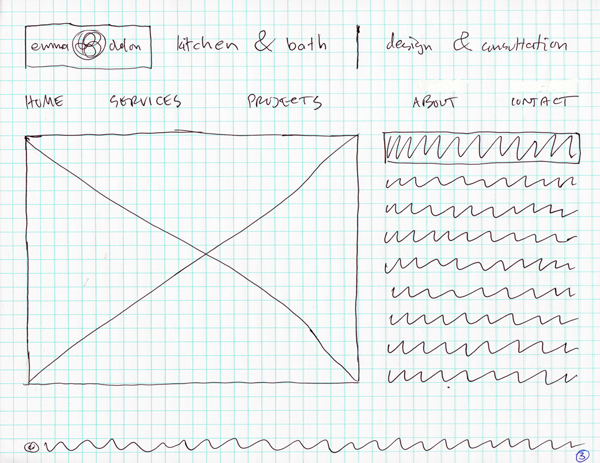
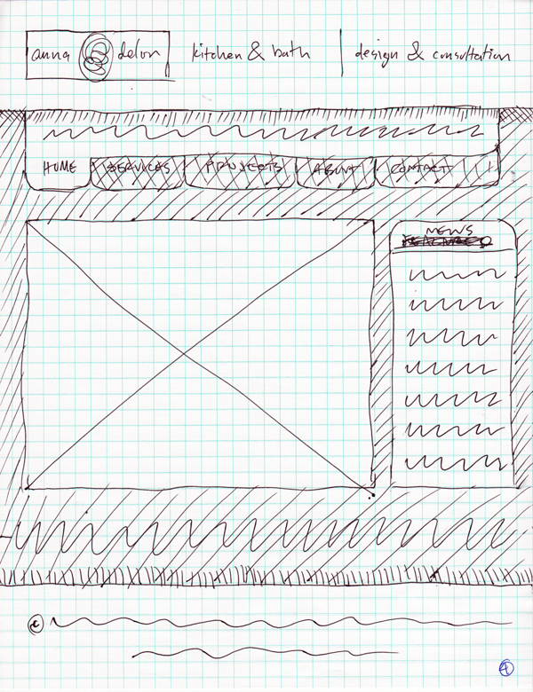
Website
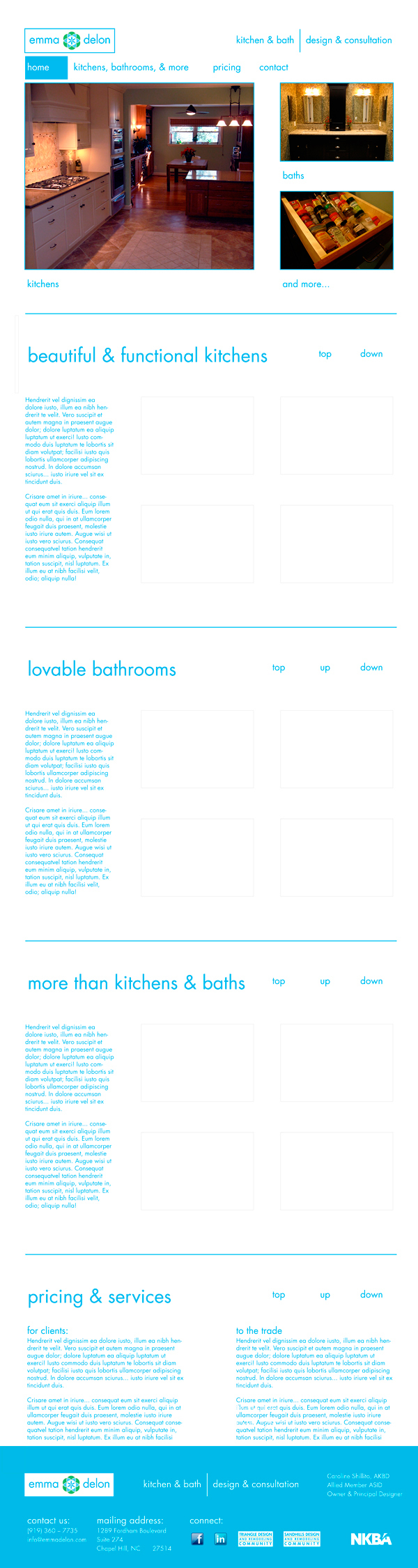
After creating the logo and business card, the next step was to create the company’s website. It was important for the branding to remain consistent with the printed materials while being appropriate for the web.
Photography was also an important part of presenting her work. All of the photos were taken by myself with input from Caroline. The clean design, with lots of white space was ultimately chosen so that her great content, the photography, was front and center. I used the Slimbox code (a lightweight "lightbox" style image gallery) to create the hovering image galleries that appear when photos are clicked.
NOTE: the screenshot of the live site below represents an ideal browsing experience, on a machine with all of the necessary fonts installed. The image is stitched together from multiple screenshots to simulate the flow of the site when scrolling.
NOTE: the screenshot of the live site below represents an ideal browsing experience, on a machine with all of the necessary fonts installed. The image is stitched together from multiple screenshots to simulate the flow of the site when scrolling.
Click below to view the site live:
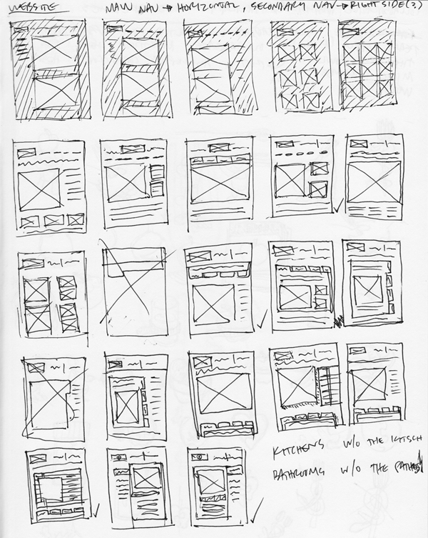
Thumbnails

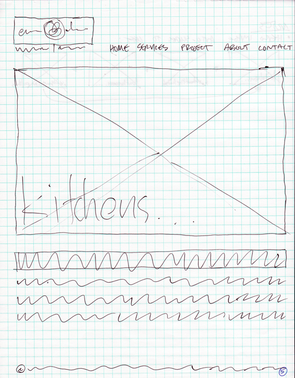
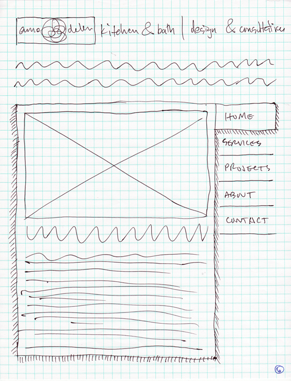
Initial Sketches
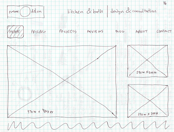
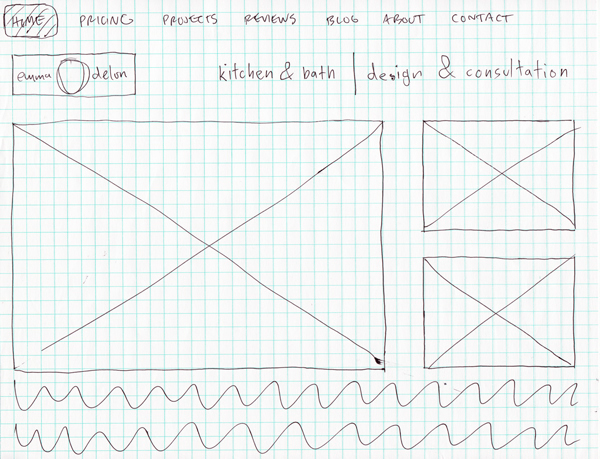

Final Sketch Variations
Site Mockup