In 2011, Bass Pro Shops had a cart that was called a "windowshade" which basically dropped down from the top of the screen, then pulled back up when you clicked close. From both a development standpoint and a user experience standpoint, this was a nightmare. No one really enjoyed this feature, but of course you can't change a large website quickly so it took a few years to change things up. This feature was live from 2011 until 2013.
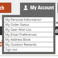
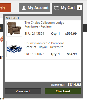
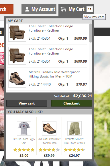
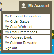
In 2013, management requested a redesign to the cart and account area of the header. We had just finished a large project to redesign the navigation so the decision was made to alter the cart flow in phase 2 of the overall site redesign. Several of us made different versions, and the one that was eventually chosen was my version. The cart/account areas of both Amazon and Walmart served as inspiration for the new mini cart and mini account design, with their nice hover/dropdown menus. We moved many of the header links into the new dropdown menus, and added copy that would indicate when you were logged in versus logged out. This was the beginning of my foray into user experience, and I've been hooked ever since.


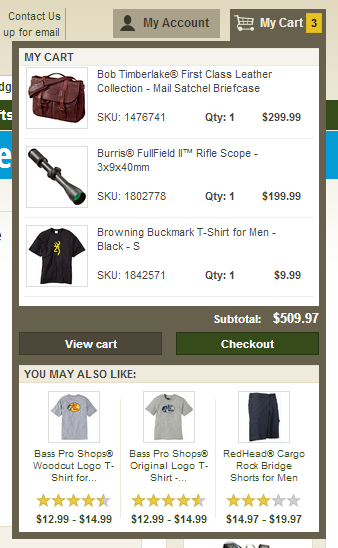
In 2014, we were asked to make the header more tablet-friendly, as tablets were served the desktop version of the site instead of the mobile version. I've mentioned before that responsive web design was not a part of the business strategy for the desktop version of the website, so we were focusing on user experience over code optimization. At this time - and part of the overall redesign - we changed colors from the brown and greens to the neutral grays, a palette that allowed the designers much more freedom in creating promotional material.