

Four Clouds, LLC
I was hired on as a contractor with Four Clouds, a software development company that specializes in web and mobile applications, in the summer of 2010. My first project was redesigning their identity, starting with their logo. I was eventually hired on full-time in November of the same year as a User Experience Designer and worked there until February 2012.
While I worked there the company was transitioning from a technology service provider to a software development firm. As the transition was discussed, the branding was changed and refined, reflected by the various phases of the logo, the brand imagery, and the website.
While I worked there the company was transitioning from a technology service provider to a software development firm. As the transition was discussed, the branding was changed and refined, reflected by the various phases of the logo, the brand imagery, and the website.
The following is ©2012 Four Clouds, LLC and is used with permission.
Identity - Phase 1
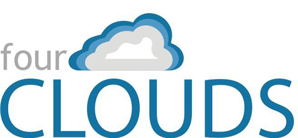
Logo idea, created by someone else as a concept for the company’s owner.
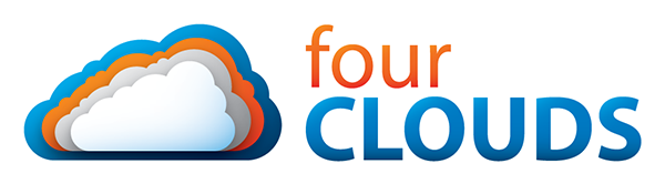
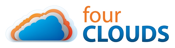
My initial logos. The top was to be used on light backgrounds and the bottom on dark backgrounds.
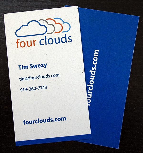
The first run of business cards, based on the initial logo design.
The cards in real life.
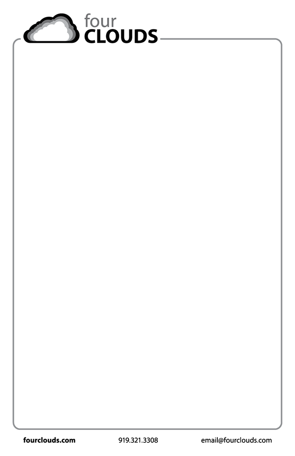
A branded notepad using a black and white version of the initial logo.
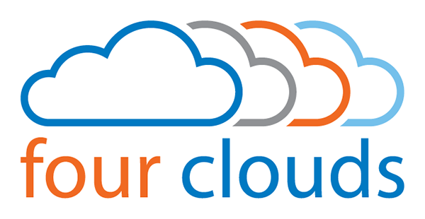
Identity - Phase 2

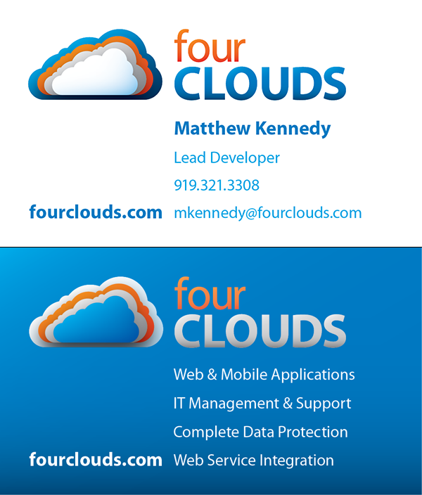
The final logo.

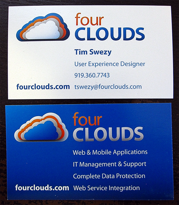
The second run of business cards, based on the final logo.
The cards in real life. Note: the unprinted/white areas are speckled because the paper is recycled.
Branding - Phase 1
To help shepherd the transition in branding needs from a service-oriented firm toward a more product-focused firm, I created a series of illustrations. The illustrations also served as fodder for branding and vision discussions as well as a source of inspiration.
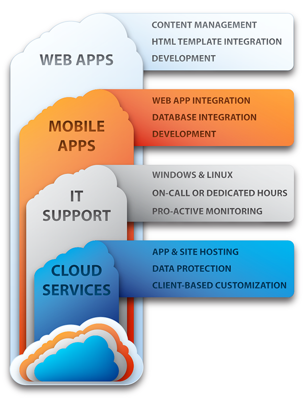
The first attempts at branding the company's processes resulted in this Services Diagram, which didn't get used since we had moved on to an idea about growing apps.
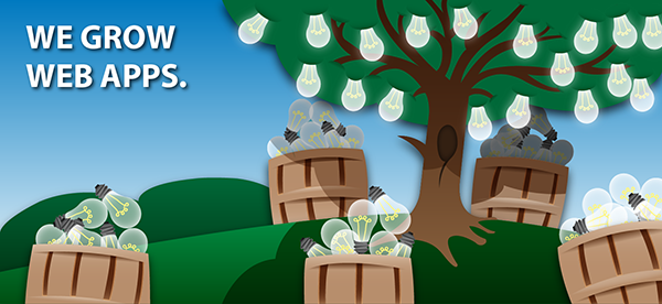
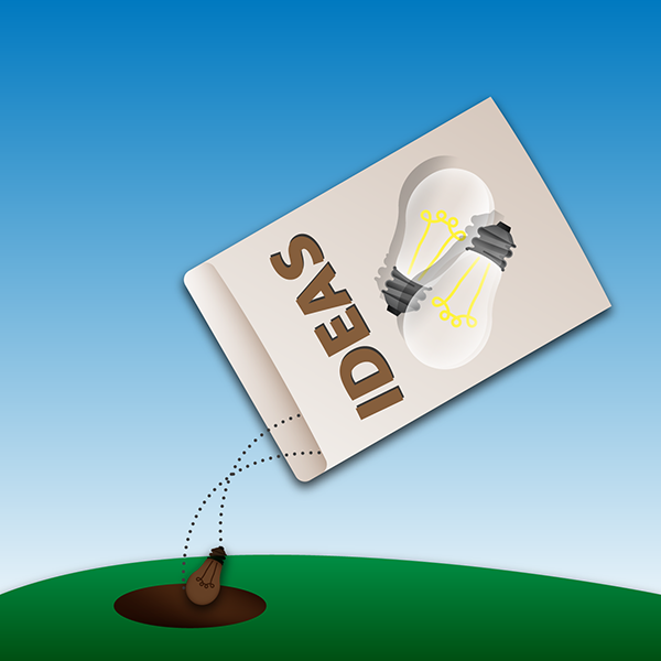
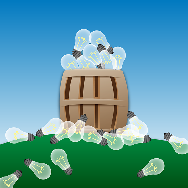
Idea Harvest Splash Image
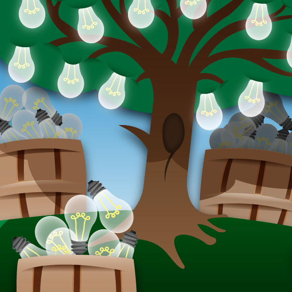
Detail
The initial Idea Harvest image created the idea of showing our process through brand related imagery.
1. Staking a Claim
2. Seeding and Planting
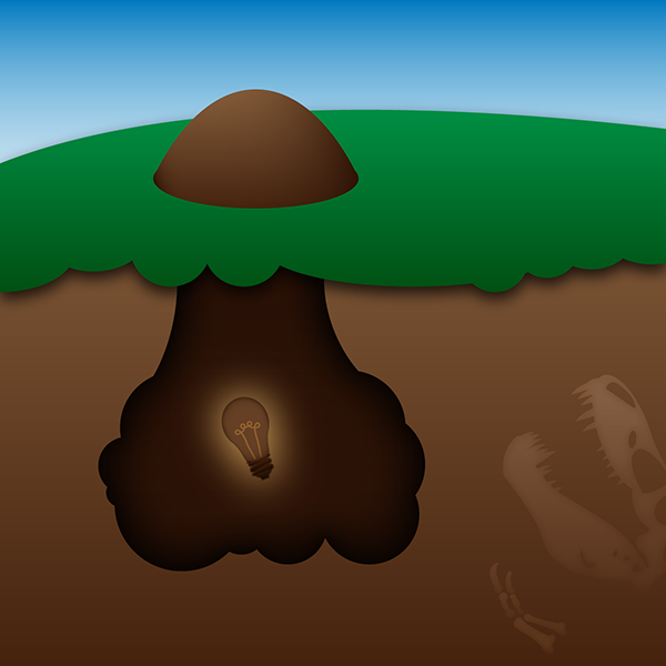
3. Stagnant
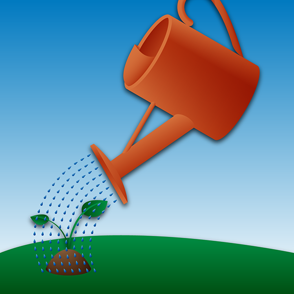
4. Watering
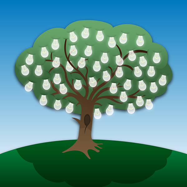
5. Bearing Fruit
6. Idea Harvest
Branding - Phase 2
The initial idea was to expand the cloud imagery used in the logo to encompass the idea of growing apps. As this area was explored further, it became clear that this wasn't the right direction for the company's brand. We refocused on the idea of building apps for the next phase.
When the branding idea shifted from “Grow” to “Build”, the imagery needed to shift as well. So the illustrations shifted towards more mechanical imagery…

The first Technology Diagram, which became too unwieldy as we documented our ideal development process.
Details of the first Technology Diagram.

A second pass at the Technology Diagram, which was simplified for clarity.
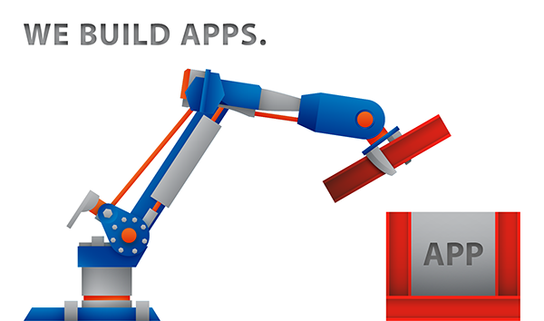
A new splash image created to reflect the switch from “Grow” to “Build”. I thought that industrial robots would be perfect for this new direction.
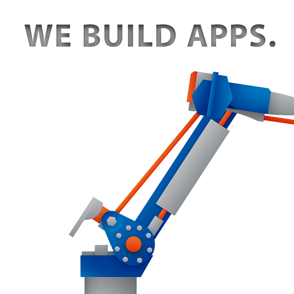
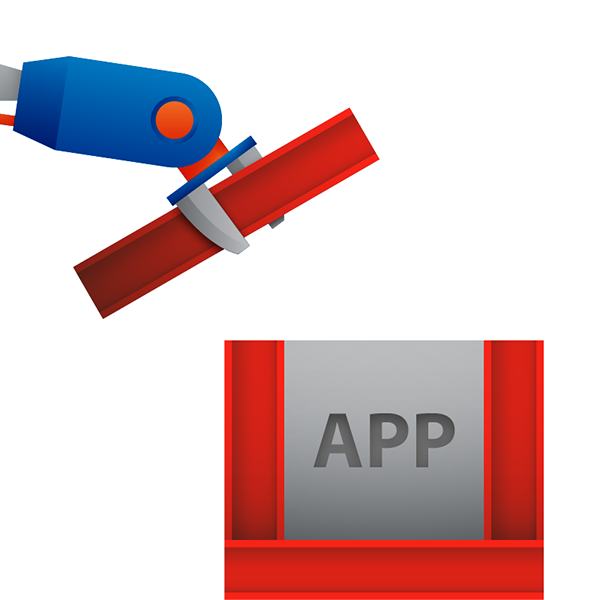
Details of the robot splash image.
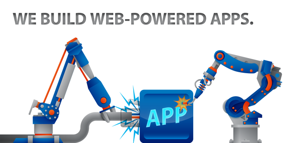
The second splash image, this time incorporating a second robot. Not long after this image was live on the website, it was abandoned for a simpler approach to the company brand, placing the Four Clouds logo and projects at the front.

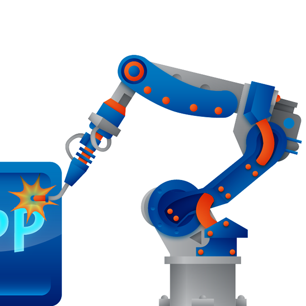
Details of the two robots splash image.
Web Design - Phase 1
When I started working at Four Clouds the name had just been changed over from Praetus. After the initial logo work was completed, it was added to the preexisting website. To support the new direction of the company, though, a site redesign was also necessary.
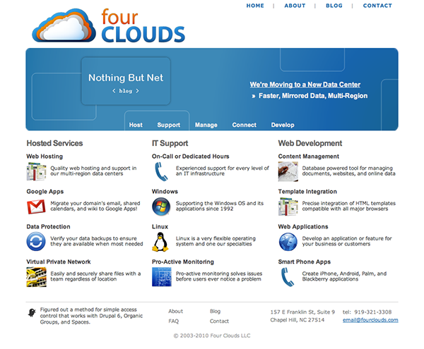
The original Praetus site changed to reflect the new name and the new logo. All other parts remained the same.
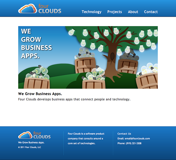
An early redesign of the homepage, featuring the first pass at brand imagery as the centerpiece.

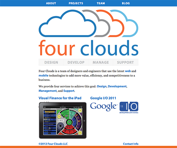
The eventual full home page redesign before the logo changed.
Web Design - Phase 2
After the logo changed to a more minimalistic style, the website then needed to reflect the new brand direction. From this point until the time that I stopped working at Four Clouds, the only brand imagery was the logo and project images.
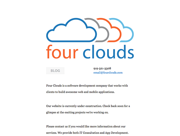
The initial homepage redesign while under construction.

A landing page created to reflect part of the brand shift towards mobile, and specifically, iOS design and development.
Web Design - Phase 3
The third phase of the Four Clouds site redesign was also the last phase that I worked on. To simplify the development and deployment process the site shifted from it’s original Drupal installation, to a Ruby on Rails app, finally settling on Jekyll in the months before I left. The new site also uses the Typekit services to display the Four Clouds brand typeface Myriad Pro.
Jekyll is a Ruby-based static site generator which uses a set of templates and minimally marked-up pages to create a full website without the use of a database back end. Changes are easily made and the admin doesn’t have to fight with an unwieldy CMS and database to launch a blog-aware site.
Jekyll is a Ruby-based static site generator which uses a set of templates and minimally marked-up pages to create a full website without the use of a database back end. Changes are easily made and the admin doesn’t have to fight with an unwieldy CMS and database to launch a blog-aware site.
To view the site live, click on the link below:
As of the first quarter of 2012 the site still looks like it does in the screen caps below. Please note that if you click the above link, the contents and design might have changed or shifted since the site design is no longer under my purview.
Home Page
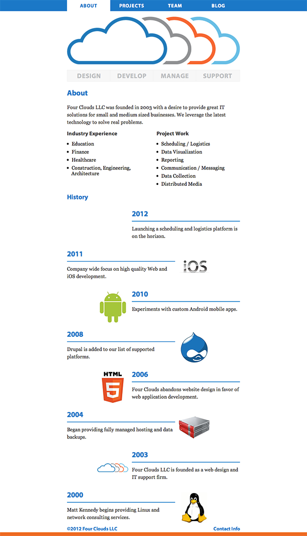
About Page
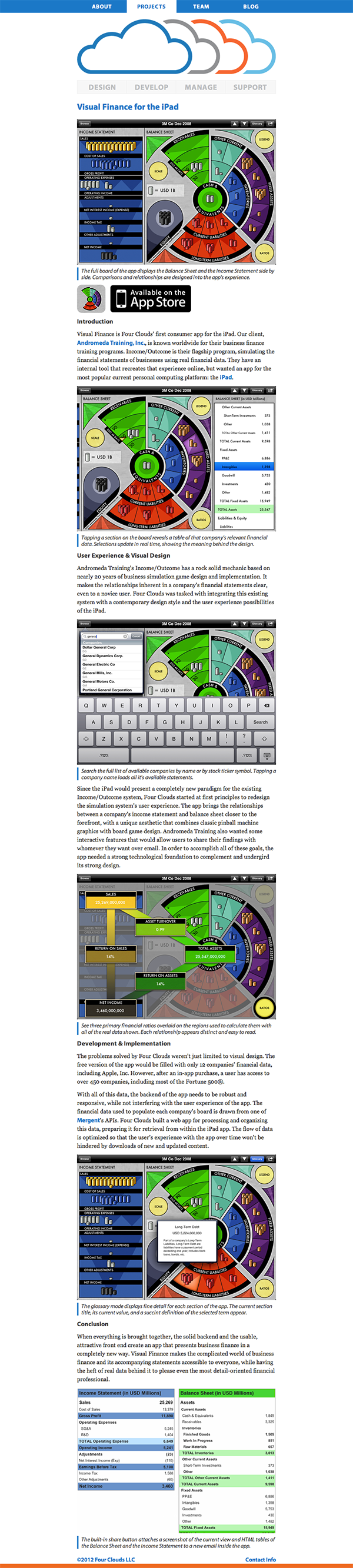
A project page
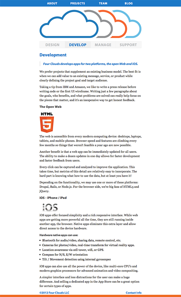
A services page

A team member page
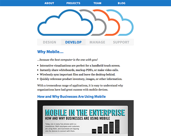
The most recent iteration of the “Why Mobile?” landing page.


