


The aim of this project was to generate content, design, evaluate and finish an editorial piece. The topic I’ve chosen was Woodstock which was held in 1969 which made history in music. The editorial book consists mainly of images rather than text.
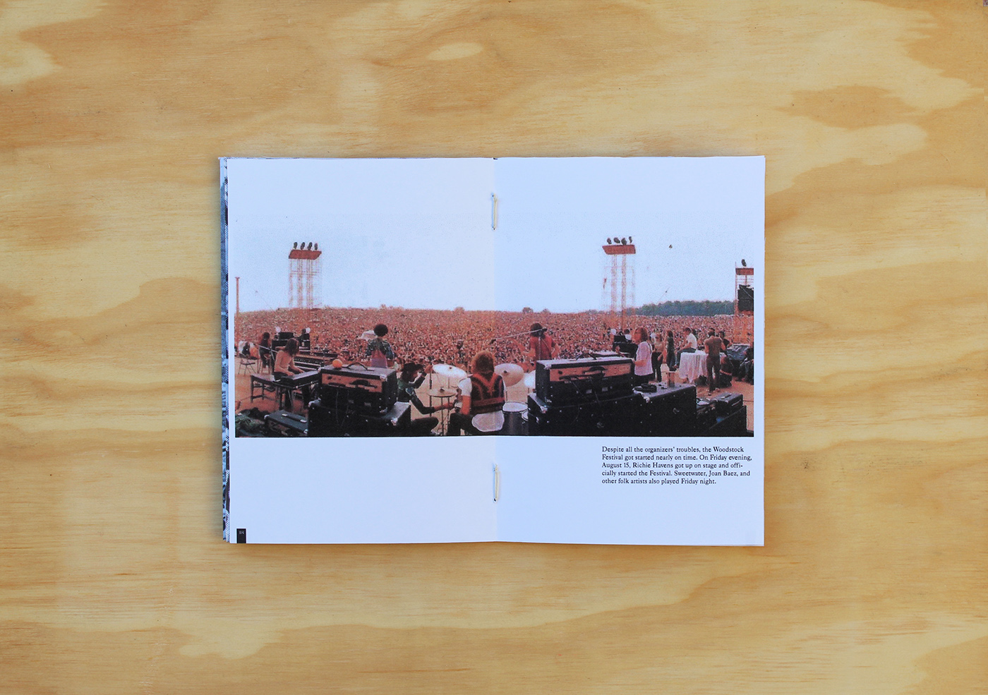
I wanted to convey a message on how many people there were during to concert. In one particular image a 2 gate fold was created to emphasize the amount of traffic there was. An A3 poster which folds into an A4 spread shows the crowd sitting down. Research was done on fonts which were used during the 1960’s. Futura was used for the titles whilst Caslon 540 was used for the copy. The font used for this particular poster is the same font used in their original poster. Due to the low dpi resolution of the images, these had to be printed in their actual 300 dpi, scanned at 1200 dpi for the highest resolution. This also brought out the dots of the printing itself which worked well with the theme of the editorial.


Title page which opens up to a 3 gate fold


Title page which opens up in an a3 poster.


