A concept design
Windows 8 is windows reimagined. So is this app concept for Ocado. It is very different from the current iPad application yet it is still very Ocado in its character. I have noticed that there may be a transition going on with the branding, style and website. The logo with the five colours, the cleaner look, the Windows Phone application. If that is the case, then my concept fall in line well with the transition.
I took inspiration from the original Windows Phone app which is itself a metro styled design. Since Windows is aiming to be consistent with their look and feel across the Xbox, Windows Phone and Windows the Ocado app needed to be consistent with its Windows Phone counterpart.
I also stayed close to Microsoft's own design rules for their metro styled apps. Using a number of elements from their developers resource kit and templates. With this app to search for products you would simply need to use the system wide search box. For account settings, billing, pin number for login will all be accessible using the settings button in the charms bar. Windows 8 however is new, and for users, the habit of going to the charms bar for settings, search and share will still take some getting used to. Therefore within this app the settings button will be part of the options on the bottom bar (not illustrated here in the designs).

Let us begin with the tiles that will give Ocado a presence on the Windows 8 Start screen. There are two modes for Windows 8 tiles it could either be a square tile or expanded. It is up to the developer to allow for the expanded option or to just stick with a square tile. The expanded tile is able to give the user a lot more information at a glance without needing to enter into the application. Since this app has information that it needs to convey to the user I have opted for an expanded tile as well. This expanded tile will tell the user the current total of their basket, how many items they have and how much they have saved through offers and deals. The tile will also give the user information about their delivery slot which is a very important piece of information which cannot be displayed on the home screen of an iPad for example. This continues the glance and go idea that Microsoft had introduced for Windows Phone. It is why metro is metro. It has been derived from "international design" modern and clean but more importantly it has also been derived from airport and metro/tube signs. In these situations the prerequisite for the design is to be quick and easy to read and comprehend. People are walking and reading, or scanning if you like, the signs as they go. They don't stop, they don't need to. They have understood. Perhaps my own tile can be simplified further. The Wednesday to become Wed is an example of a future improvement.


Once they tap, or click if they are using a mouse, on the Icon the splash screen appears and they are automatically logged in or taken to the login screen. The automatic log in may only work if they recently logged in, however a time out feature should require the user to log in again if the app hasn't beeing used for a short while. Becasue this app deals with shopping and payments security is paramount.

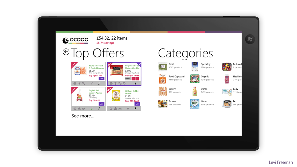
The Welcome screen with various links, and access to the categories by swiping to the left. Notice that Search is on this screen even though the Windows 8 Users are encouraged to use the system wide search button. Search is important to this app like the Bing maps app, so offering it here will help those users who need to see it on the screen.
Also here is the current status of the current basket. The total amount is enlarged for emphasis of the most important information to the user. The text is also a link, so tapping on the total and the "you have 22 items" text will take you to your current basket. Tapping the red delivery slot will take you to the delivery screen. Saving s will take you to the basket with the offers and deals products filtered.
Selecting shop will bring the following loading screen up

This screen is the loading screen where the catalogue is being populated. The catalogue will only need to download once and subsequent uses of the application will have an almost instantaneous transition to the products. Because the products do need to load the first time, I thought it would be useful to include an animation of how to select items.
As I mentioned before, Windows 8 is new and not everyone would know how to use it correctly. This animation serves as an instruction not just for selecting in this app but for others a swell. The animation will be smooth, the pointed finger will gently tap and hold on to the item and pull down both items on screen. After that another animation will show how to select on the mouse (not illustrated here) by right clicking the items. Credit for the "Van" symbol by Marwa Boukarim, from thenounproject.com
I hope you like my concept, more are on their way.
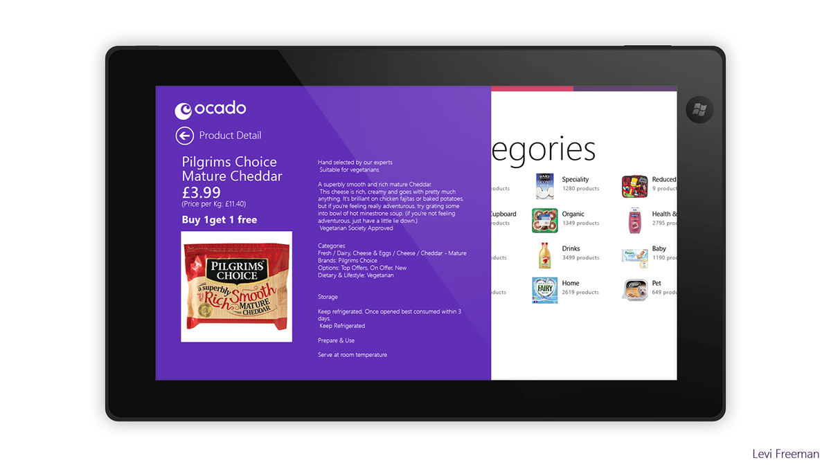
Here are the rest of the images for this concept
Levi Freeman


Update: After using the Windows 8 Consumer Preview (and changing my Local to the US to try out more apps on the Marketplace) I have come across few more apps and notice a few UI designs that I thought were very interesting, Allo Cine which I later discovered was Screen Rush thanks to the new ScreenRush app on Xbox which had the same logo, has put a search button on the top right, clicking this brings up the windows 8 Search interface. This is something I may add to my Concept Design.
It is not always good to duplicate an option, the metro design language is born out of simplifying things and stripping down things that are unnecessary however in this instance, duplicating the search button just helps those trying to figure out how to search. As mentioned before, the user experience for Windows 8 is new, however over time searching and selecting items will become something that everyone is used to.


