This is the cover of the brand standards.
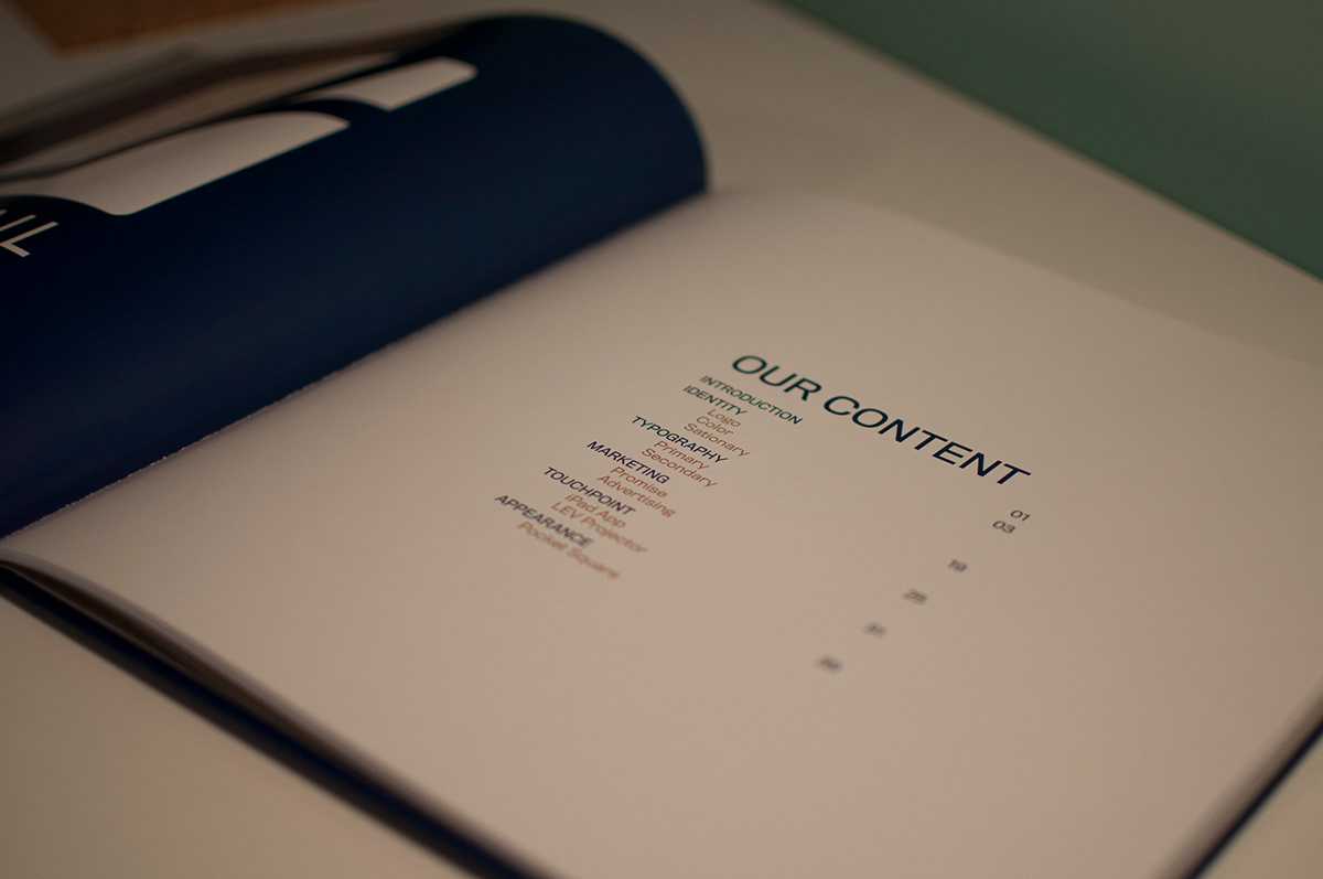
The brand standards is broken up into six sections: the introduction, identity, typography, marketing, touchpoint, & appearance.

This is the page divider for each section of the guide.

The LevRail logo is the basis for the brand. I felt it was important to describe the logo to the company so that everyone knew the history behind the mark. The "l" and the "r" come together to form the map of the U.S. Their lines run off the square in LA, NY, and DC. It is simple yet complex in that the normal customer may not pick up on it right away. Yet, after having someone explain, they should feel closer to the brand and appreciate that there is a secret meaning behind the mark.

With the logo, I wanted the company to have a very easy understanding of the ratio.

With the color guide for the brand, I felt it was important to show not only the PMS, CMYK, RGB & HEX of the color but also the allowed opacities of that color as well.

The stationery suite is important to note in the brand standards. I felt it was important with this category to list specific measurements instead of ratios. That way with every print of the letterhead, business card, or envelope, LevRail was sure to be spot on.

Typography is important when presenting the brand. There are many brands that do not follow their rules for type treatments and placement that weaken the brand. By having a primary and secondary typeface, the company would always be able to maintain their public face of the brand.

With any brand identity, the brand would fall apart without the promise of the company. With LevRail it was no different. I made sure to include their promise as well as their mission, vision and values. It was important that this be in the brand standards for all employees to know what they are representing.

This is the advertisement campaign. Seeing as the company was designed for the business class to travel bi-coastal to reach LA, NY or DC, I wanted to provide basic images of things that are a hassle when traveling on other modes of transportation that is not LevRail.

I developed a static iPad application that would allow customers to purchase tickets, order drinks and food and keep track of their reward points. The app was to be simple like the rest of the brand. The customer was to get to where they were going at a quick pace without having to tap into multiple page layers within the application.


This is my prototype for the LevRail touchpoint. It was to be a projector that you could plug into any smartphone and project your business meetings for multiple people to see instead of crowding around a computer or iPad. The customers would receive this after so many miles traveled with our company as a way of saying thank you.

This is the inside of the packaging for the projector.

This was the physical prototype for the touchpoint I developed.

