Project date: 2015
ETF Website Redesign

— O V E R V I E W —
Who Is ETF?
ETF is the world’s leading independent authority on exchange-traded funds. Their mission is to empower investors to build better portfolios. They do this by providing education, news, analysis, and data analytics on ETFs. Their four main business lines are their website, data analytics tools, print magazines, and events.
My Role
I partnered with the Head of Growth, editorial, and the development team to redesign the website from the ground up. I oversaw all aspects of design from strategy to launch.
Users
• Professional advisors and strategists that are ETF veterans
• Retail investors & advisors new to ETFs
• Institutional investors

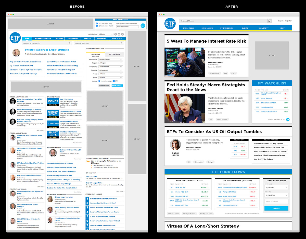
Before—original website
The Problem
The original ETF website was designed as a source for news and analysis of exchange-traded funds. However, over time the business grew to include a data analytics product, an events business, and a print magazine. Each one of these new businesses lived within its own micro-site making it difficult for users to discover content, and for ETF to promote content site-wide across the various businesses. The visual design had also become dated, there was a lack of content hierarchy, ad overload, articles were difficult to read, and the site wasn't mobile-friendly.
Goals
The primary goal of the website redesign was to restructure the site architecture to focus on content integration across all of the business lines (news & analysis, data analytics tools, print magazines, and events). We wanted to improve content discovery, increase impressions, and drive event attendance, and magazine subscriptions. In addition, we wanted to update the visual design, improve readability, decrease ad load, and create a mobile-friendly website.

After redesign
Solution
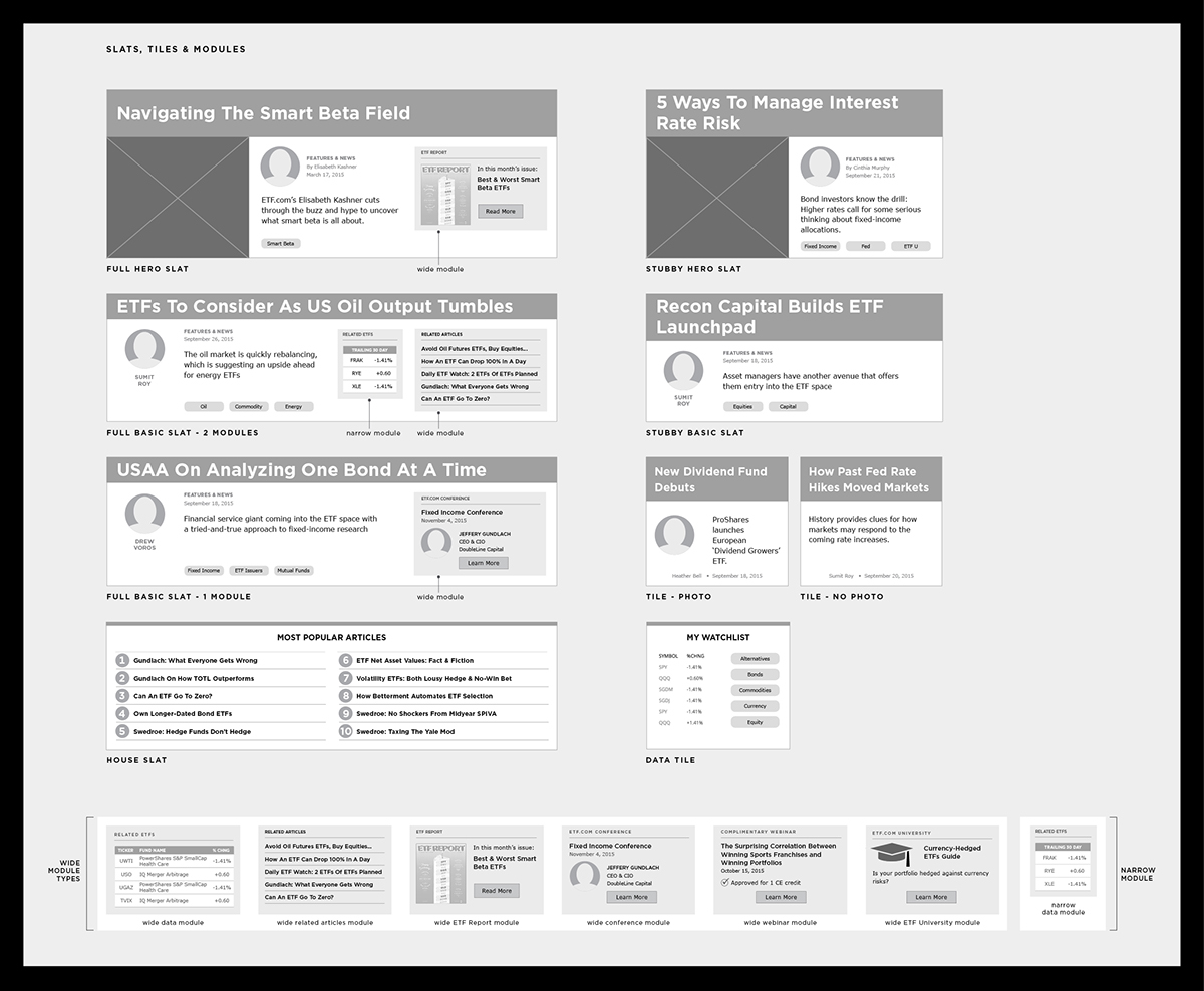
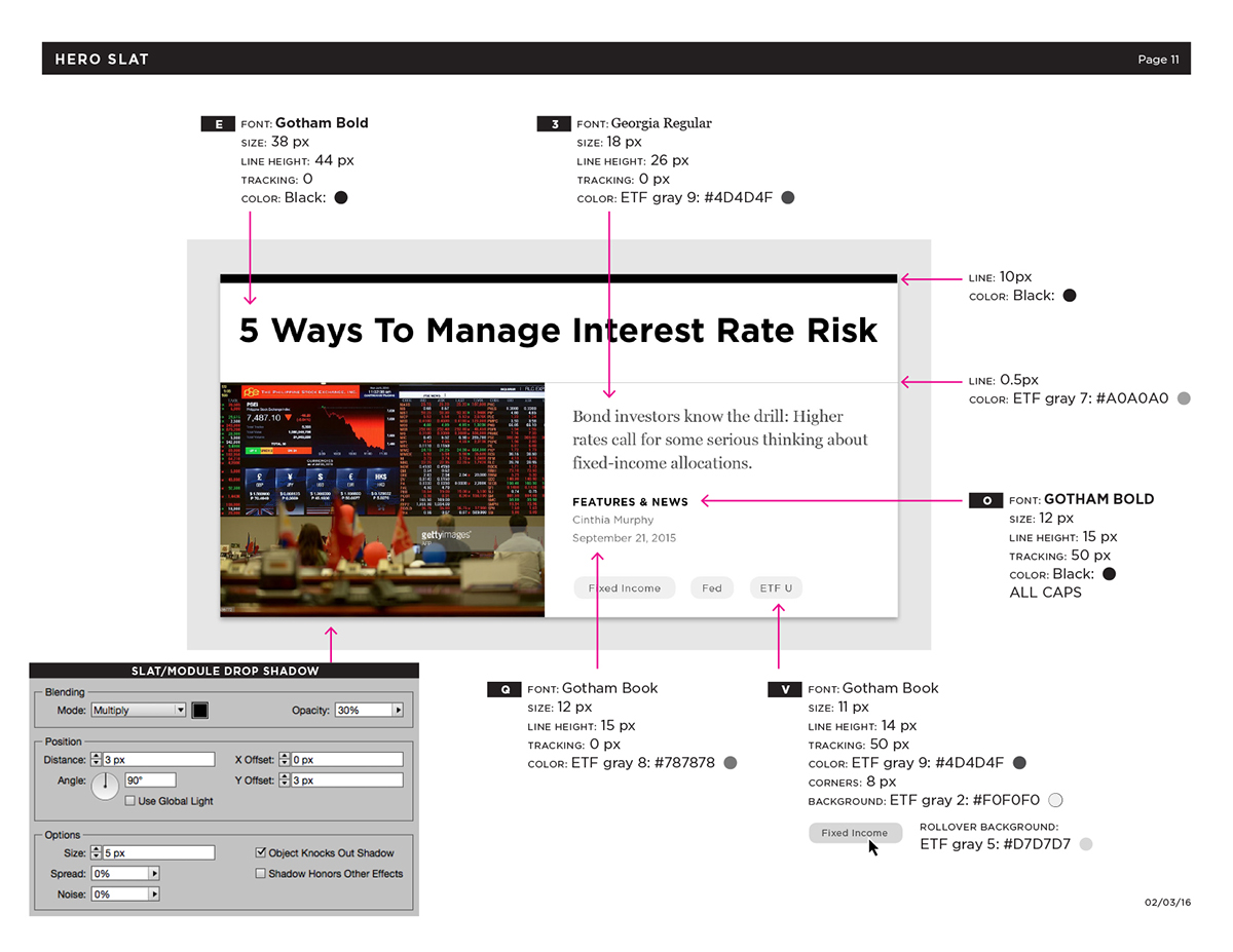
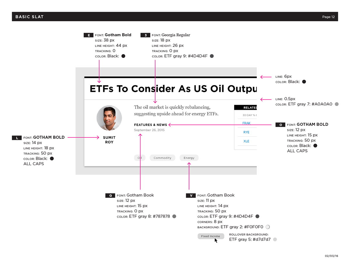
We decided to build the new website with a modular structure based on a hierarchy of what we referred to as slats and tiles. The visual hierarchy of these modular components allows editors to curate content, which helps users navigate through the information on the page. Within certain article slats there are modules that surface up related content across the four business lines (data, events, publications, and editorial). Not only does this promote user engagement and content discovery, but it also allows ETF to drive users to specific content and parts of the website that they want to promote. The modular structure provides other benefits as well. We designed tiles and ads to be easily swapped out, this gives ETF the freedom to adjust the number of ads they want to serve up at any given moment. The modular structure is also flexible and will allow the website to easily grow and evolve as ETF's business develops in the future. In addition, this modularity simplified the backend allowing developers to easily reuse components. In rethinking the site architecture, we were guided by focusing on the various points of entry into the site, and how we could help users quickly discover the content they were looking. The new visual design is clean with plenty of white space, promoting improved readability.
— P R O C E S S —


— B E F O R E & A F T E R —


homepage

article

news & views

category page

Events

— R E S P O N S I V E D E S I G N —

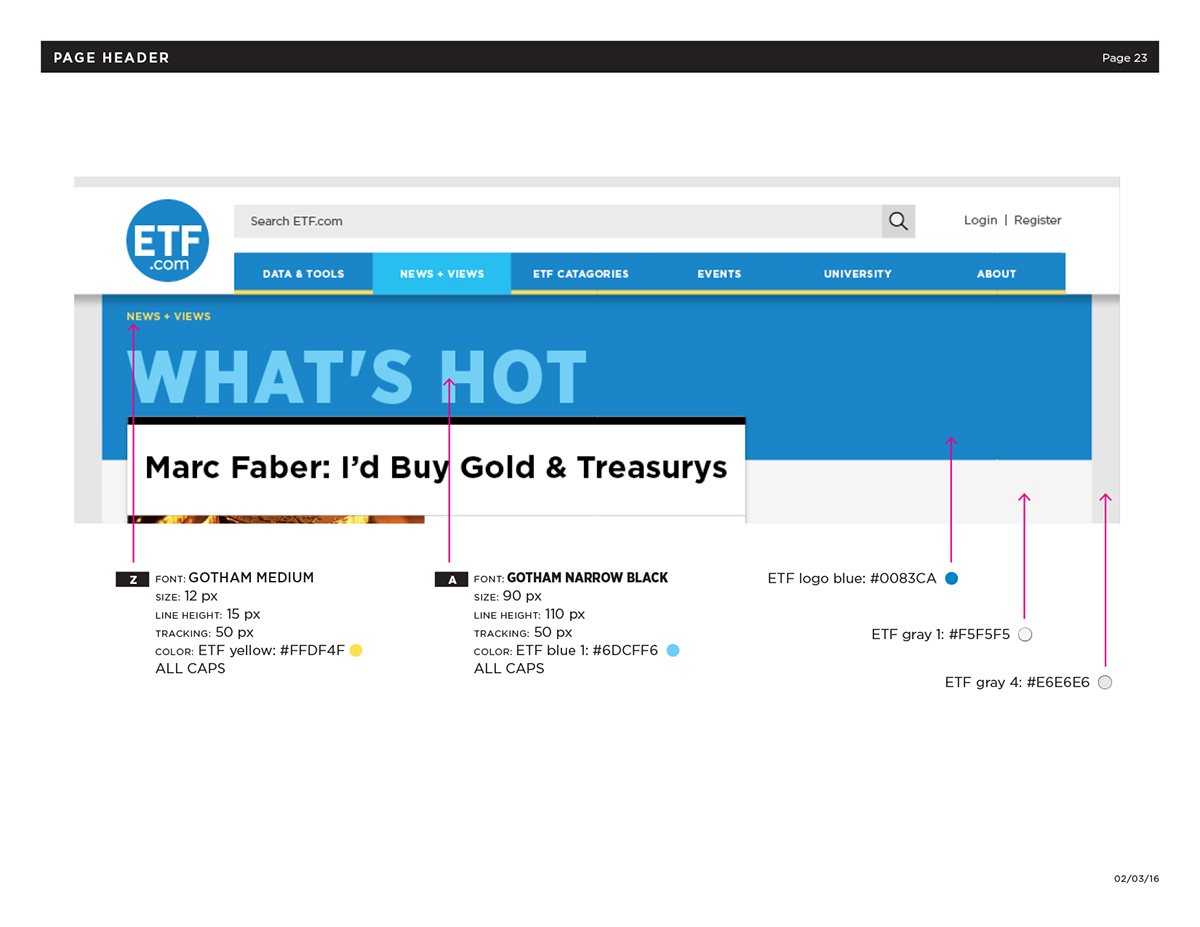
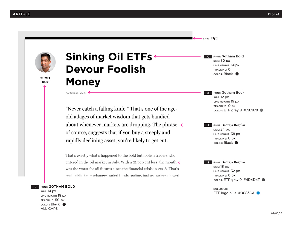
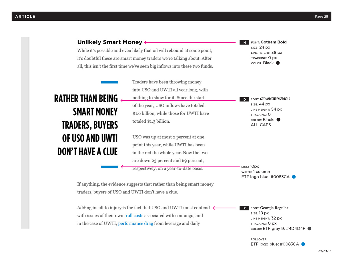
— S T Y L E G U I D E —


DESIGN DIRECTOR
ETF
ETF
(Project date: 2015)

