
Harvard Business School wanted to research a modified crest design that would reproduce more easily across a wide array of mediums. The original crest had a lot of complexity in the shells, scalloped cross, and the books along the top edge which made some applications difficult to reproduce well. Unfortunately, while the work was well-received, it was not used and the current crest remains in use.
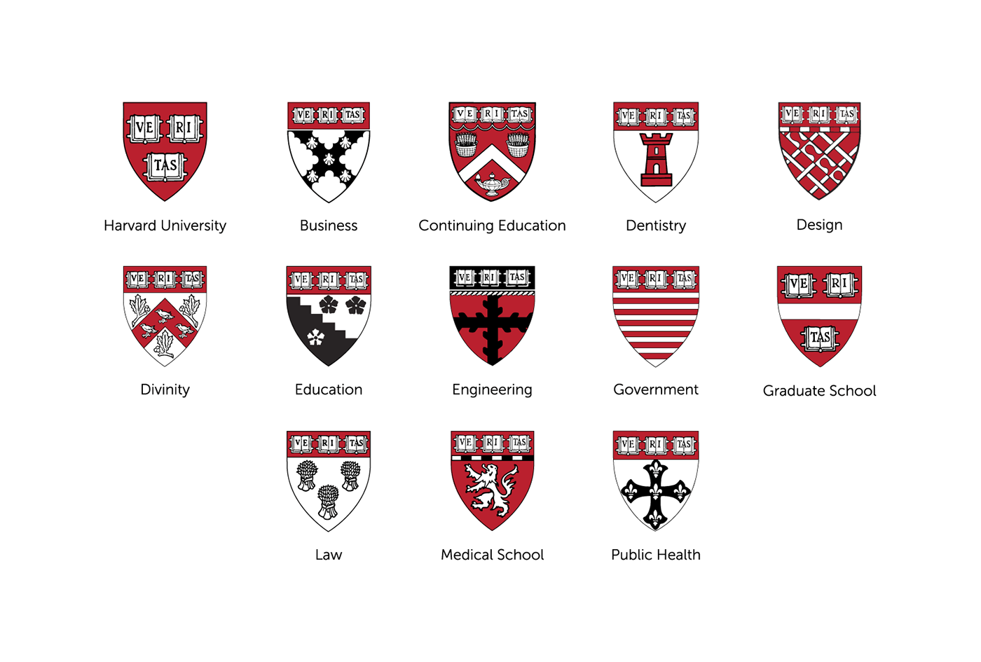
Current crests for all schools at Harvard University
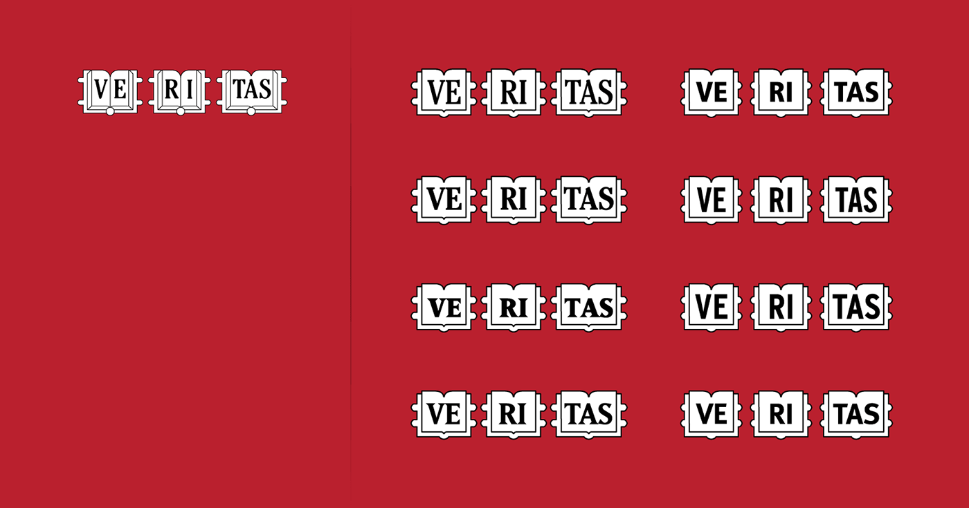
Research in to repalcement typography for VE RI TAS in the books. Also, simplifying the book illustration to make it earier to read and scale to small sizes.
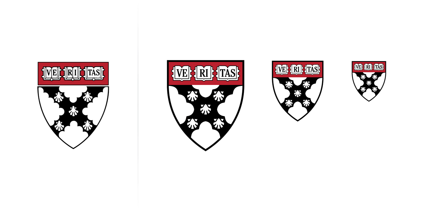
Original crest on teh left. Redesigned crest on the right at various sizes.

New crest paired with HBS typography in both full color and black and white against crimson red background.

Alternate crest explorations that kept some of the traditional elements of the original crest but simplified the design.

