


The event is celebrating 50 years of existence and remembers good times from the past. The organizers wanted that the image of this year's special gathering reflects older times from the 70s and 80s when this type of student gatherings were much bigger and more common.
The visuals are made in that manner, bearing the bold and strong image with elements and compositions representing the movement. Direction of the elements implicates the energetic and positive vibe of the event.
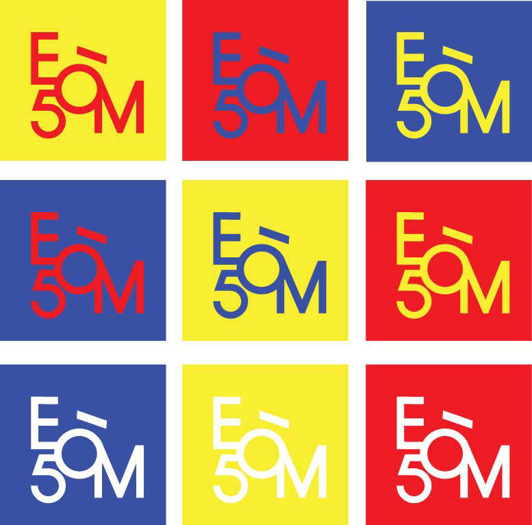
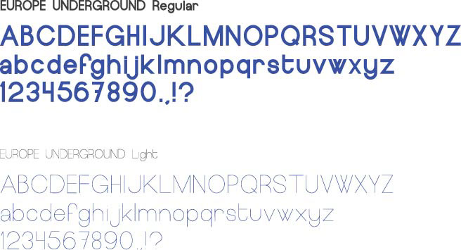
Logotype is made as an intervention on the letters of the event's name. Typeface used is Europe Underground Regular.
The logo, as well as all the other visuals comes in 3 color pallete + white as the present non-color. Colors were chosen because of their vibrant and strong feel, each coming from the inspiration of Swiss design style, that was foremost a big influencer on the creation of the whole identity.


NOTE:
As the font is free only in personal use, the organizers will be informed about the purchase in case they decide for this VI. (bearing in mind this is a school project currently!)
(http://www.aringtypeface.com/europe-underground)
All images are mine.
Mock ups used for presentation of the design:
Website: http://crtv.mk/aTgw
Website: http://crtv.mk/aTgw
Poster: http://creativebooster.net
T-shirt: freegoodiesfordesigners.blogspot.se
Canvas bag: GraphicBurger
Hat: ZippyPixels
T-shirt: freegoodiesfordesigners.blogspot.se
Canvas bag: GraphicBurger
Hat: ZippyPixels


