
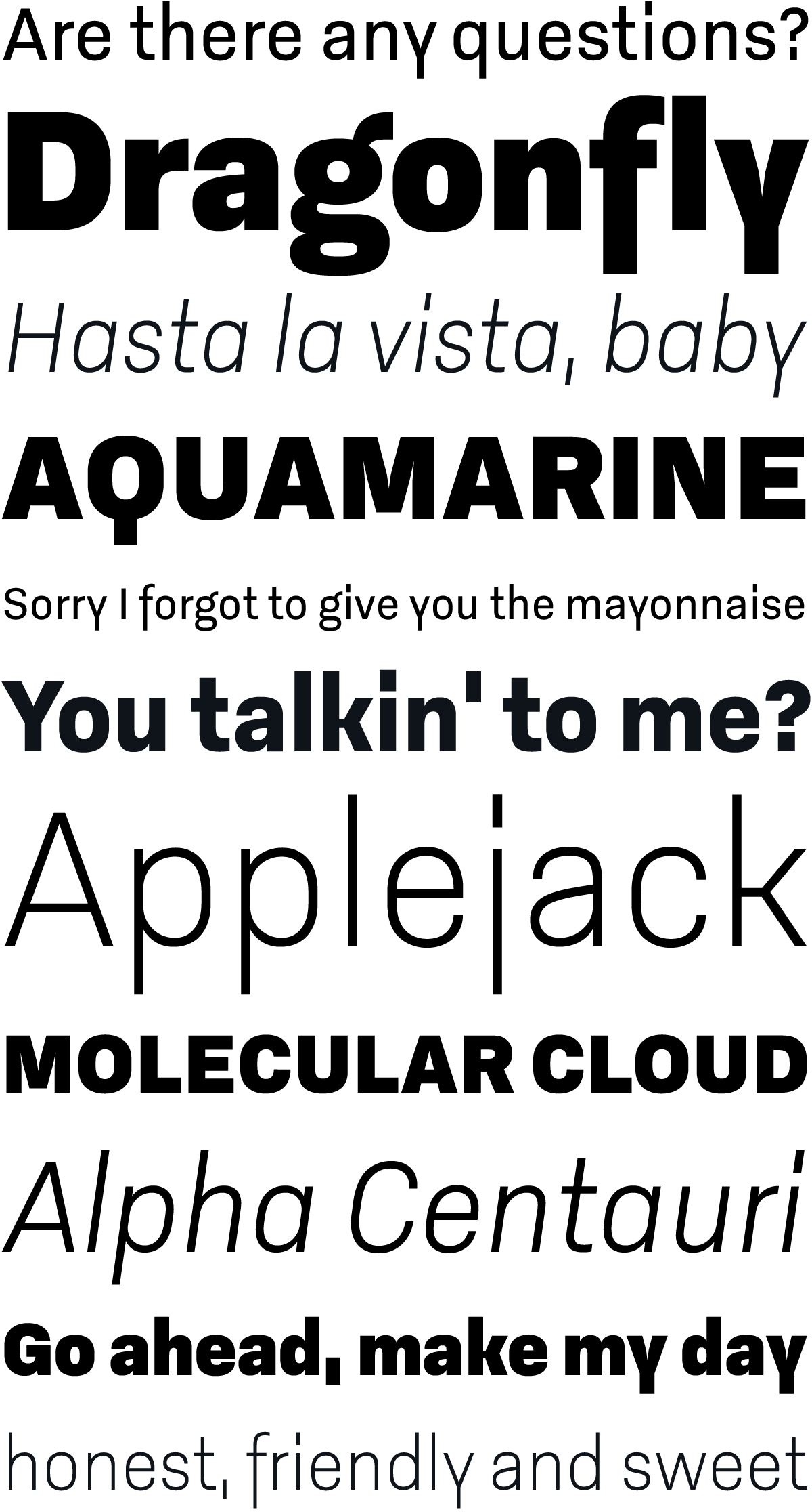
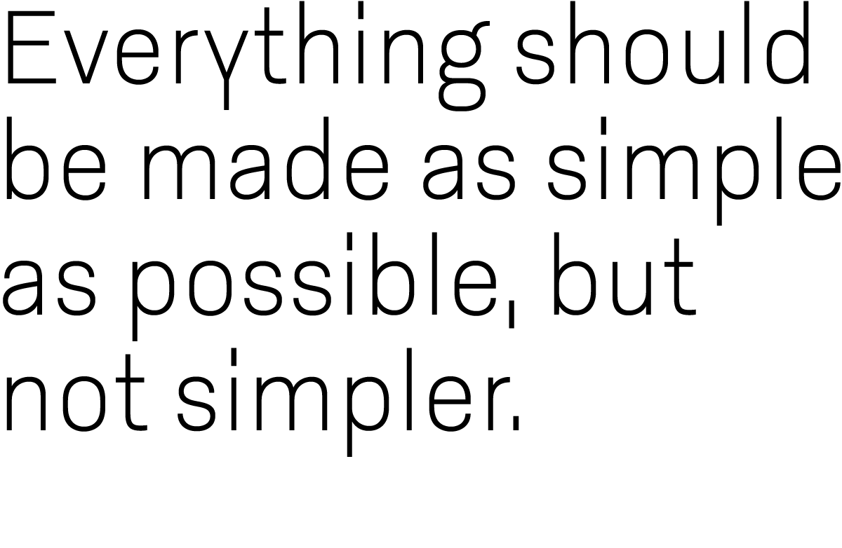
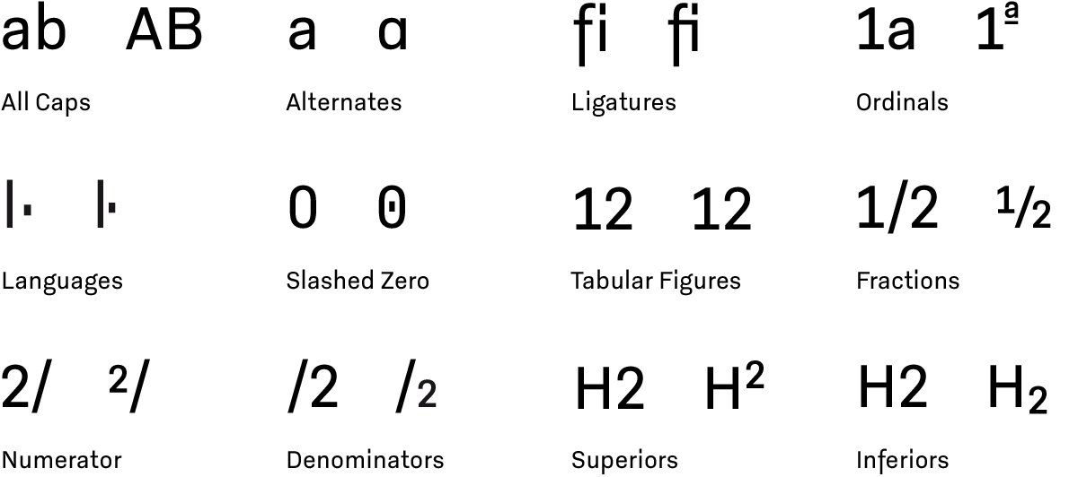
Godfrey is a compact, straight-sided, sans serif with a solid and reliable personality. Particularly striking are the descenders on ‘f’, ‘j’ and ‘y’ – which are composed completely of straight lines – and the protracted points of the ‘i’ and ‘j’. This emphasis on straight lines and equal proportions lend Godfrey a very structured and clean appearance while also ensuring its very unique character. As a result, Godfrey is a legible typeface that is expressive without being distracting.


Want to see more? Keep in touch by clicking the Follow button.
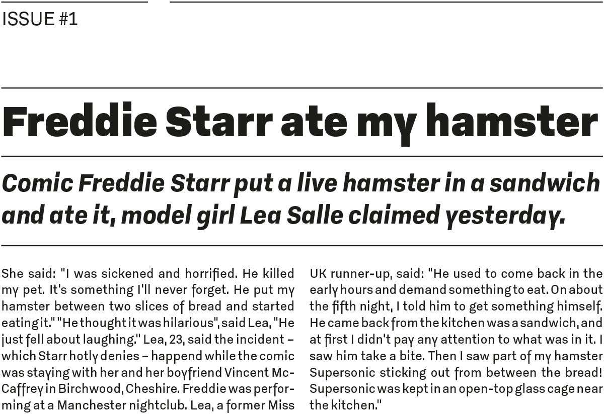
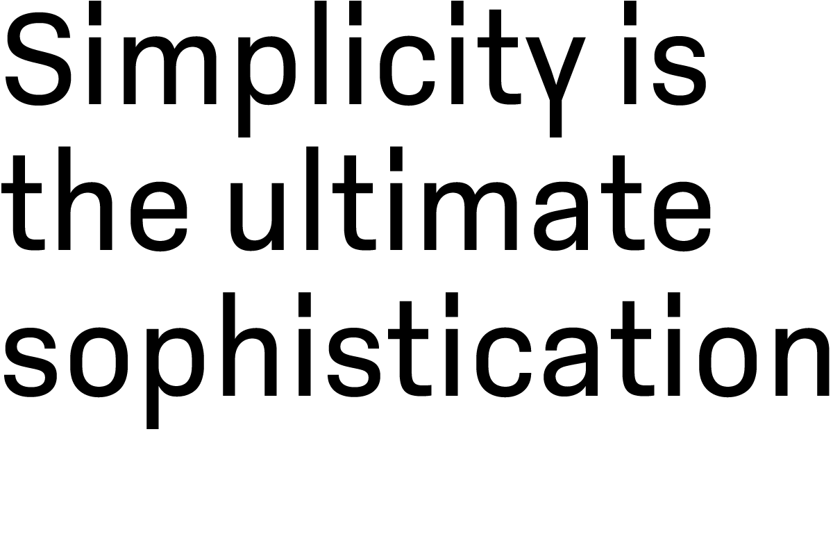
To see more of this modern typeface visit LudwigType
To see more of this modern typeface visit LudwigType
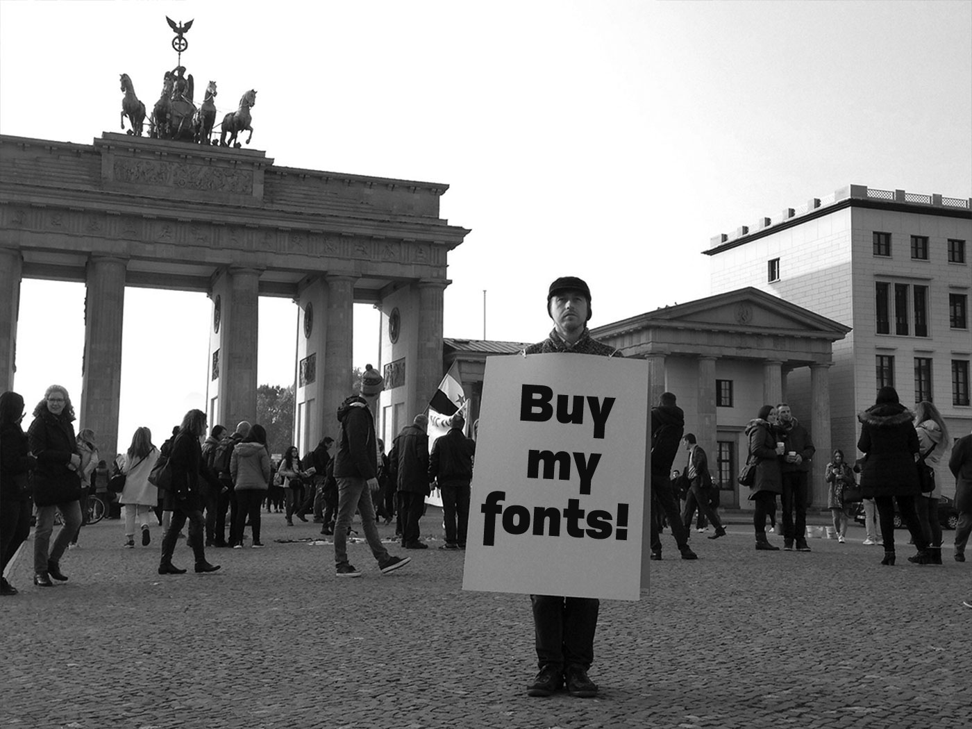
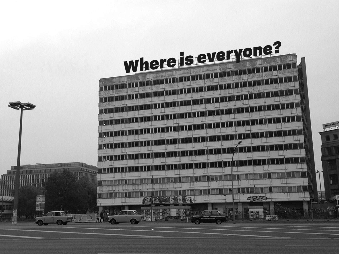
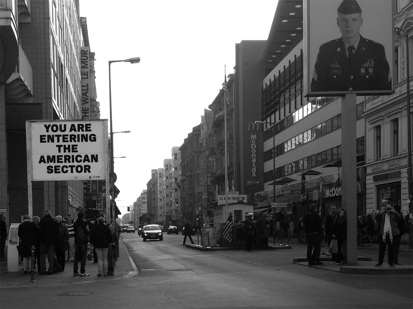
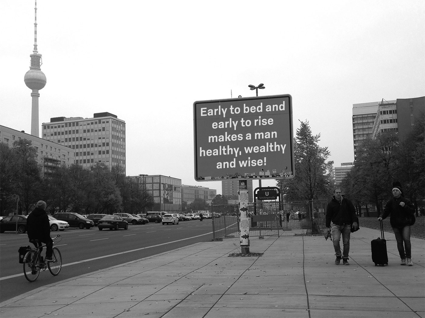
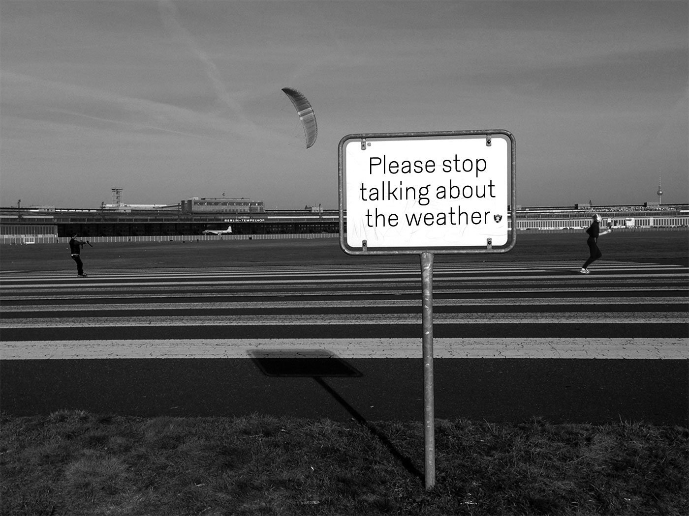
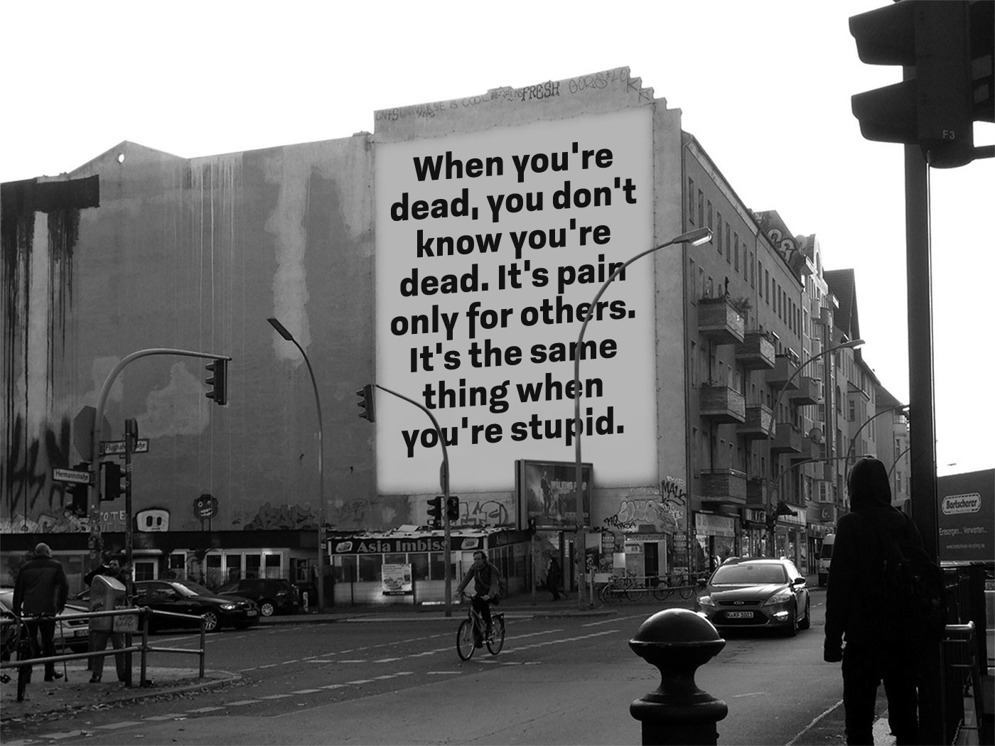
Also don’t miss this minisite, where you can type your on text on signs and buildings all over Berlin.
