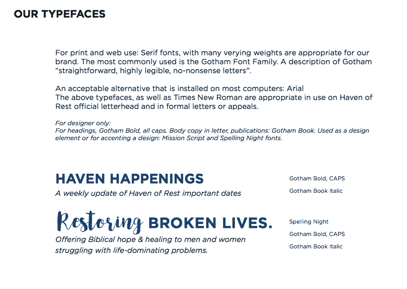
BACKGROUND INFORMATION ON THE ORGANIZATION:
For over 55 years, it has been the goal of Haven of Rest Ministries in Anderson, SC to help transform lives of men and women with life-dominating problems, such as addiction, homelessness, and other broken lifestyles. The Haven is committed to restoration of the whole person through a Biblical approach that helps people learn how much God loves them and gain the insight they need to lead a productive life.
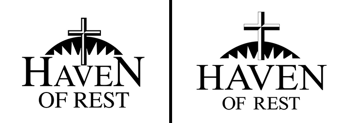
Before and After of the main logo (above):
Alterations include:
1. Raised the cross up, since the main part of the organization's mission is to show the love of Christ to its clients.
2. Remove the larger "H" and "N" in the word "Haven", since they do not add additional meaning or visually represent anything.
3. Softened the sharpness of the horiizon behind the cross.
4. Sized down "of rest", since the organization already goes by the nickname "Haven". I did this hoping to eliminate the "of rest" completely from the name later down the road.
*These steps toward refreshing the logo and overall brand were huge victories, considering the logo had not been changed in 54 years.
REFRESHED BRAND:


"Refreshed logo" in main brand color "Haven Blue"

Horizontal version of logo in main brand color "Haven Blue"
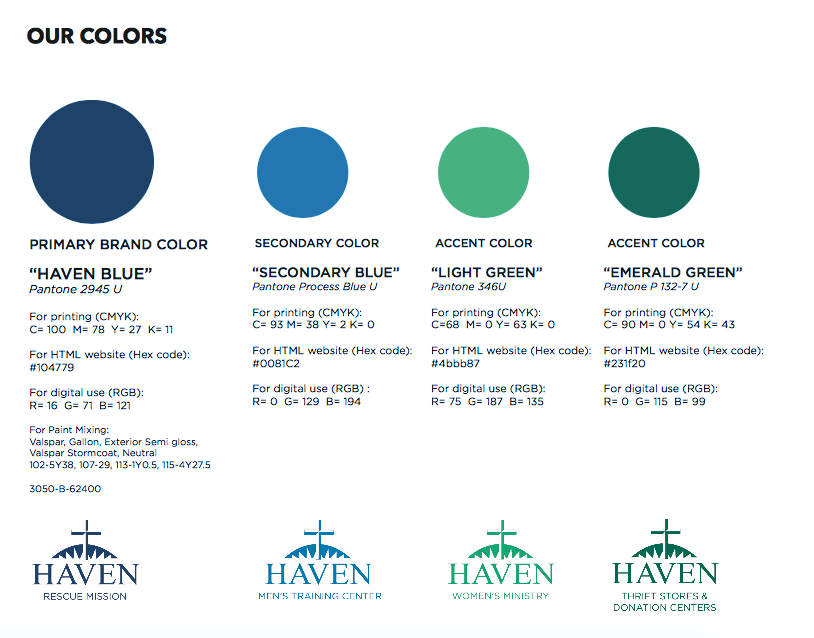

The new variations of our logo, specific to the 4 areas of the organization.