Optima Telekom is the second largest landline operator in Croatia. Meeting their 10-year anniversary they decided for a rebranding. We joined forces with Jackie Agency who devised a brand strategy, while we were in charge of the visual identity and won the rebranding pitch.
The identity is based upon a simple logo intervention – by displacing the dot of the letter 'i' the logo is infused with energy and optimism. The red and black color-scheme creates a link with the previous identity.
Production: Jackie Agency / Sound design: Tin Ostreš / Animation: Dražen Zeljković
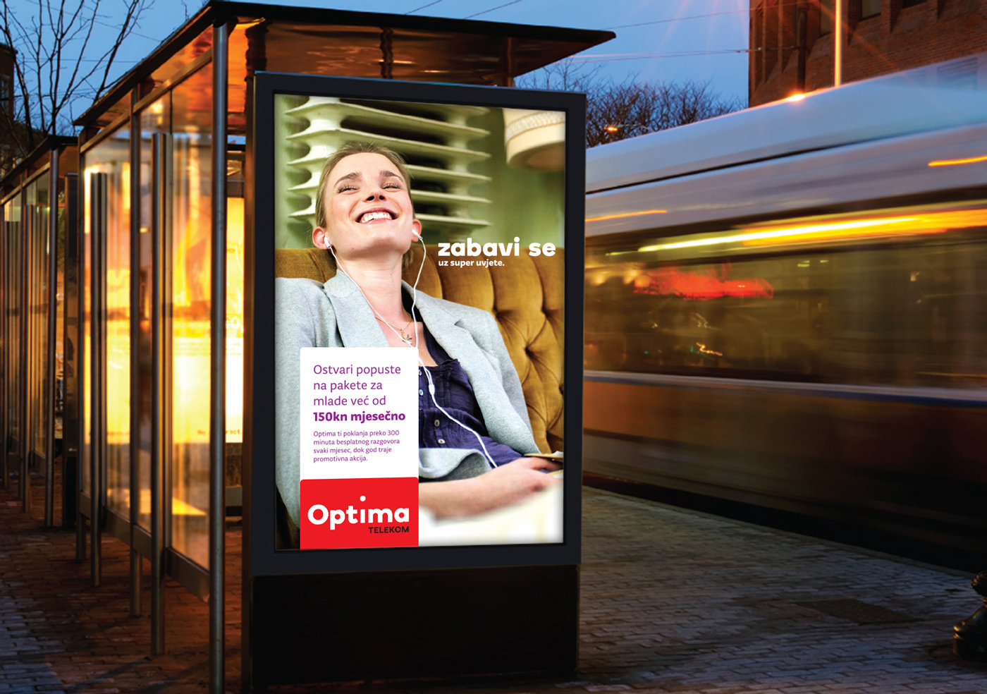


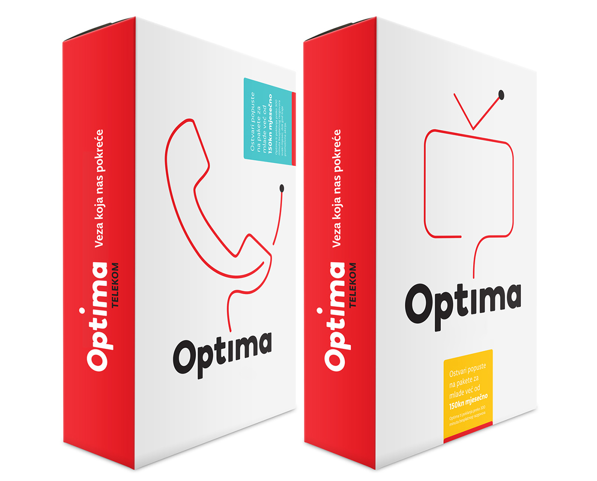
The identity is further extended by the bouncing dot's red 'trail', thus opening the space for various logo mutations, whether in order to communicate Optima's services, or a key value of a current campaign.


Production: Jackie Agency / Sound design: Tin Ostreš / Animation: Dražen Zeljković


A detailed graphic standards manual was created to ensure consistent applications of the visual identity.


