


The Brief
Hawksfield is a modern real-estate agency situated in Cambridge. One of the goals of this project was to get away from the traditional look of the property agencies in Britain.
Cambridge, being a center for students and tech companies, is attracting a lot of young people all over the world. So they were considered as the core target group.
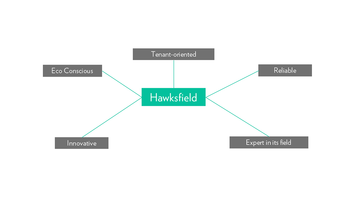
Brand Attributes
Identifying the brand attributes helped in establishing a proper direction for the whole identity.
The Identity
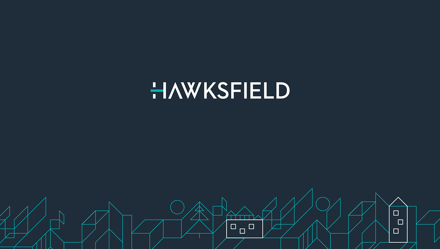
The Identity
The identity is consisted of a lettermark and a dynamic graphic system.
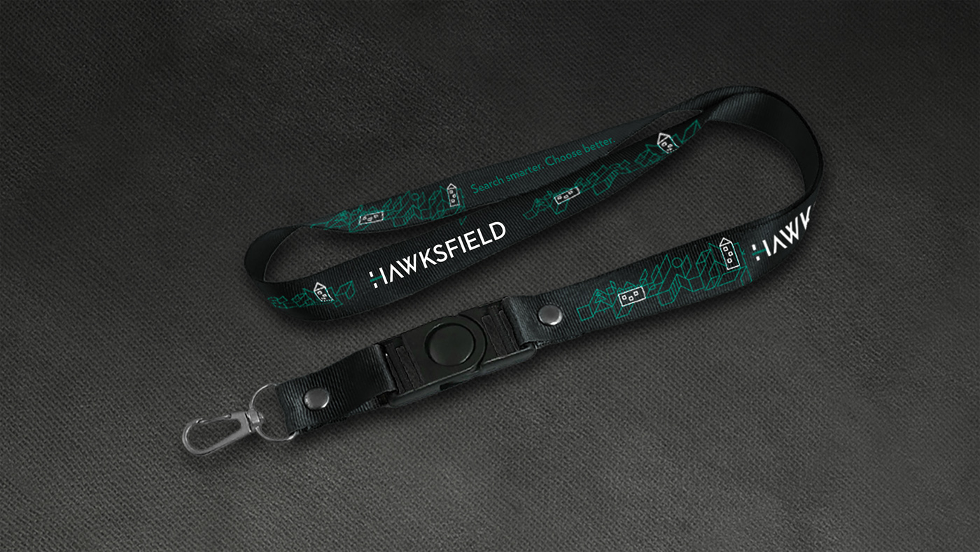
A grid is used to generate line art which contains simple property symbols. This way we instantly show that Hawksfield is a property agency since it cannot be determined by its name only.
Using the grid, any number of variations can be developed to fit the theme or the composition.
A grid is used to generate line art which contains simple property symbols. This way we instantly show that Hawksfield is a property agency since it cannot be determined by its name only.
Using the grid, any number of variations can be developed to fit the theme or the composition.
See the video above to learn how the dynamic graphic system is created.

Examples of line artworks varying in size and complexity. The possibilities of the system are endless.


Brnded USB key

Christmas-inspired line artwork created with with same system.
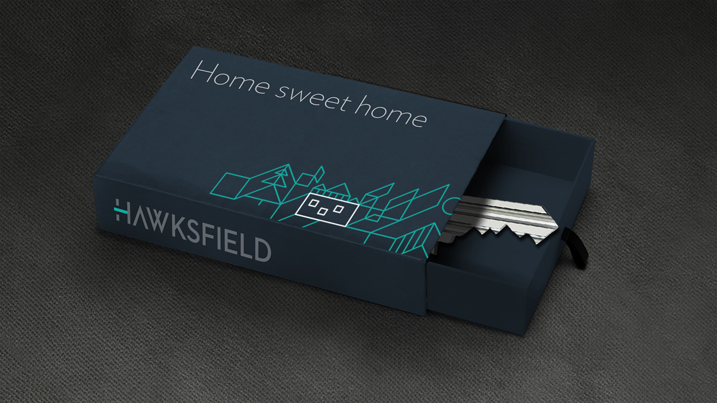
Key box for new tenants

Cut-out Flyer

Temporary website

A Magazine Ad proposal layout, using B&W photography to stand out from the other real estate ads cramped with a lot of busy photos.

Magazine ad which ran into a local property magazine promoting benefits for landlords.


Hawksfield prides itself on being eco-conscious, and one way they are taking care for the environment is by using electric cars.


Boards placed in front of the properties let by Hawksfield.


