


As you all know, on September 1st Google not only announced their new logo, but their new corporate typeface as well, ProductSans.
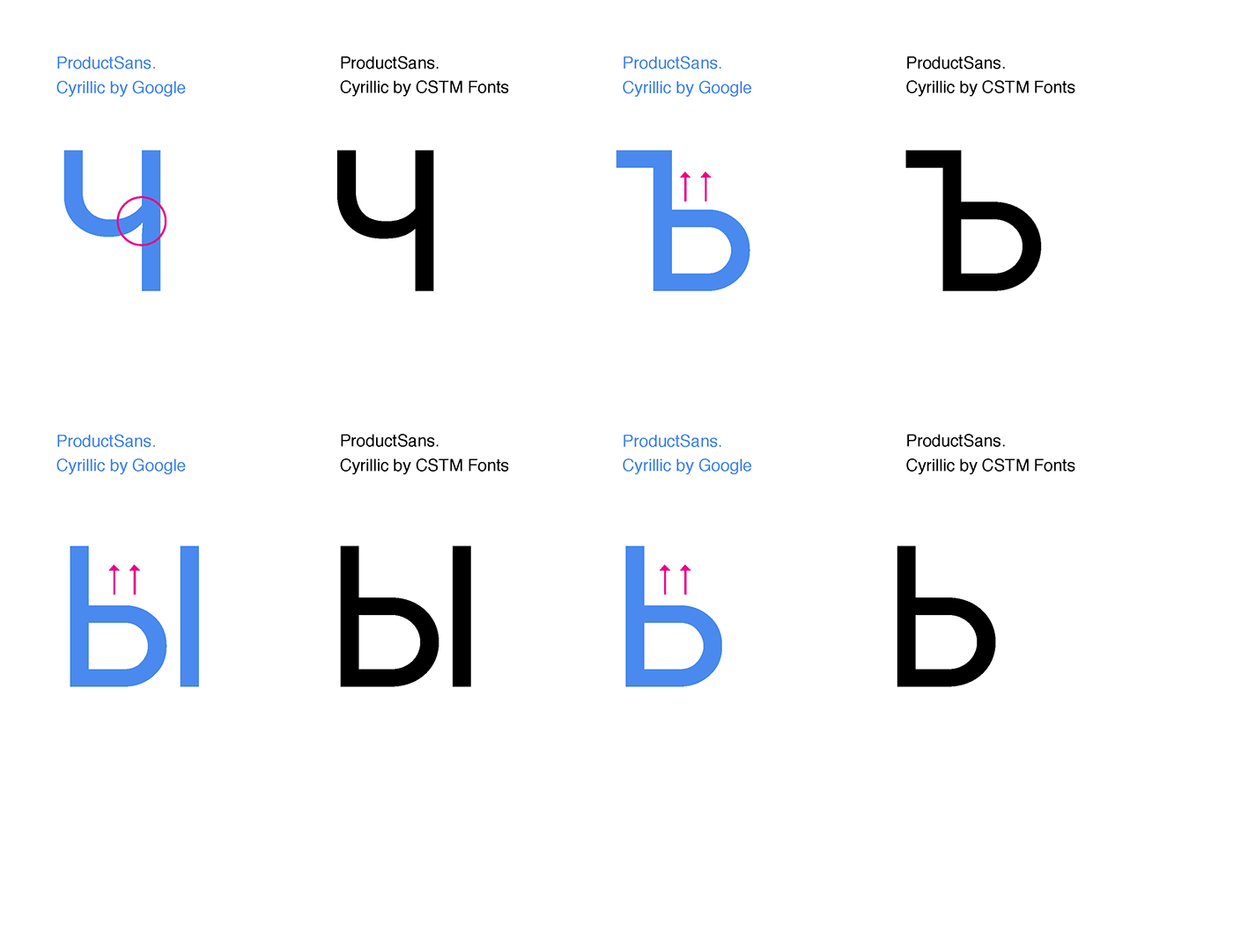
We would like to let our colleagues from Google know about a few issues in the typeface's Cyrillic set that they may have missed. We only spent a few hours on this to simply point out the inaccuracies. You may not find these ideal from a stylistic point of view, but at least they show the proper direction to fix the Cyrillic characters.
Here's a link to the hi-res images.
1 сентября Google вместе с новым логотипом представил новый фирменный шрифт ProductSans. Мы взяли на себя смелость обратить внимание профессионалов Google Design на некоторые конструктивные нюансы кириллицы, которые они возможно упустили. Мы потратили на эту работу всего несколько часов, чтобы только показать сами неточности, поэтому выбранные нами решения могут быть не идеальны с вкусовой точки зрения, но мы обозначили главные конструктивные проблемы.
Вот здесь можно посмотреть на изображения лучшего качества.
Вот здесь можно посмотреть на изображения лучшего качества.


