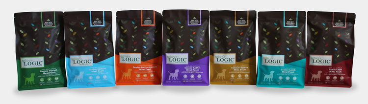
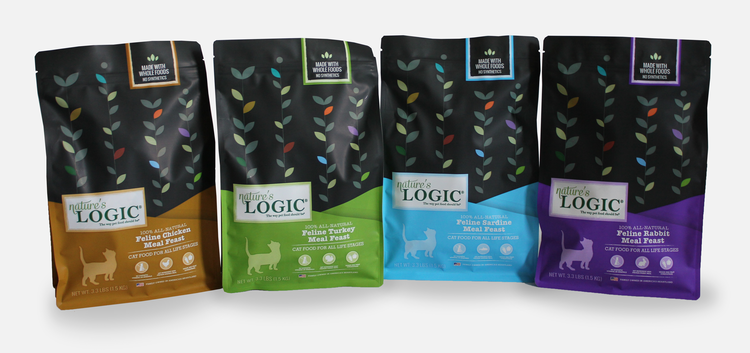
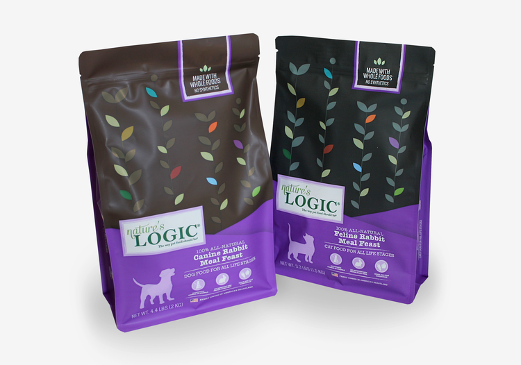
Nature’s Logic wanted to refresh their packaging as their distribution and demand for their “whole food nutrition” pet food grew. They desired to move away from their previous barnyard/down-home look and completely modernize their packaging with flat artwork and bold colors. The leaf design on the front of the packages is both organic and mathematical, calling to light the brand name, Nature’s Logic. Each colored leaf on the front represents one of the colors associated with each protein type so that their entire line is subtly displayed on each bag. Since customers had begun to incorrectly refer to their brand as “Logic” due to their disproportionate logo, the typography was updated to reflect their correct name and the cleaner approach to the rest of their packaging. The dog and cat silhouettes were taken from their old packaging as were the base flavor colors to retain a touch of their former selves. However, their flavor colors were then brightened and made bolder for a stronger shelf presence.