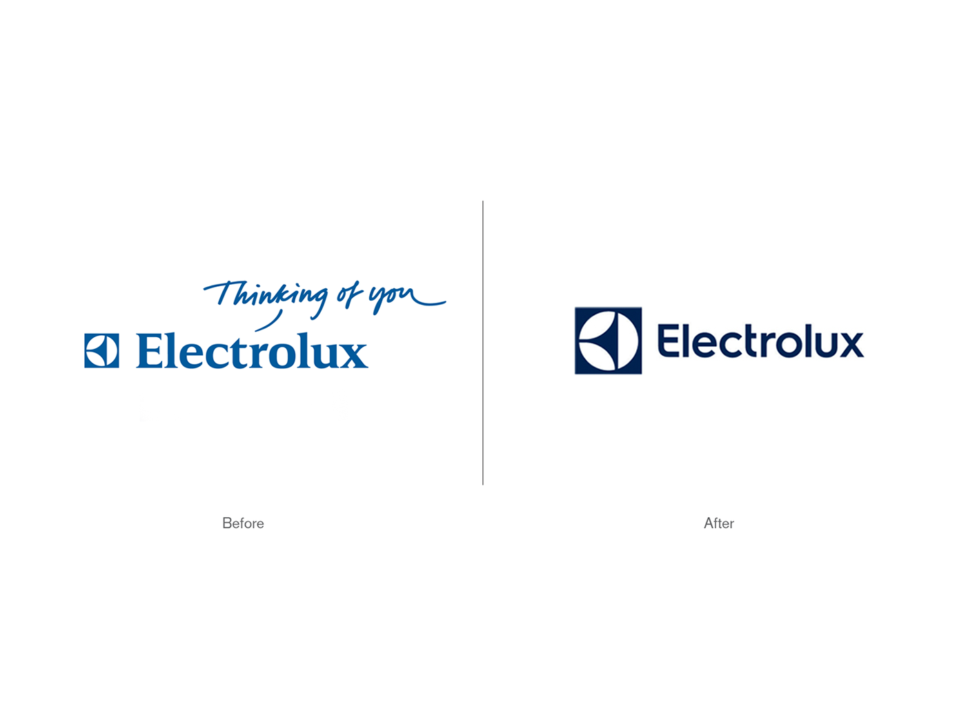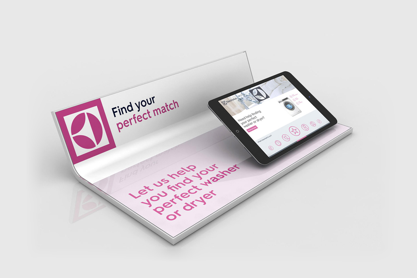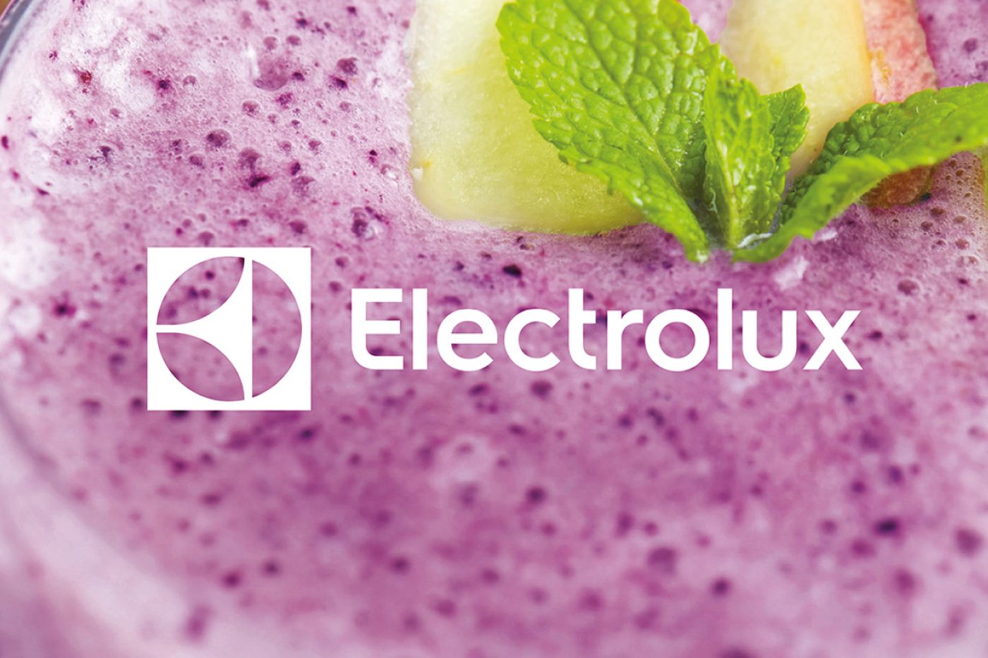
To become the world-class marketing and design company they aspire to be, household electronics company Electrolux needed to modernize their visual identity and retail experience. An updated logotype, influenced by the company's Scandanavian heritage, was created and their iconic symbol was freed from the lockup and used in a more confident fashion.
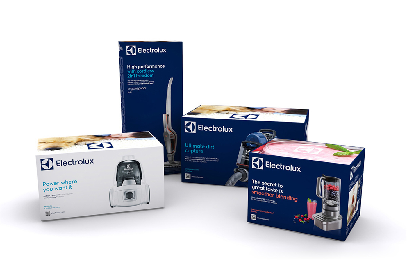
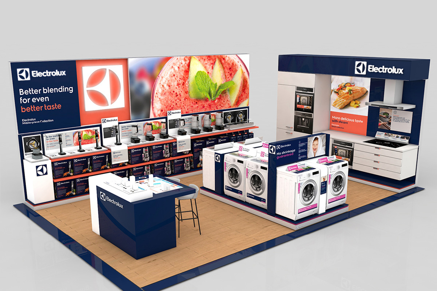
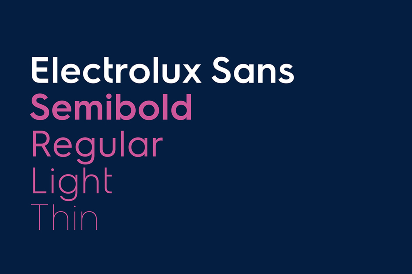
Their core color blue was darkened to have a more premium appeal, supported by a palette of bold, vivid colors designed to stand out in retail environments. A custom typeface, benefit-driven messaging and imagery focused on delightful outcomes created a new experience on packaging and point-of-sale displays.
Creative directors: Peter Dixon & Hector Pottie
Designed while at Prophet