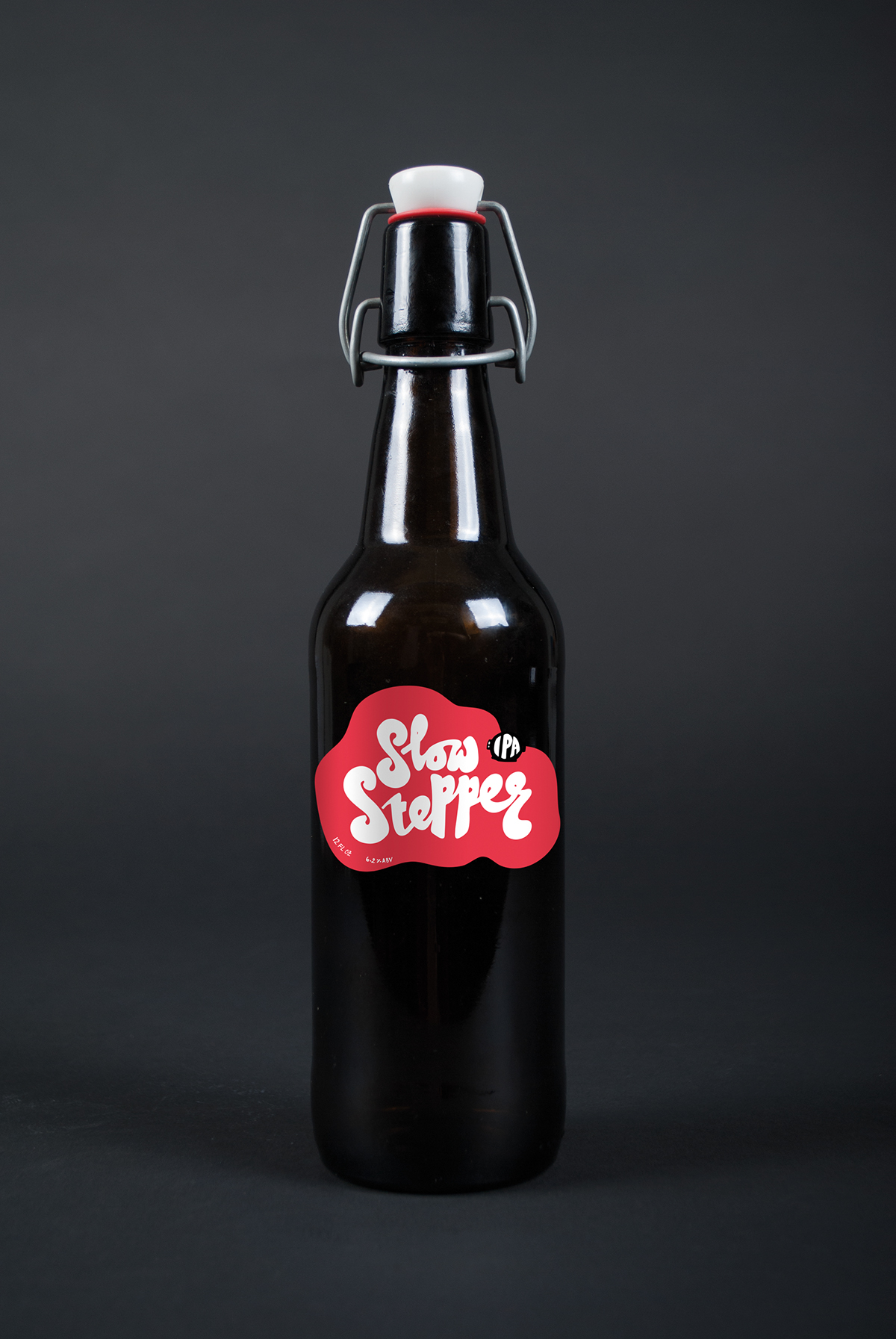
BRIEF:
Logo, identity, & packaging roll-out for Slow Stepper IPA.
- Student Work -


APPROACH:
Drawing ideas from the concept of the brewery, 'water bears' became a symbol because of their ability to come back to life, just as the brewery has done in it's industrial surroundings. Water bears are strange & interesting microorganisms, and many of their quirky facts played major roles in the design, branding, & packaging. The main fact being that water bears can survive in outer space.
Drawing ideas from the concept of the brewery, 'water bears' became a symbol because of their ability to come back to life, just as the brewery has done in it's industrial surroundings. Water bears are strange & interesting microorganisms, and many of their quirky facts played major roles in the design, branding, & packaging. The main fact being that water bears can survive in outer space.


PROCESS:
1. Research into demographic & beer labels that appeal to this demographic.
2. Concept development of brewery & wordmapping to discover keywords.
3. Research into look & feel, color, and typography styles based on chosen keywords. Ideas summarized into moodboards (see images below).
4. Sketching & design of logo (see images below).
5. Sketched handwritten & graphic elements and applied to appropriate roll-out.


