


Antoning
branding
This project is a fictional project created with the support of Toormix, a graphic design studio based in Barcelona.
Antoning is a social & cultural Hotel based in Sant Antoni, Barcelona
This hotel is a cultural epicenter and meeting point for young people, both tourists and locals.
The Hotel has an open Hall, makes events and workshops, has a club & bar, a restaurant with a Michelin star and a snack bar where you can eat at an affordable price.
The Hotel has an open Hall, makes events and workshops, has a club & bar, a restaurant with a Michelin star and a snack bar where you can eat at an affordable price.
NAMING

- Discover the authenticity of the neighborhood of Sant Antoni
- Socialize and experience
- Socialize and experience
+
Sant Antoni
=
ANTONING
"We were antoning in Barcelona two days ago"
"Let's go antoning"
CONCEPT

SYNERGY
Socialize with each other is one of the highlights of the hotel, the youngsters meet and share experiences with one another, which makes them grow personally and culturally.
LOOK&FEEL
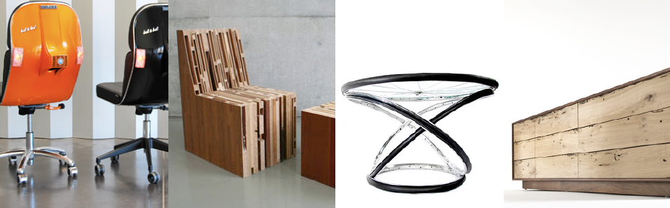


Natural, reused & recycled materials.
(without sacrificing the aesthetic sense)
(without sacrificing the aesthetic sense)
Opposition of modern objects with old objects.
Spaces with natural light.
Open spaces that make easily to interact with each other.
IDENTITY

The symbol of the brand makes reference to both synergy and vintage tiles of Barcelona's homes.


Sant Antoni
+
Synergy (Socialise & experience)
=

+

=

TYPOGRAPHY

COLORS


BRAND ARCHITECTURE

CORPORATE STATIONERY

ACCESS WRISTBAND

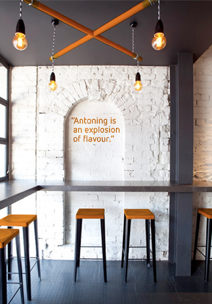
COMMUNICATION


ATMOSPHERE


AMENITIES

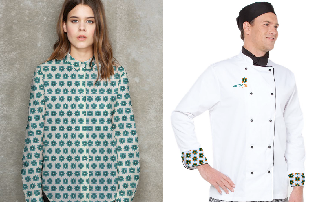
STAFF CLOTHING

MERCHANDISING

CO-BRANDING WITH PALENS


