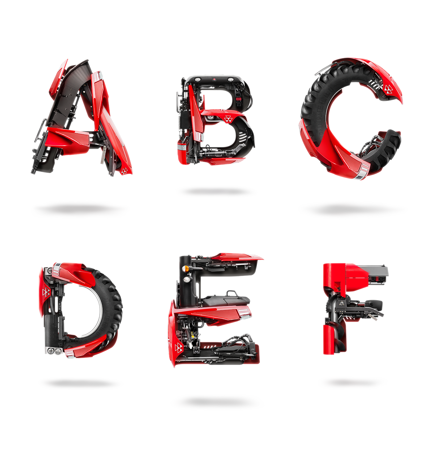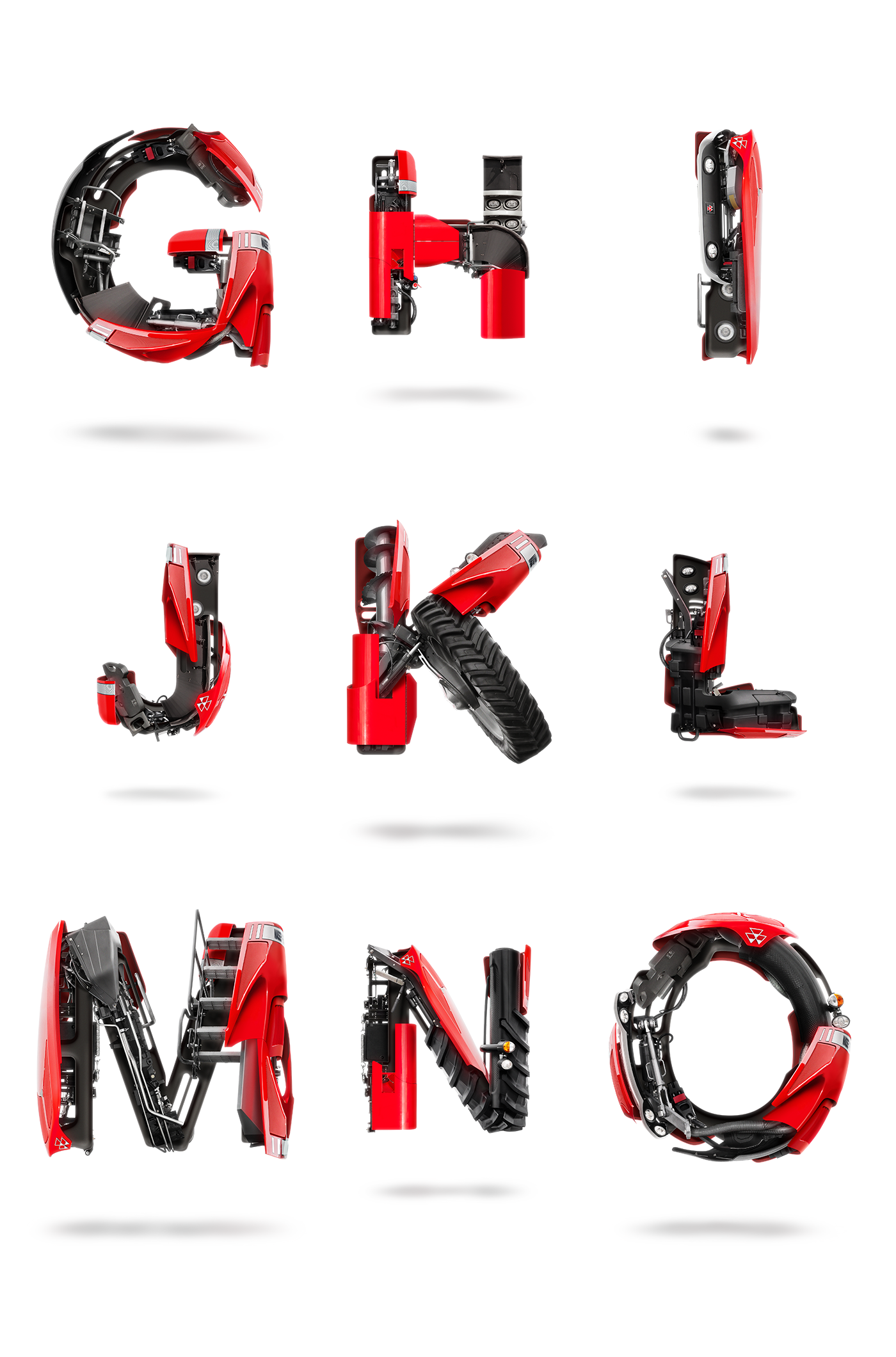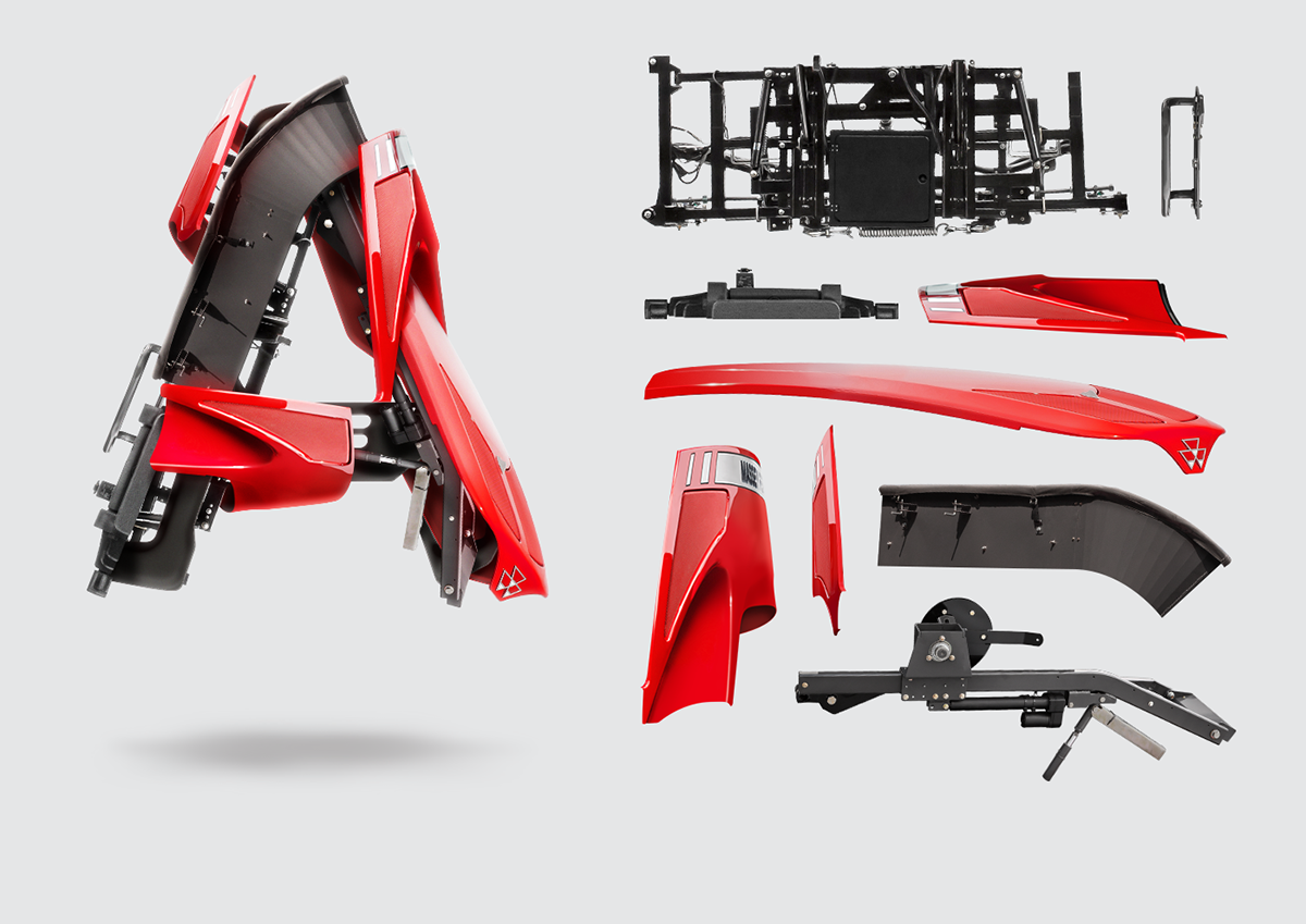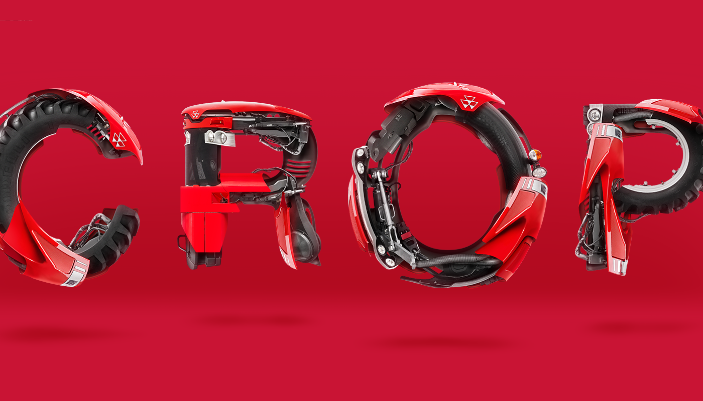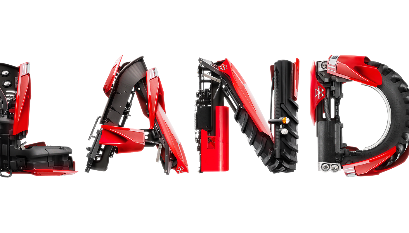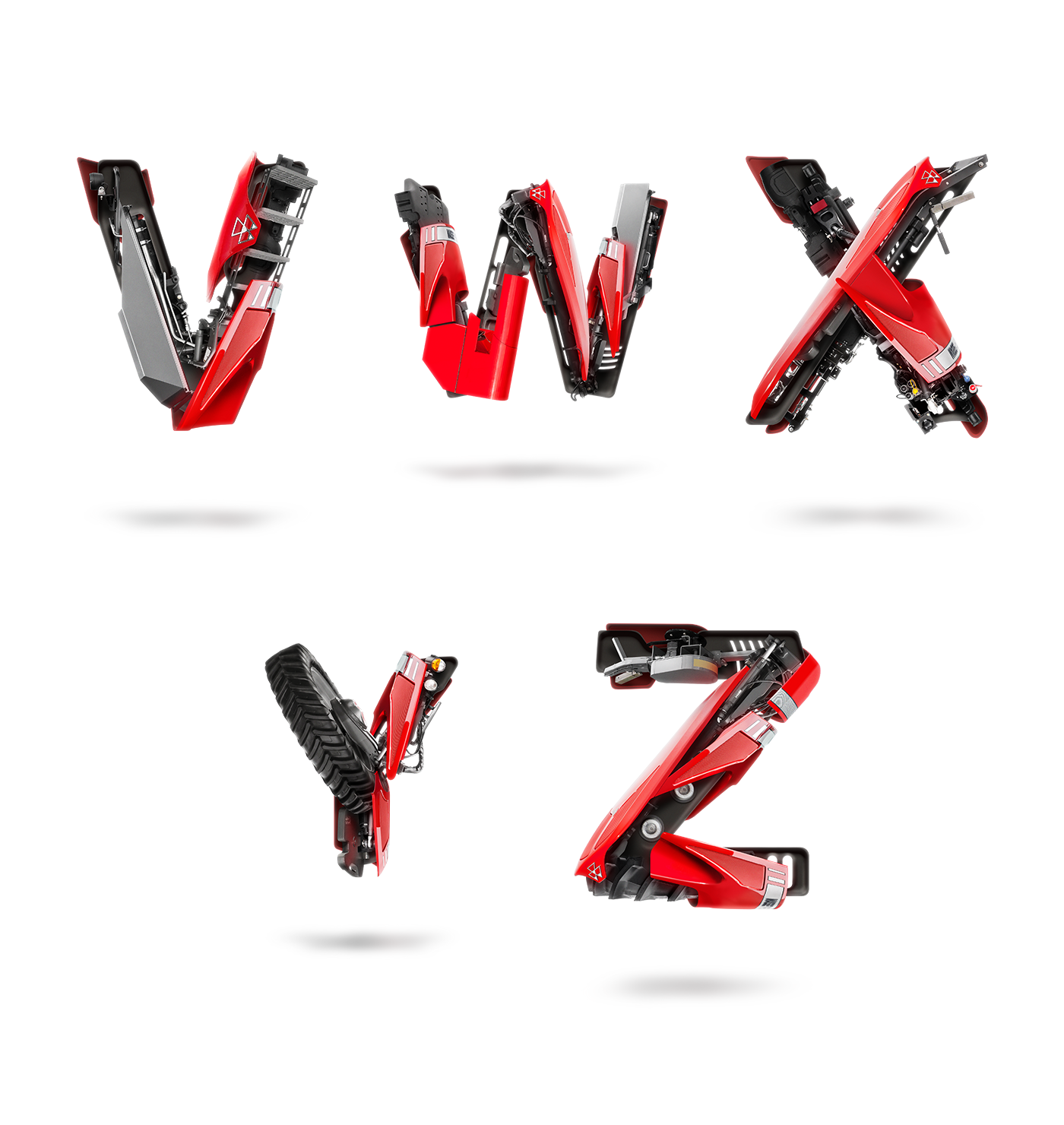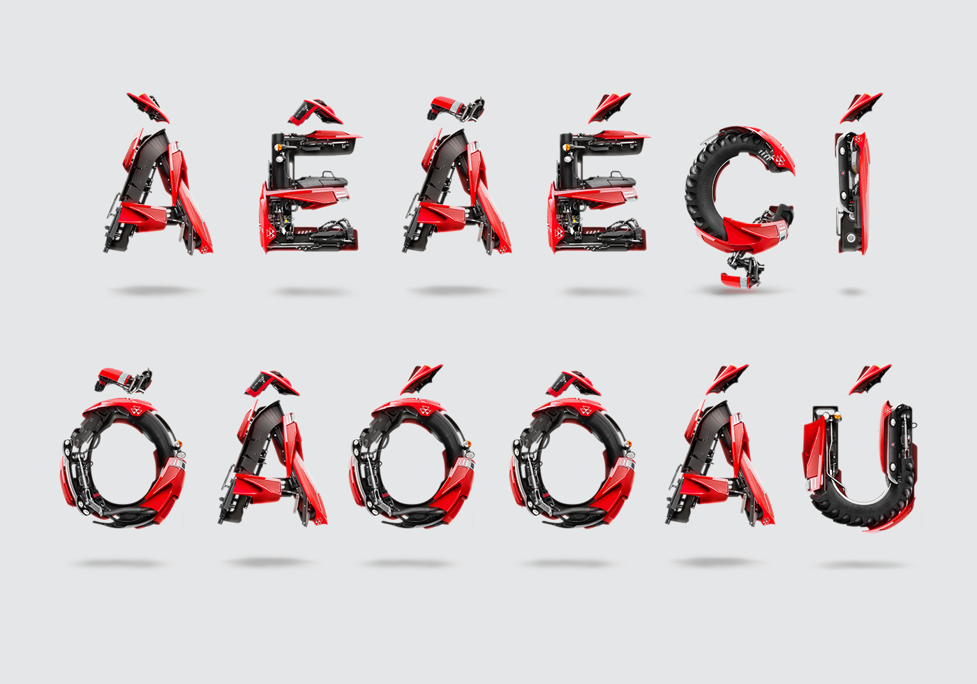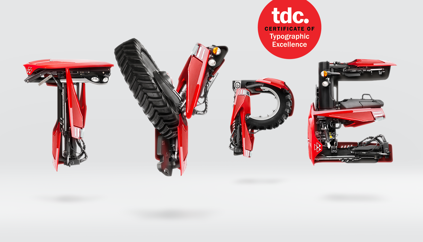
I was commissioned by Dez Comunicação in Brazil to create an upper case alphabet for Massey Ferguson, based on the shapes of Helvetica Neue—their corporate font—and using parts of their world-renowned products, such as tractors and pulverizers, taken out of photographs they provided.
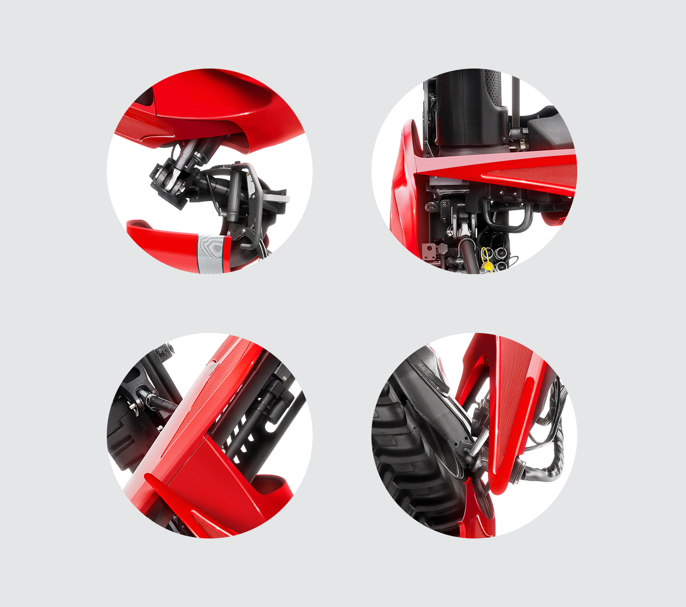
The biggest challenge was the relatively small number of source images I was able to work with, which constrained the quantity of “building blocks” available to make up the letters. That and harmonizing all the different kinds of lighting and levels of image quality from image to image.
______
Credits
Representation: Möve/Norte (many thanks to Bárbara Scatolini and Bruno Narvaez)
Client: AGCO, Massey Ferguson
Agency: Dez Comunicação
Creative Direction: Thiago Bizarro
Art Direction: Fausto Hagen and Fabio Piucco
Awards
Type Directors Club's TDC62 Certificate of Typographic Excellence