ARGENTA REBRANDING
Established in 1956, Argenta Bank is Belgium’s fifth largest financial institution that also operates in the Netherlands and Luxembourg. Argenta offers a wide variety of financial products and services, ranging from savings and investment products, to personal loans and insurance policies. The Argenta philosophy is one of personal banking and is founded on mutual trust. They believe tailored advice is the key to a long-term relationship with customers.

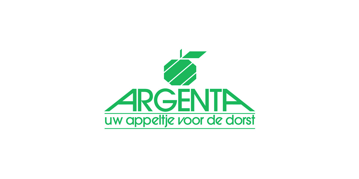
Before
The old corporate identity looked very stale and outdated compared to the competition. This was mostly due to the lack of a carefully chosen color scheme and the overload of gradients and drop shadows. Moreover, the decision to incorporate the brand's baseline made the logo very hard to adapt to different formats.
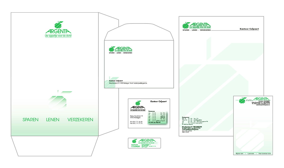
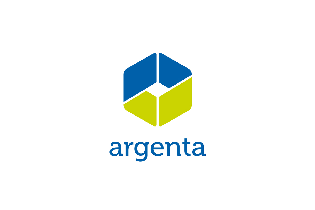
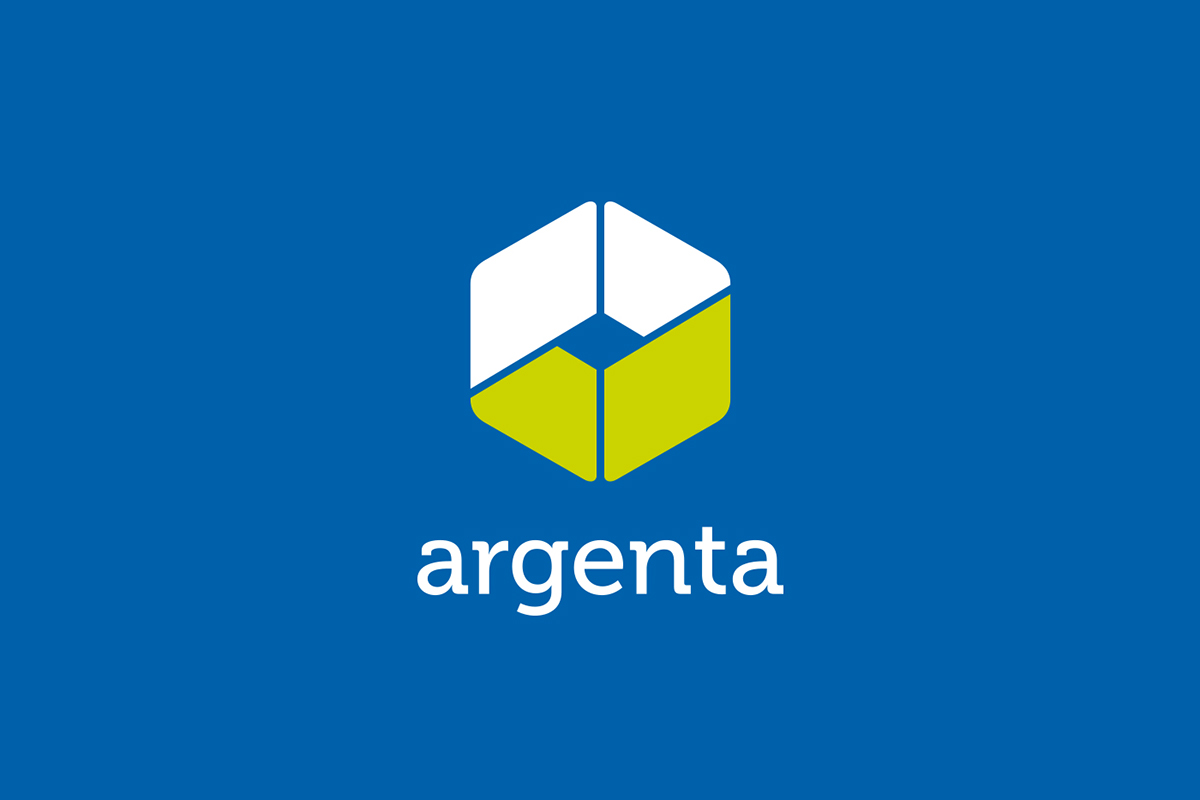
After
The new logo is a modern reinterpretation of the old apple symbol. Immediately visible is the green checkmark which represents ‘reliability’ and ‘trust’. Furthermore the logomark consists of two colored shapes representing a respectful and welcoming handshake. The shapes can also be seen as a ‘chain-link’, symbolizing Argenta's approach to security and its commitment to reliable financial advice. Lastly, the nature of the financial industry is depicted in the symbol as an ongoing ‘cycle of transactions’.