
"36 Days of Type is a project that invites designers, illustrators and graphic artists to contribute their vision of the signs that make up our alphabet.
During 36 days of non-stop creativity, participants are challenged to design a letter or number every day to generate a complete alphabet, leading to an overall picture of the ability to represent the same sign from many different perspectives.
This project aims to create a space for creation around typography and graphic possibilities endless." —36daysoftype.com
I actually didn't find out about this project until it was up to letter I. I did the rest of the alphabet and numbers, and then went back to complete letters A – H. Most, but not all of the characters have a concept, and some have more than one version. I used just about all of my graphic skills to create 36 days of type. It was actually 37 days since an ampersand was added at the end. In addition to working on my own characters, I was able to see the work of designers, illustrators, and photographers worldwide who were also creating their 36 days of type.

A is for A-hole.

B is for Beans.

C is for Cape Cod.
This is actually a variation of the logo I designed for CapeNet.

D is for Delicate.

E is for Excalibur.

F is for F clef.

G is for Girl.
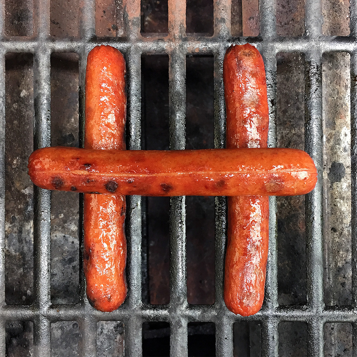
H is for Hotdog.

I is for Identity.

J is for Jew.

K is for K-velope

L is for Level.

M is for Matches.

N is for Noodles.

O is for rainbOw.

P is for Pie.

Q is for Quacker.

R is for Robot.

S is for Skinny.

T is for Type bubble.

U is for Unconnected.

V is for Vibrant.

V is for Vertical.

W is for Wallcovering.

X is for Xrcise.

Y not?

Z is for Zig Zag.

Zero = Nada


Numbers two through eight were inspired by the work of Piet Mondrian.


Eight = Ocho

Nine O'Clock

Amp-ersand


