


Uppress S.A. is one of the leading companies for professional printing solutions in Greece. What makes them differ is the attention they give in every detail and the perfection of the outcome they can offer in both digital and offset printing methods.
We were commissioned by the client to design a new identity for the company in order to reflect the quality and the modern vision they have as their primordial values.
The whole identity is based on clear forms, bold typography and a professional -yet friendly- styling that attracts the eye and makes a memorable image for the clientele.
The main request was to keep the basic element of the current logo - that is, the word UP inthe specific typeface
and restyle the rest of the logo in such a way that the word PRESS would become equally visible and prominent.


The result is a logo that is clean, readable and modern, adopting the aesthetics of contemporary graphic design.
Considering the colors, the client had a strong request to keep the orange hue almost identical. A slight alteration was made to it in order to have a stronger effect, combined with the secondary color we chose, that is a dark blue. The contrast created combining these two colors is bold and eye-catching, making a more professional and modern image overall.


Enjoying the client’s total trust, we wanted to create a unique visual identity in order to make the company’s image memorable, dynamic and well-suited to the needs of the modern market.
Our principal concern was to design all the elements in such a way as to have a coherent look and an engaging character. This is why we chose to base the image in bold typographic messages, customized for every single element, be it a business card or the wrap for the cargo van of the company.
All the messages are set in uppercase with either left of right alignment and divided in lines, following semantic or grammatic rules. The phrases are also divided by means of color following the semantic cohesion.


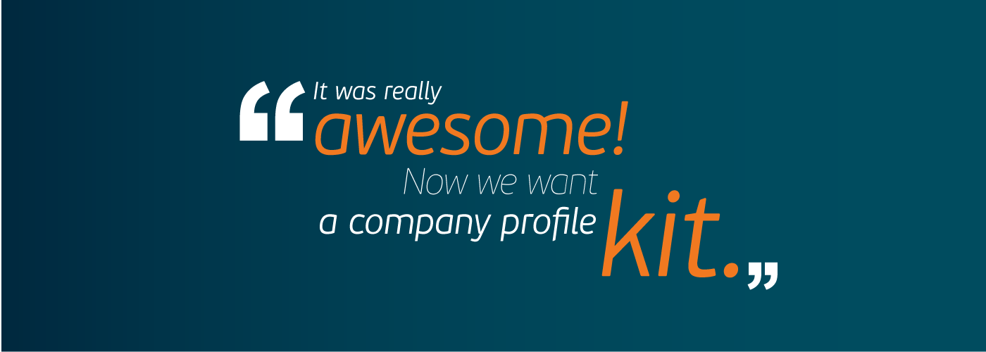

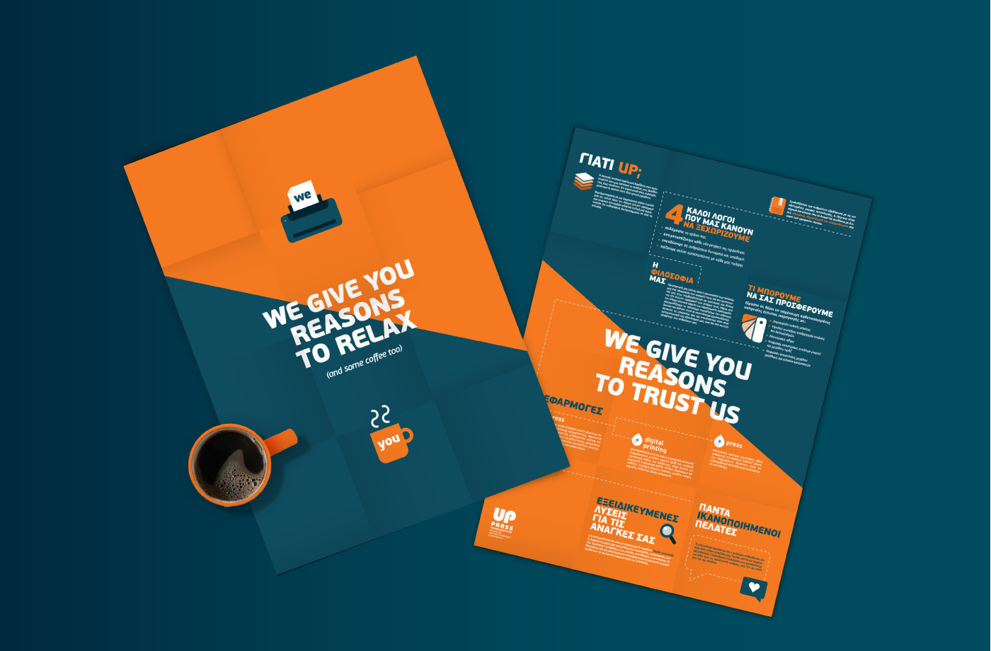
As the branding was evolving, the client asked us to design a corporate brochure and gift pack.
After long and creative brainstorming, they chose our proposal of giving a branded mug along with a custom designed pack with coffee as a gift to their clients.
The main idea behind the concept was that the clients can be sure that with Uppress everything will turn out well. The coffee suggests relaxation, thus the company offers all the means to its clients to feel relaxed.

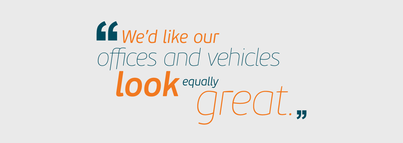
The signage system for he company’s new offices is based on clear typography and contrastive colors on subtly grey walls. A number is assigned to each office in order to create a flow of work and an easier way for the employees to cooperate.
The corporate cars have a custom design wrap that makes them easily distinguishable, even from a big distance.
The visual language remains consistent with the core brand identity in order to empower the general image of the company.
The visual language remains consistent with the core brand identity in order to empower the general image of the company.


Although we provided a very solid and innovative design for the corporate website, the client has chosen to follow a different way of presentation and commisioned a digital agency to construct it.
Our new role was to advice and consult the whole process through our creative judgement, helping the development team build a website that would be mainly functional, yet with a special touch in terms of design.


(Don't forget to press the button!)


