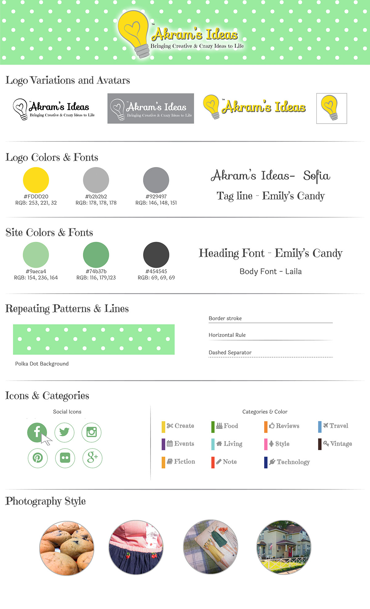
When updating my Akram’s Idea’s brand identity I wanted to bring more focus to the light bulb graphic I designed for the first logo.
Instead of using the light blub as the dot for the “i”, I wanted to highlight it and make it stand out to really give the sense that Akram’s Ideas is all about creative and crazy ideas.
When designing the official logo I wanted to make sure the tag line was incorporated into the logo as it really helps describe what Akram’s Ideas is to someone who is newly introduced to it.
Due to readability of the tag line the logo has to be rather large, thus is not at all times. I created a secondary logo without the tag line for use in smaller settings online. The light bulb can be used as a stand-alone logo mark for use as an avatar or when a square image is required.
I used warm yellow and gray colors for the logo and matched them up with a lovely mint green for the overall branding. Since a lot of my site covers my love of all things vintage I wanted to include a vintage style pattern and polka dots just seem to work well with this design.
The branding for Akram’s Ideas stays consistent from print to web and I am really happy with how this project has turned out.