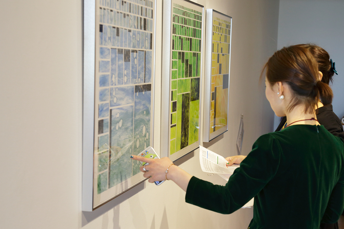
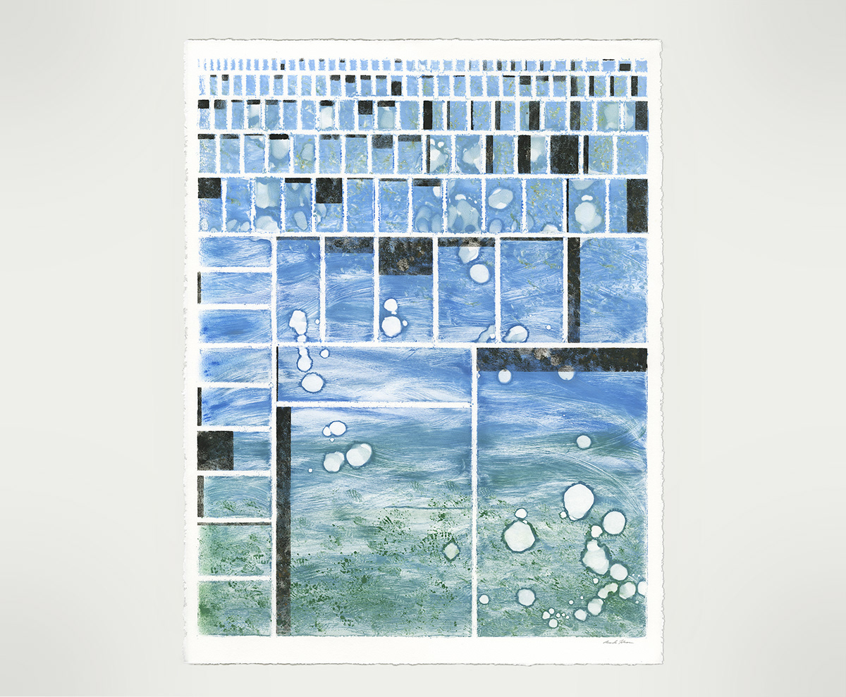
Beyond Measure infographics
22 x 28 in monoprints on Rives BFK paper.
These images are tree map infographic charts made with data from the 2014 Human Development Report. The overall size of each of the squares represents the total population of a given country. For example, the largest squares on the bottom are China and India, with the largest populations. The brown shaded regions overlaid on top of each country's square represent the percentage of that population currently living without a basic necessity due to environmental deprivations. The blue composition maps the percentage of world population living without access to safe drinking water, the green composition maps the percentage of world population living without access to adequate sanitation, and the orange composition maps the percentage of world population living without access to electricity.
I created this series by manipulating ink by hand on a plexiglass sheet. To mark the delineations for each rectangle segment, I applied tape onto my matrix before inking and then removed it just prior to printing. Each composition is a one of a kind unique monoprint.