Helping modern shoppers easily find products at a reasonable price without scarifying quality.
OVERVIEW
The Two Twenty wanted to fill a gap in the home decor marked. Picket Studio led development of the brand to help hit the sweet-spot. I was hired for the front-end development of the new site.
What began as a small curated targeted range, expanded to multiple product ranges and categories during the project. As a result the IA needed rethinking, along with its implications to findability, navigation and site structure.
What began as a small curated targeted range, expanded to multiple product ranges and categories during the project. As a result the IA needed rethinking, along with its implications to findability, navigation and site structure.
THE TEAM AND MY ROLE
I worked as a remote front-end developer together with the PM, designer, UX person, and the developers at Picket Studio. I prototyped and tested the liquid responsive layout before developing templates for the Shopify ecommerce CMS.
The team collaborated to find solutions to deviations from the wireframes and UI design when problems where discovered.
CONSTRAINTS
To save time developing everything from scratch I developed the new Shopify theme on top of a blank template with most of the functionality we needed in place. Because the Shopify liquid template language can’t be run locally we installed a Shopify plugin in our text editors and used Git to push to a temporary Shopify shop.
Mobile support was a given with the target market in mind. I chose the Zerb Foundation framework because of it's mobile first approach to layout. The basic layout also works as a fallback for older browsers without support for media-queries.
The site is backwards compatible to IE9, and has a message encouraging visitors with older browsers to upgrade their browser. Modernizr helps with the progressive enhancement. JavaScript is used to enhance the user experience - e.g. the “Load more” link defaults to the next page of listings, while loading them inline when JavaScript is available.
To begin with the large amount of fluid, responsive images made the page jump wildly as the images finished loading. I stopped this by adding a padding underneath each image which acts a placeholder for the image to load within.
RETROSPECTIVE
I'm happy with the solution for avoiding page reflow as images load on responsive pages. I've since been able to re-use that in other projects.
The off-canvas navigation in combination with the fixed header needed to work on different screen sizes, which brought with it some browser specific bugs as well. I got it solved, but with fairly project specific code. In the future I’d like to have templates ready for various types of off-canvas nav, which the UX and design team can choose from, thus knowing this won’t take up unnecessary time during development.
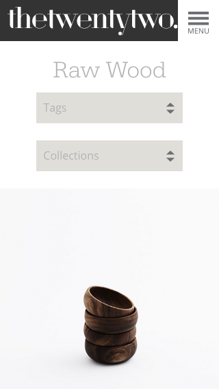
Product detail page

On mobile
Check-out page

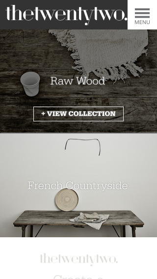
Home page


