

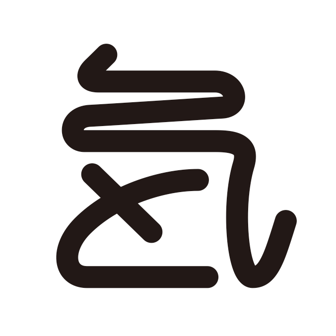
Simplified combination line from KANJI character "気" or "氣" and HIRAGANA character "と".
"気" is for qigong, "と" is for "Tokashiki" - the director's last name of this clinic.
Simple but powerful stream line means fluent human energy. I wanted to have an Asian atmosphere via these character combinations.

Banner types and box types of design for multiple use. Negative color patterns too.

As the client's favor, we choose an orange color for brand's dominant color. I always arrange all combinations for RGB/CMYK/Web safe color.

Box types are good for SNS avatar, badge, stickers, etc. I also make usage guidelines if it's needed.
I also got domain tokashiki.jp and SNS accounts at the same time. Naming phrase and brand visual sing, these two important factors could not be separated these days, even if I got an order for one of them.


