One of my first tasks at Bryn Mawr was to strengthen and expand the brand. At the time I was hired, we only had a set of logos, colors, and typefaces to use, with a very lightweight brand guide. The vibrancy of the school's students and environment informed a look that features bold colors, uplifting original photography, and clean, strong typography.
2013 Annual Report on Giving "Shout the Love": the theme is drawn from a line in the beloved school song.


Dynamic, engaging new look for folders given to prospective students by the Admissions Office. The design is based on a super zoomed-in view of the school's mosaic sun symbol. Each folder is color-coded by division (Lower School, Middle School, and Upper School) and includes both division-specific and school-wide marketing materials.


A bold, eye-catching new design for Fall Visiting Days, a major yearly recruitment effort by the Admissions Office. Featuring a flyer, postcard mailer, and visit brochure with division-specific schedule stuffed in the front.


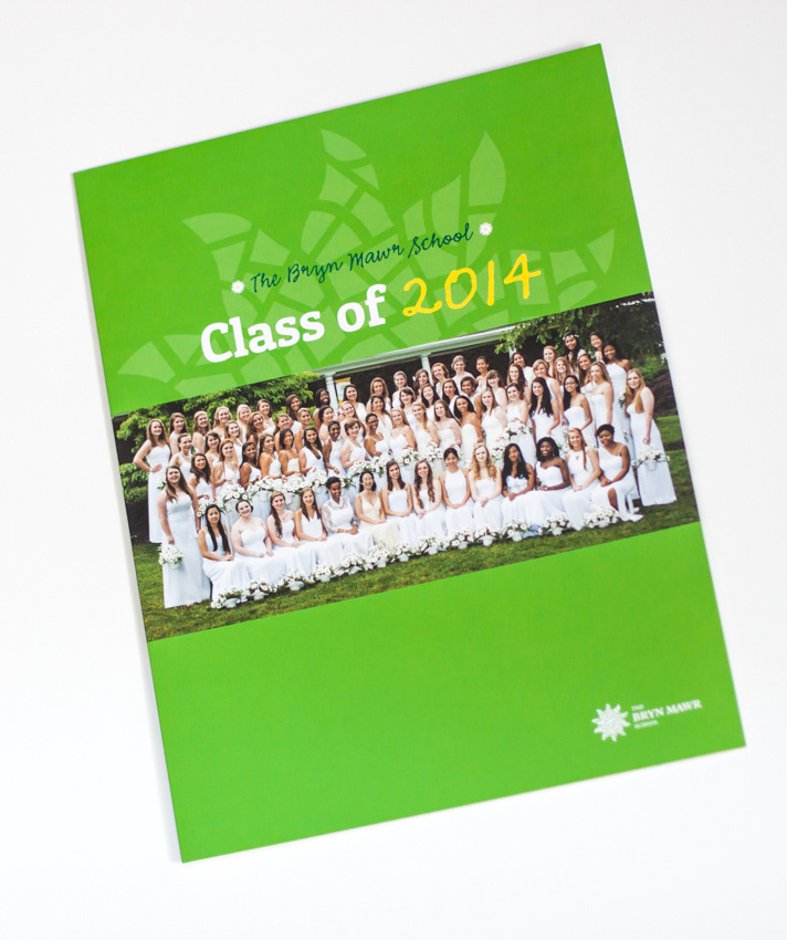
Class of 2014 Profile Brochure, featuring interviews with students and a visual representation of data relating to the graduating class. Loosely correlates to Bryn Mawr's online viewbook, Voices.