


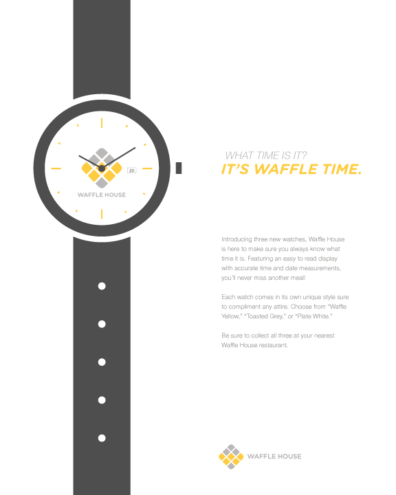
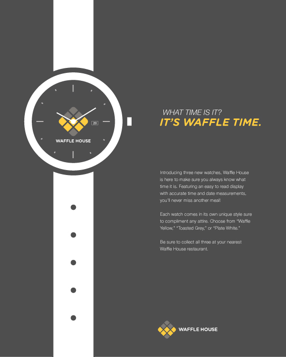
Waffle House Branding
The rebranding of Waffle House hits the point home that food is fun. Aiming to please audiences of all age ranges, I went for a warm color palette that was both inviting and different from traditional restaurants. In addition, Gotham Rounded Bold continues this theme through its bold yet gentle aesthetic. The logo combines the shape of a waffle and the shape of a road sign. Since Waffle House is still a major "highway restaurant," I wanted to allude to that within the mark.
The project entailed deliverables which included: A logo, a website, business necessities, an advertising campaign, window displays, and promotional items. Looking for something different to tackle, I decided to focus on a holiday-themed ad campaign, complete with gift wrap! Combining my established brand with a holiday theme worked well and multiplied the level of fun I initially set out to achieve.


Holiday Campaign


Waffle Card


Website


