

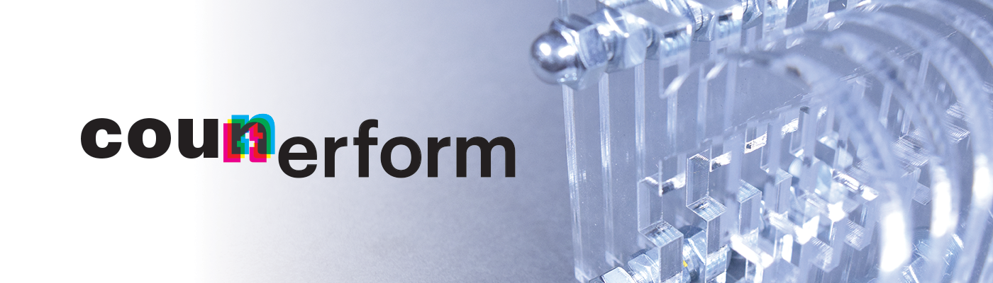
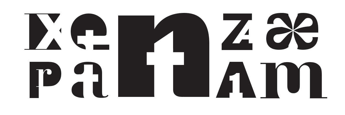
Cou[nt]erform begins as questioning the dichotomies present between different letterforms: form and counterform, positive and negative space, serif and sans serif. How can different forms work to not only work together, but serve to emphasize each other's defining characteristics? What essentially makes each letterform truly unique and identifiable? This train of thought lead to a marriage of forms, emphasizing the simultaneous recognizibility of not only the letterforms used but the typefaces as well.
To further understanding this relationship, multiple forms were used in a booklet that also deconstructs the CMYK printing process while a singular form was made three dimensionally in order to examine how the forms interact with space.
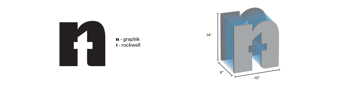
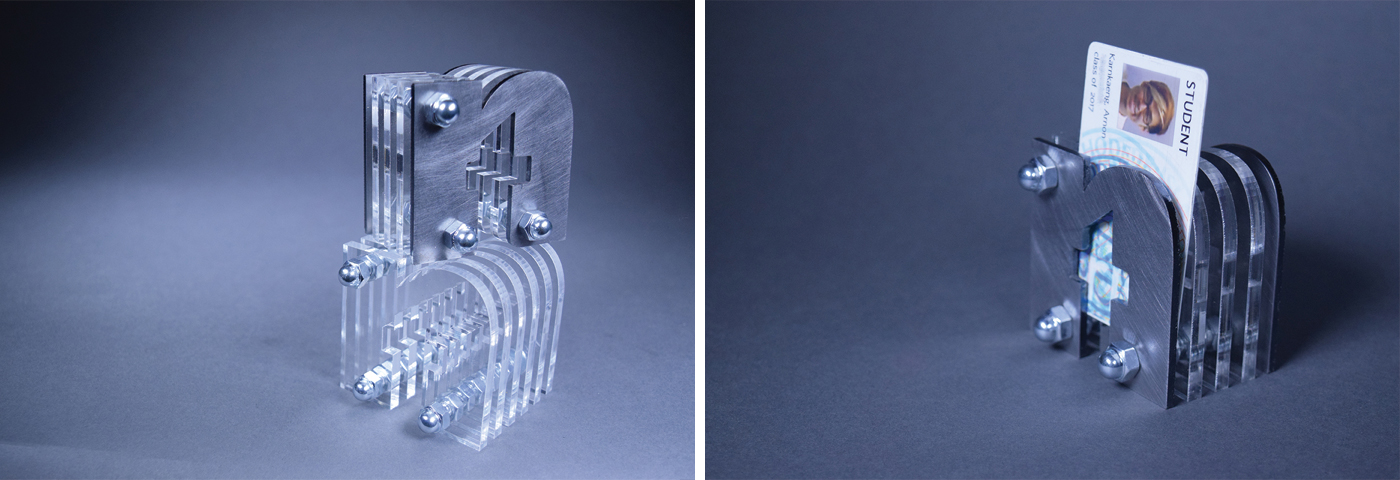
The 3D form of the letter was constructed using steel, acrylic, threaded rods, and nuts. Spaces were kept between layers of material to allow for functionality and begin transcending the space and form. Smaller mock-ups, one with solely acrylic and another with steel, were made in order to test material and how they would interact with each other before making a final bigger scale version. Smaller mock-ups function to carry smaller pieces. The final piece is able to be used to store sheets of paper as well as function as furniture.

Thank you for viewing!


