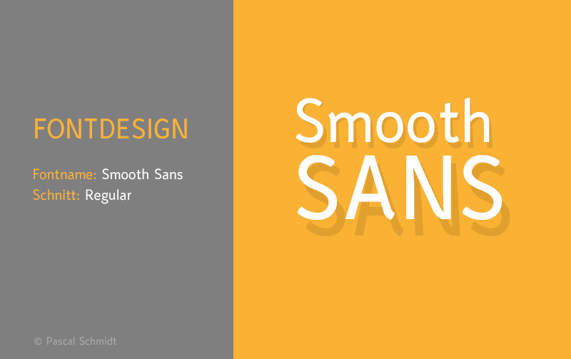
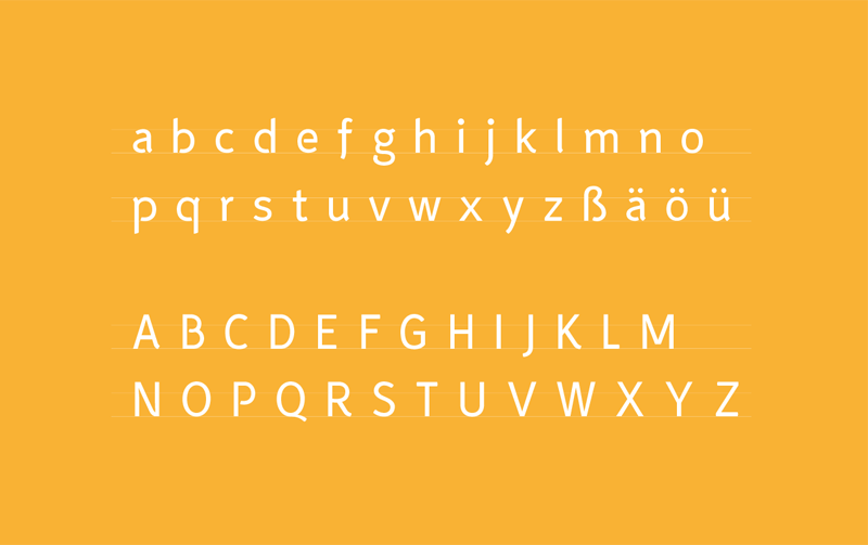
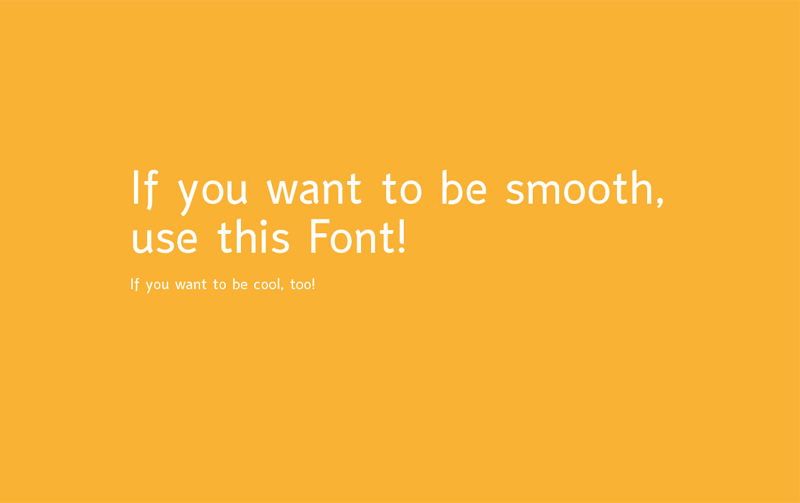
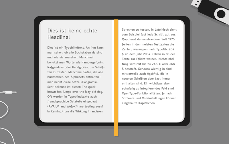
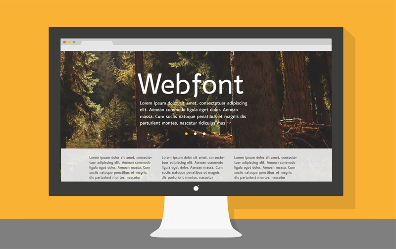
The font “Smooth Sans“ combines the simplicity of a sans serif and the dynamic character of a classic serif font and is created for body text. The character is smooth and linear at the same time.
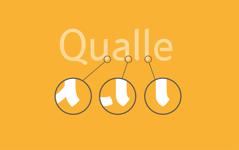
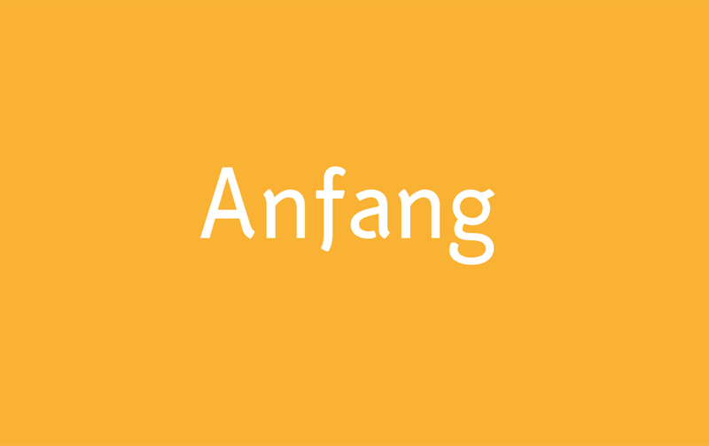
A special feature is the stencil look. In headlines the „Smooth Sans“ shows his special look.
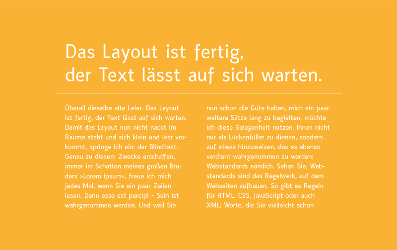
However, in small font sizes, the open counters are mostly imperceptible. So it does not upset the reading flow.
However, in small font sizes, the open counters are mostly imperceptible. So it does not upset the reading flow.









Thank you for watching :)


