Brief:
Sherbit is developing a highly complicated smartphone app which amalgamates and visualizes data from users’ apps and devices in order to give individuals control over their personal digital data. We were employed to develop user personas, test the usability and flow of the proposed app, and provide recommendations for onboarding.
Sherbit is developing a highly complicated smartphone app which amalgamates and visualizes data from users’ apps and devices in order to give individuals control over their personal digital data. We were employed to develop user personas, test the usability and flow of the proposed app, and provide recommendations for onboarding.
Process:
UNDERSTANDING POTENTIAL USERS
Armed with a strong understanding of the Quantified Self movement and the Sherbit app’s abilities and competition, we began by challenging the assumptions the client had on who their potential market would be.
Screener Survey

We started by sending out a screener survey across a number of platforms online. This allowed us to reach out to potential interview candidates and collect additional information to build possible proto-personas.
Proto Personas

Taking the responses from the online survey, we plotted respondents across a whiteboard. From there, I was able to develop proto-personas which the team would later challenge in the user interviews.
User Interviews

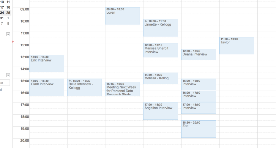
Over the course of a week we met with three to four survey respondents from each proto-persona group and hoped to validate our classification assumptions.
Personas


From the results of these interviews, along with the insights gained previously, we were able to devise User Personas, which I created In Adobe Illustrator.
GAINING KEY INSIGHTS
Card Sort

While we conducted our persona interviews, we requested our respondents create mashups. This technique was employed to judge their intuitive actions as well as their enthusiasm for the concept. This provided us with great insights that later influenced the onboarding user flow.
Usability Testing

While the app is not yet created, Sherbit were able to provide the team with screenshots which my teammate used to develop a comprehensive prototype. This allowed us to understand what users felt was intuitive, where their painpoints were and what they saw as the strength of the mobile application
Affinity Map

We took all of our insights from the interview and card sort, put them on post-its and rearranged them to get a better understanding of reoccurring themes.
Journey Map


Taking our personas, and our understandings derived from the affinity mapping, we developed a number of hypothetical journey maps. The maps detailed our persona’s context, emotions, goals and frustrations as they find and navigate through the app.
Painpoint Matrix


Taking all of our research we noted areas which could potentially require solutions, plotted them on a whiteboard, then rearranged based on what the post-its were trying to achieve and voted on key focus points for our UX Recommendations.
DETAILING UX RECOMMENDATIONS
Reimagined 'Create Screen' Prototype

I developed a low-fidelity mock up of a reimagined ‘create’ screen in Axure. Our usability study showed people were highly confused by the interactions and felt the design was not intuitive, people:
- Believed that the scrollable bottom navigation bar was either a banner ad, or not scrollable,
- Kept trying to click on the circles,
- Expected to be able to find the datapoint they were looking for by either search or a category view, as well as the ‘service’ view currently available.
Our prototype removed the bottom nav bar, allowed the user to click directly on the circles on-screen, and facilitated search by category, services and search bar.
Reimagined 'Dashboard' Prototype

The other area of confusion was the dashboard screen, this is where the user stores their saved recipes. From the usability study with the initial prototype we found that users were:
- Overwhelmed by the multitude of charts and graphs on the screen at one time,
- Lost due to the lack of actionable information and frustrated by how long it took them to gain insights from that data,
- Concerned by the lack of customizability of the charts in the case of missing data.
We developed a prototype solution (which my colleagues developed in the accompanying prototype) which completely reimagines this screen. Storing charts behind information points, allowing data customization and grouping of similar recipes.
Onboarding User Flow

Due to the nature of the application, it is quite difficult to explain and even more difficult to show its varied use-cases in a concise and informative onboarding process. One key takeaway from our interview, card sort and usability study was that people found it difficult to understand the concept, and upon downloading an app, would be impatient to learn about it in the real world. Knowing this we devised a short onboarding tutorial, comprised of:
- A short swipe-able overview of the application
- A walkthrough of creating a recipe (we suggested mixing together phone usage and the phone’s calendar, highlighting phone usage trends over time). The user is then prompted to add this chart to their dashboard.
- The dashboard screen plays home to the rest of the user onboarding (adding devices/apps to track, adding what items they would like to manually add, app and graph training). Once a user completes an onboarding action that item will disappear. This approach allows the Quantified Self type persona are free to play around with the app after only a short period of time, while less comfortable users can continue to learn the apps functionality.
The Result:
The client was very excited by the results, saw new applications for the app based on the use cases we presented and is actively working on implementing our recommendations for the Alpha version of the Sherbit app.
For more information on the Sherbit app, including its progress – visit Sherbit.io


