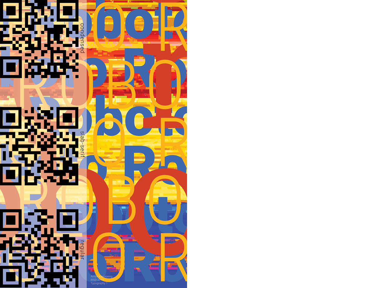
The poster focuses on the history and variations of Roboto. Colors were taken from Google's logo. Background colors were given a subtle gradient in order to evoke a feeling of progression.
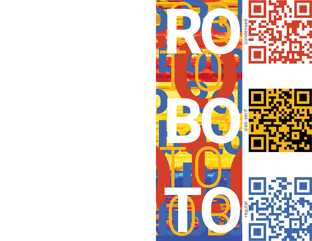
The intended use for the typeface to be used for display screens is acknowledged through the use of QR codes, prompting the viewer to interact with the poster through the use of technology.
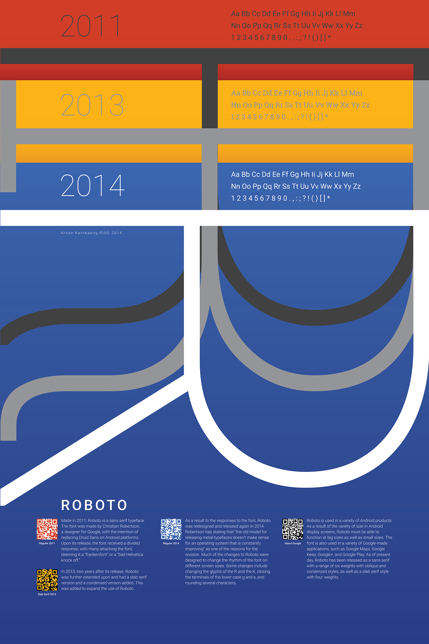
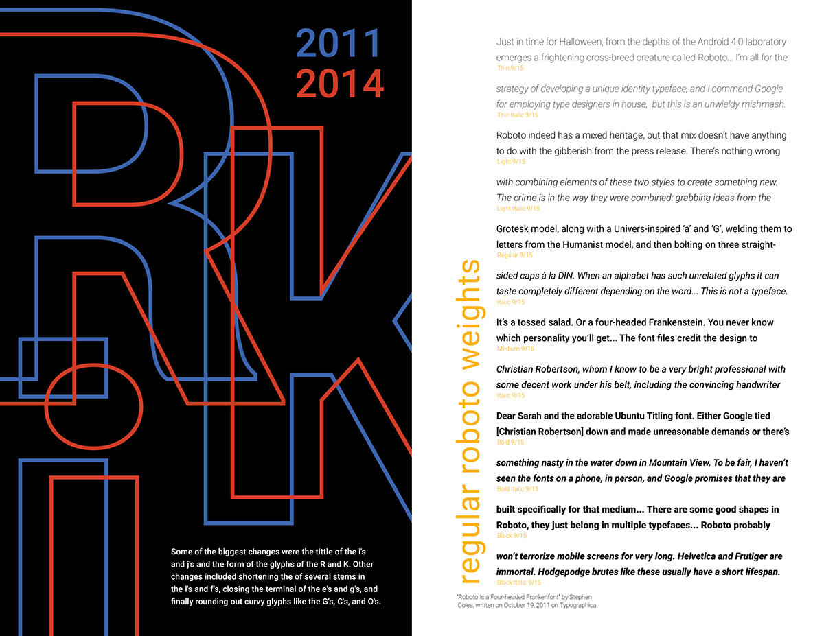
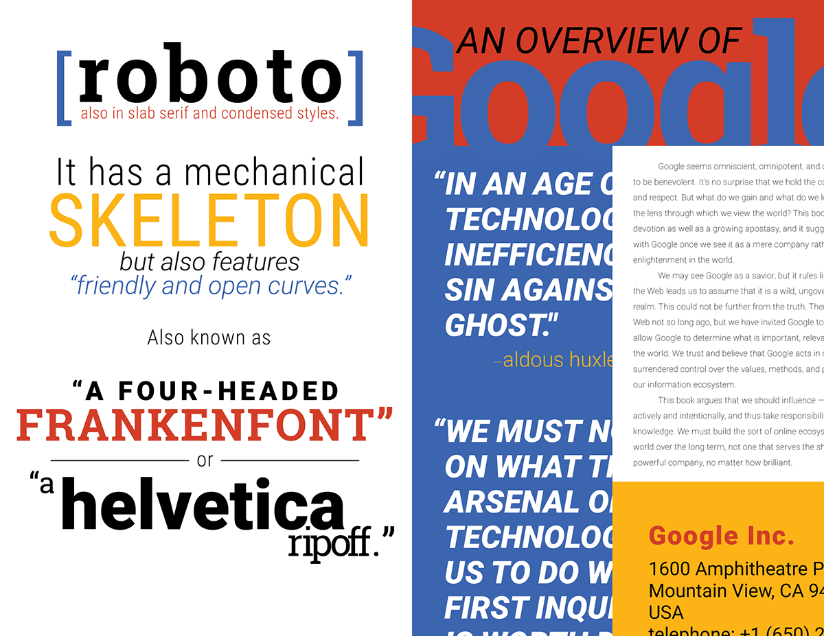
The specimen references the responses given to both the typeface and its maker, using criticisms that the typeface as well as commentary on the prevalence of technology to display the versatility of Roboto in different settings. The specimen also reflects the origins of the typeface, through repetitive use of Google's colors, a glitch texture, and the use of QR codes.
Thank you for viewing.

