
H2Overhaul
3 logo suggestions for jovoto NY/H2Overhaul
3 logo suggestions for jovoto NY/H2Overhaul
I've had the great pleasure working for jovoto NY making a logo for the project H2Overhaul. jovoto wanted three suggestions for a typographical logo. At least one of the suggestions should have the O in H2O shaped like a water drop.
H2Overhaul held a competition on the jovoto platform in October 2011 looking for ideas which explored how new and existing buildings/facilities could use less water, reuse the water they currently use, and capture water to use on-site.
The project was supported by Treehugger and Duke University's Center for Energy Development and the Global Environment (EDGE)
See the exiting submissions for the contest here.
Inspiration

The first logo suggestion. The logo shapes are inspired by drops and ocean waves and are build over clean circles.


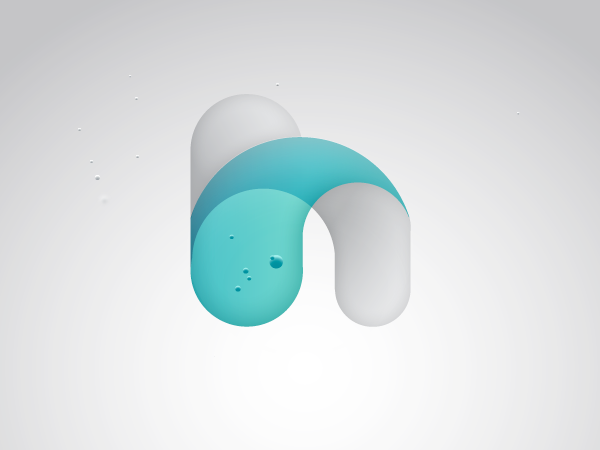
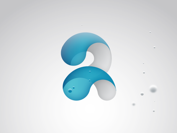
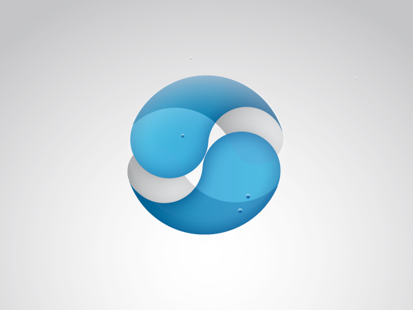

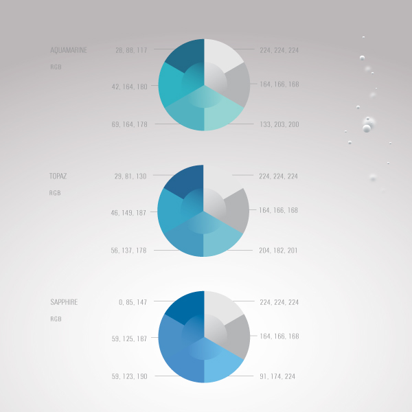
I've used fresh splashy water colors to create a vivid and positive appearance and combined the blue tones with more dampened light grey shades to balance the over all impression.

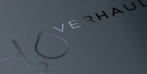
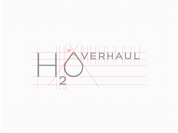
This is the second suggestion for H2Overhaul. A Scandinavian, minimalistic, clean logo based on the font "Hero" by Fontfabric. This is a really charming, likable font! I've downloaded it a while ago, but haven't really had the job that fitted the font before now. I like the way it's rounded and soft and still kept stylish and slightly uptight.
Hero is a free font you can download at Fonfabrics website.
Hero is a free font you can download at Fonfabrics website.


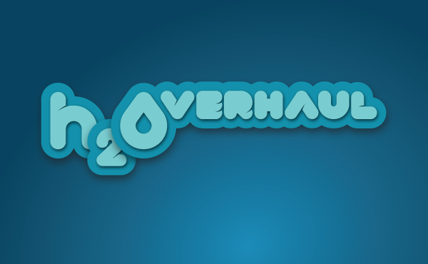
The third suggestion for H2Overhoaul. I've tried a fresh and young style here. Who says "green tech" can't be funky?!
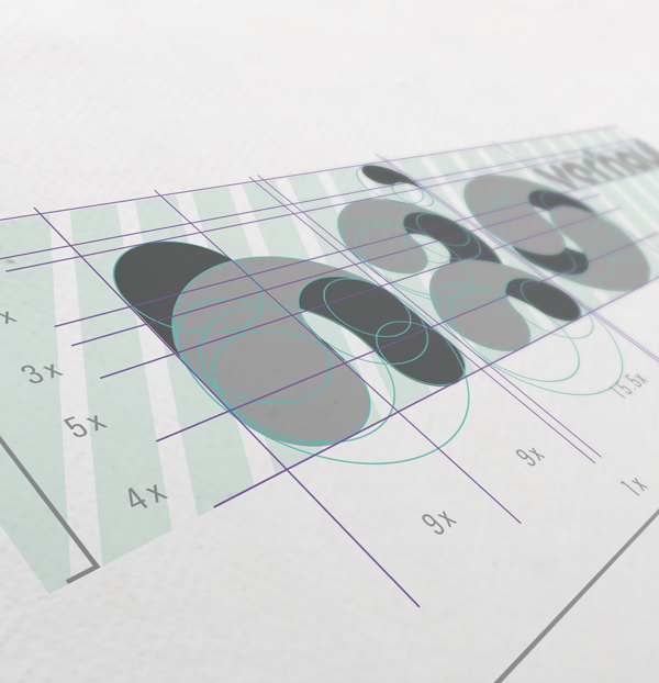
I've designed the letters specific for this logo.
Inspiration for colors and style


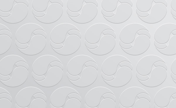
Greyscale versions of the logo

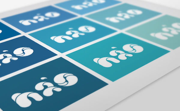
Color versions of the logo


