
Who is 88?
Works by AA* and LL**. Call it a studio, call it a deisgn duo, call it two miniature dachshunds infinitely sniffing eachothers’ bums. We’re not sure what it is. It’s not nothing, it’s just not necessarily something.

Liquid Identity Logo System
Moving, adaptable logo. 4 half circles are arranged in various combinations wherein the half-circles are turned in 90º increments to visually represent the number“88.”
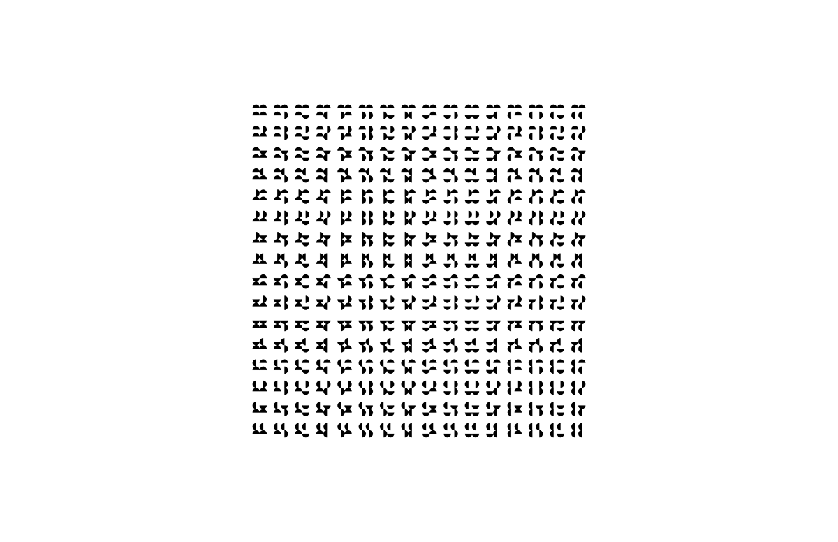
Above is the primary mark.
Below are all (256) of the possible combinations for the logo under the 90˚ constraints. Any one of them may be used on their own when representing client work and should be chosen based on what best represents the type of work/setting it will be found in.
The versatility of the logo represents the wide variety of work which eightyeight will offer (from branding, posters, ads and consulting to product, ui/ux, web, enviornmental, etc.)

Typography
Replica was built on a very strict grid not unlike the logo system for 88. A strong mono weight is a good compliment to have as well. Replica comes in a mono weight, but I have not purchased it, so aperçu was chosen.
Color
Void. Well, sort of. Color scheme is limited to black and white, leaning slightly more heavily toward white with black type/graphics.
Colors can be used, but sparingly and with real purpose behind the choice to do so.


Icons (handset)
Rules are made to be broken and therefore the logo system has been given some room to breath in order to make these letterforms. The half circles are adjusted within 45˚ angles (still fairly strict) to create the alphabet.
These are for very limited use and should rarely (if ever) be set into multiple words.
Icons (illustraions/emoticons)
These graphic icons bend the rules a little further. The half circles are still bound to the 45˚ rotation and position restrictions, but they can include as few as 1 half circle. Each icon will be built in the same proportions as the logo (2x2 grid, half circle occupying 1 space each) but is to be accompanied with simple monoline shapes.
For the emoticons, the two top half circles represent the eyes with a single monoline to represent a mouth, the two components combining to express an emotion.


Patterns
Loose and tight patterns.

Web
The website is a primarily a portfolio of our work, using a fullscreen slider interchanging interesting photography/videos of the work. Menu items convert to hovering text boxes/links with the exception of the “Blog” link. The goal is to keep them on the home page with their eyes on the work for as long as possible.
For branding simplicity, the url is a Haitian domain:


