Hanno
brand & identity evolution
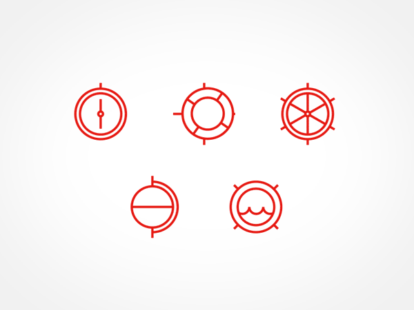
Over the past couple of years we've been building and evolving our brand and identity. There are few projects as challenging as designing for yourself, but we’ve had a lot of fun with this one.

© sneakerdog

© Sergei Golyshev

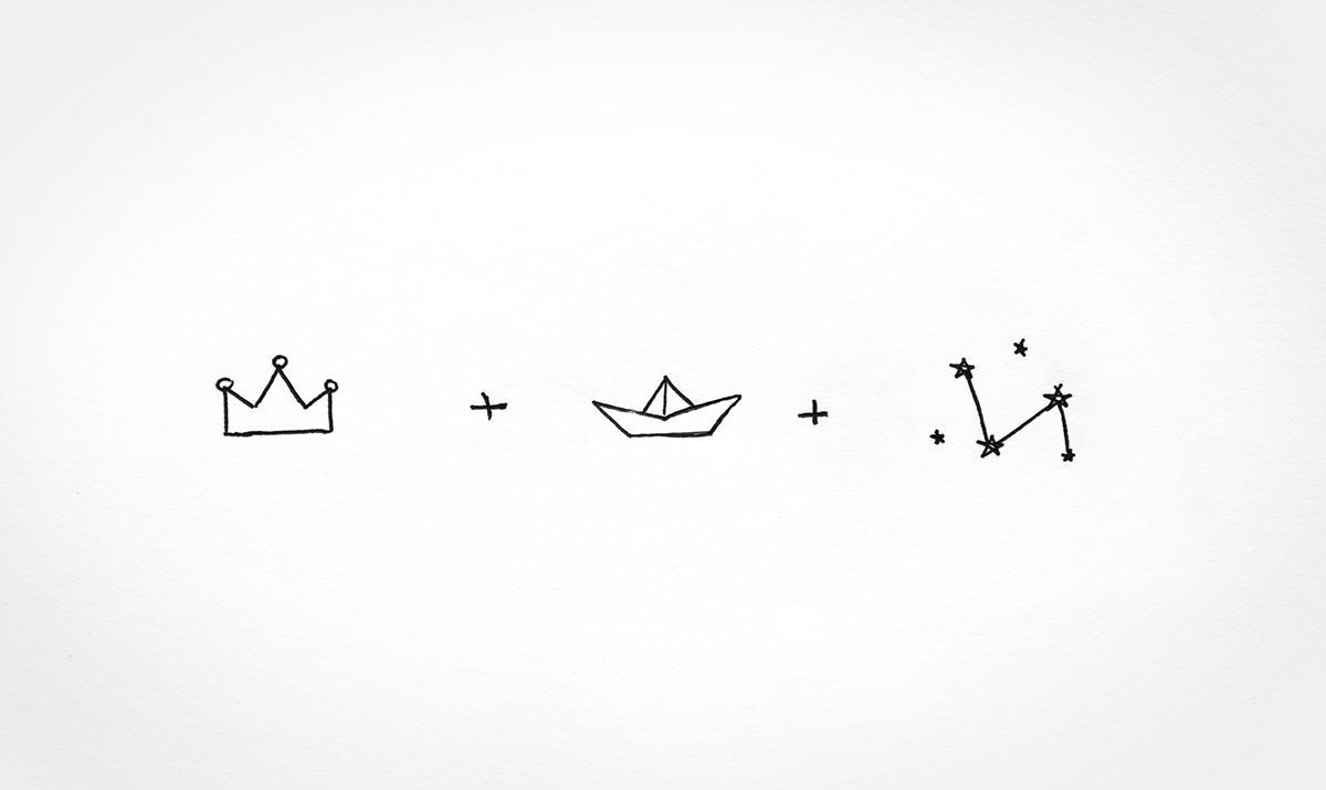
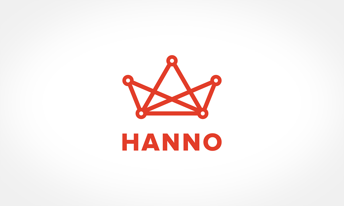
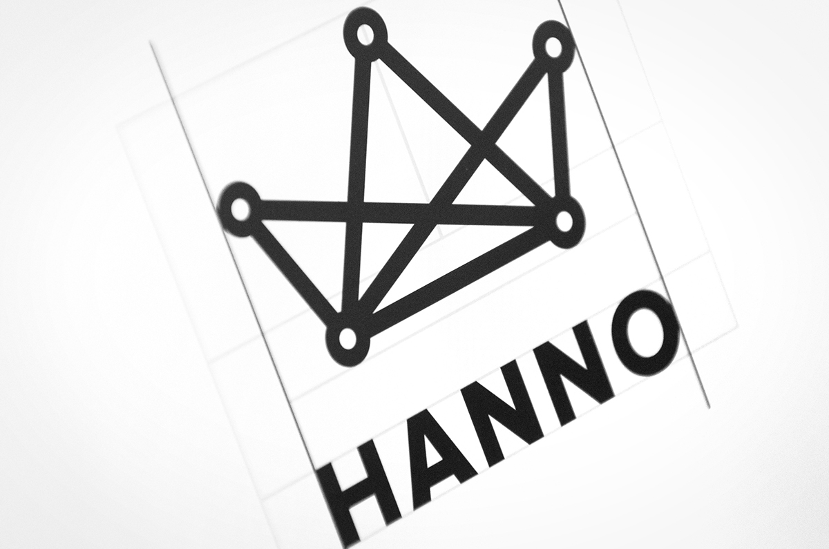
At first glance the logo appears to be a king’s crown, but it is also intended to be seen as a boat, to symbolise the explorer and adventurer within us. Through the interconnected dots, we symbolised the star constellations that ships would navigate by. And finally, there’s additional significance in that this series of dots and lines represents our 5 shipmates as a distributed team which is nevertheless still very strongly connected.


Primary font


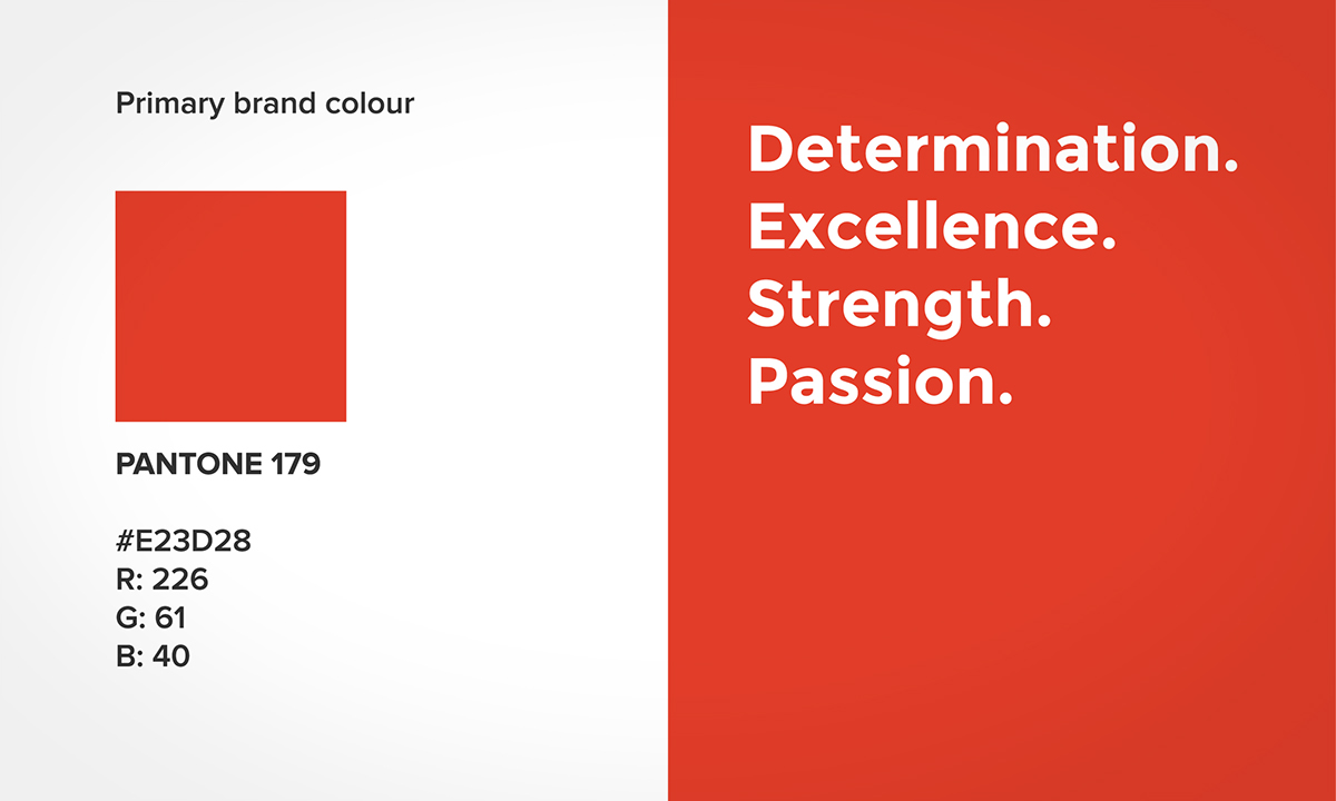
Primary brand colour