Tan Ren Tan Drop Honey Packaging

Tan Ren Tan is one of the most known pharmaceutical brand in China. It is the proud of national medicine and very popular over there. Medicines in Tan Ren Tan are made exclusively from natural raw materials. The order was for the redesign of a jar for honey. Certain requirements were put forward: it was necessary to get away from the image of a honeycomb – hexagon, maintain product awareness; the packaging had to look modern, but not contradict Chinese traditions. The packaging designed by Igor strives to emphasize the transparency of honey, its physical properties and richness of color. The basis of the figurative solution is a slowly flowing the edge viscous drop. To make the shape not too intrusive and add the intrigue, the drop was turned inside out.
This project won the "Design & Design" International Award, Paris in April 2015. It was published in "Structural Packaging Art" book, 2014, Hong Kong and also in the 2019 edition.
______________________________________________________________________________________________________
Kuvshin Cosmetic Series

Cosmetic packaging, bottle and jar. Developed while being working at JSC “Miran”.
Winning diploma of Rosupack 2004 Fair in nomination "Rosupack chooses the designer". 2004. JSC "Miran" got the gold medal at the "Intercharm" exhibition. There were produced and sold in over 10 million items during the period from 2004 - 2008 years.
______________________________________________________________________________________________________
Plastic Packaging

Cosmetic packaging developed through 2003-2009 years while being working at JSC “Miran”. For this period more then 30 bottles and jars were produced for mass market. Some of them were featured in noAH IX DIRECTORY OF INTERNATIONAL PACKAGE DESIGN book, 2009, Japan or Design Matters: Packaging 01 book, 2008, USA.
______________________________________________________________________________________________________
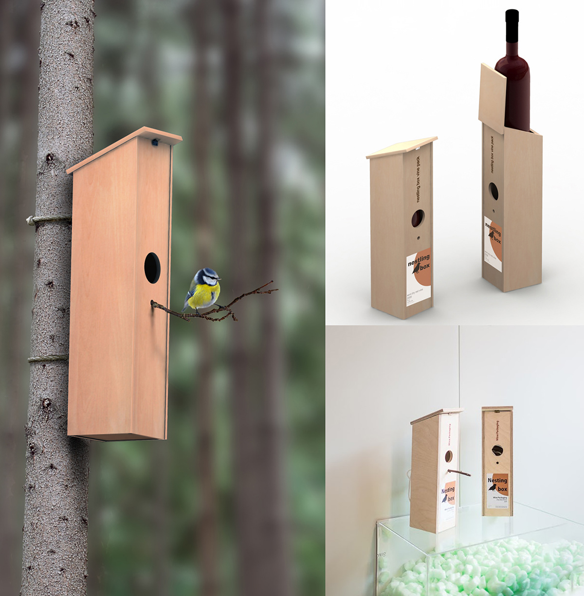
Nesting Box

Nesting box project has a dual purpose: to protect the wine bottle and to provide a shelter for birds when you do not need it anymore. The packaging is made of plywood, which is biodegradable and easy to produce. The front has a circular hole that serves as the entrance for the birds. The packaging also has a string that attaches to the back, which can be used to hang the bird house from a tree or a pole. The packaging is designed to be attractive, functional, and eco-friendly.
Nesting box was published in "Packaging structures" book, 2012, p. 242-243, Hong Kong and "Gcolon" magazine, #5, 2012, p. 88, Korea and shown during Lodz Design Festival, Inside the box exhibition. October 13 - 23, 2016. Poland. Photo by Lodz Design Festival.
______________________________________________________________________________________________________
Nacao Natural Cordiceps Packaging

Nacao – is a premium brand of Manjiela company which specialize on raw materials for Chinese traditional medicine.
Nacao's visual identity, packaging and showroom initial idea were created at Solovyovdesign.
Gift Crystal pack was designed as bespoke for the client. It won the Design and Design international award. Paris.
Cube – is the cordyceps powder packaging. For the best result it should be taken on time. According to the client requirement the timer was built on into the packaging as well as the mensural spoon.
For other type of products the capsule packaging was designd.
______________________________________________________________________________________________________


