
The goal was a redesigned, simpler version of the heraldic Wndsn logo. It's a one piece shape; a smaller, icon-like maker’s mark that lends itself as a tool mark and which will be used in parallel to the more refined original.
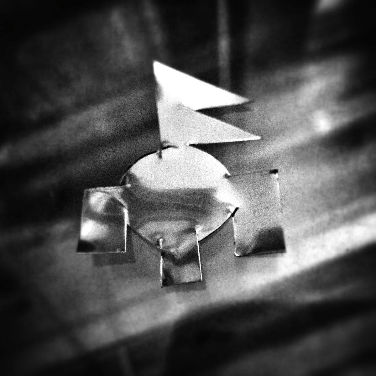
Shape study, cut out of aluminum.


