

ZetA
This project was executed during my Erasmus programme in Istanbul. It was hard, because only one student spoke fluent english in that class... So I had little time to speak to the teacher, because 99% of the class was in turkish. Which I (almost) don't have a clue...
But the premise of the exercise was pretty simples: I had develop a fortifying shampoo brand, from dust to a final product.
But the premise of the exercise was pretty simples: I had develop a fortifying shampoo brand, from dust to a final product.


ZetA, a new brand of shampoos.
What distinguishes it? It’s posture.
LOGO


Main Version: It must be used preferably to others. It’s proportions, colors and type faces should be totally respected, according to the following rules.
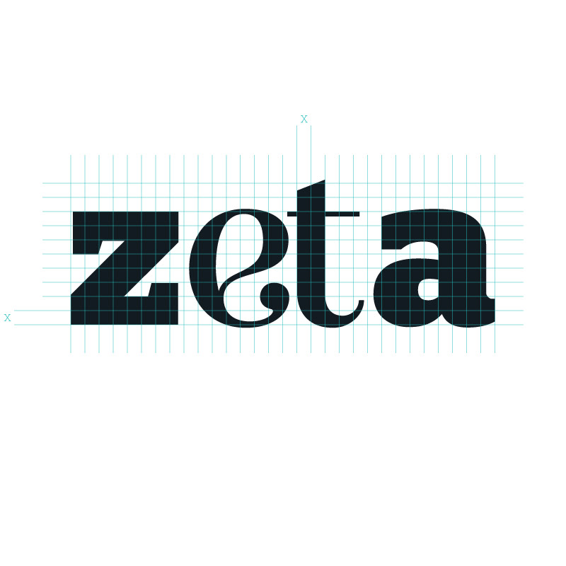
Grid: This grid is the base of the logo, setting relationships and proportions between all the elements. The X measure is the basic element of the relationships. It changes according to the specific support where the logo is going to be applied to.

Safe Area: This grid shows the minimal safe area that must be respected so that the logo can have a clean reading.

Color: The basic colors for the main logo and its complementary version. Note that to achieve a Rich Black in CMYK, you need to use 20% of Cyan. The values for RGB and Web are also presented.

Product Color: This is the ZetA’s color. Its aimed to be used in the packaging designs and in graphic details. Never use this color with Rich Black logo version.

Typography: This typeface is elegant, dynamic and fresh. It’s meant to be used on the logo, for the letters E and T. Any other type of use is strictly prohibited.

Typography: Besides the logo, it’s recommended to use this typeface through the stationery and other communication medias to get a clean message. The Thin, Light, Medium, Book, Semibold, Bold, Black variations, as well as the Italics variations should be used wisely in order to obtain a cohesive identity.
BEHAVIOR

Maximal Reduction: The logo can only be resized to a size that doesn’t change or eliminates the reading. It’s recommend to use 15 mm for the print version and 70 px for the screen versions. Both values refer to the horizontal length.

Background Color: In the cases where only one color is going to be used, positive or negative, this rules must be followed. Do not change in any case.

Background Color: The logo must be used upon color in which it doesn’t loose its legibility. Changes between positive and negative must be made to preserve that legibility. These are some examples.


Restrictions: The logo is one of the spinal elements of the brand. In any case, it shouldn’t be altered or redesigned. These are some examples of what should not be done.

Particular Case: This is the outline version of the logo and can only be used for technical extraordinary situations, such as, PVC cutting.
STATIONERY

Business Card: The Business Card has two versions for the test. All the measures should be respected, they tend to correlate the dimensions of the support.

A4 Letter: Like other supports, the logo and its safe area is based on a quarter of the support. After that, using the x-height previously constructed, every placement is based on that rule.

DL Envelope

DL Color Envelope

C4 Color Envelope

Car Illustration This simply illustration shows two very important rules when working with uncommon/ particular supports: give attention to the safe area and never place the logo on divisor parts, like doors. In this case you can see a good application without cutting/ damage the logo in a door.
ADVERTISING
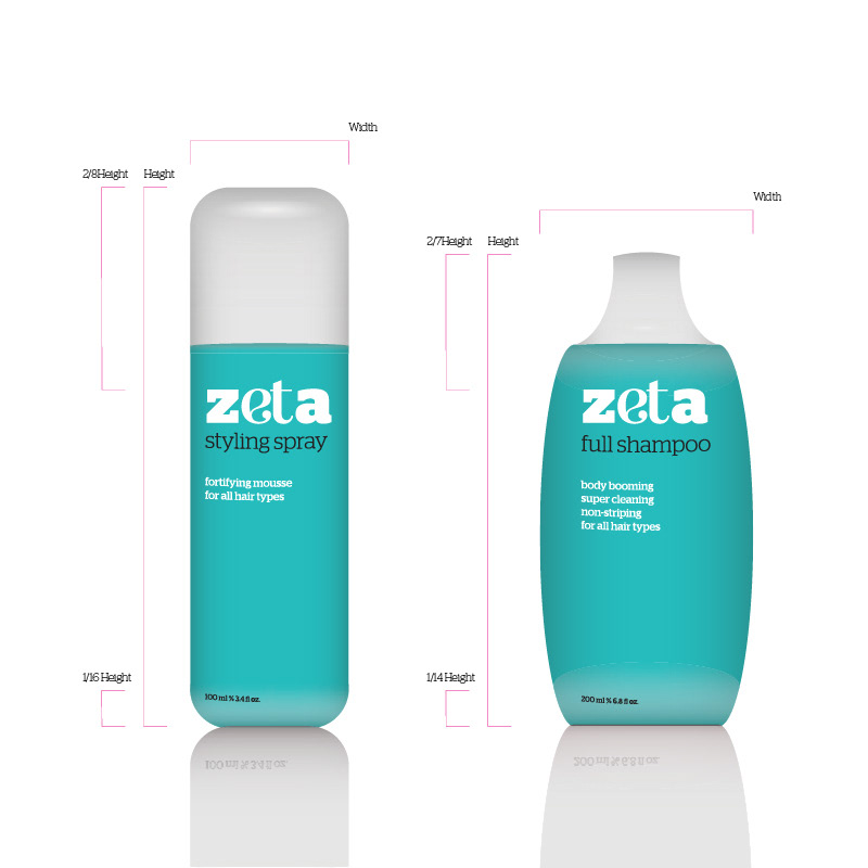
Packaging

Slogan: A possible slogan and it’s metric relationships with the logo.

Magazine: Since I was trying to combine a cosmetic product with a medical one, I decided that I should present the “classical advertising” as an almost science. In this way, I show myths related to hair care. This also shows that the brand is open and secure.


