January.2014
沙坡尾視覺形象 | SHAPOWEI OCEAN CULTURE FESTIVAL
﹣
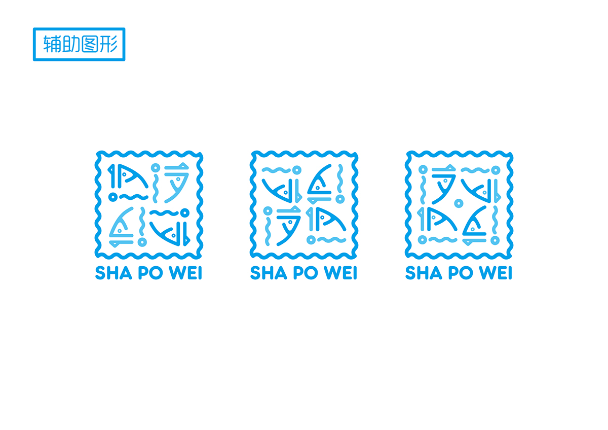
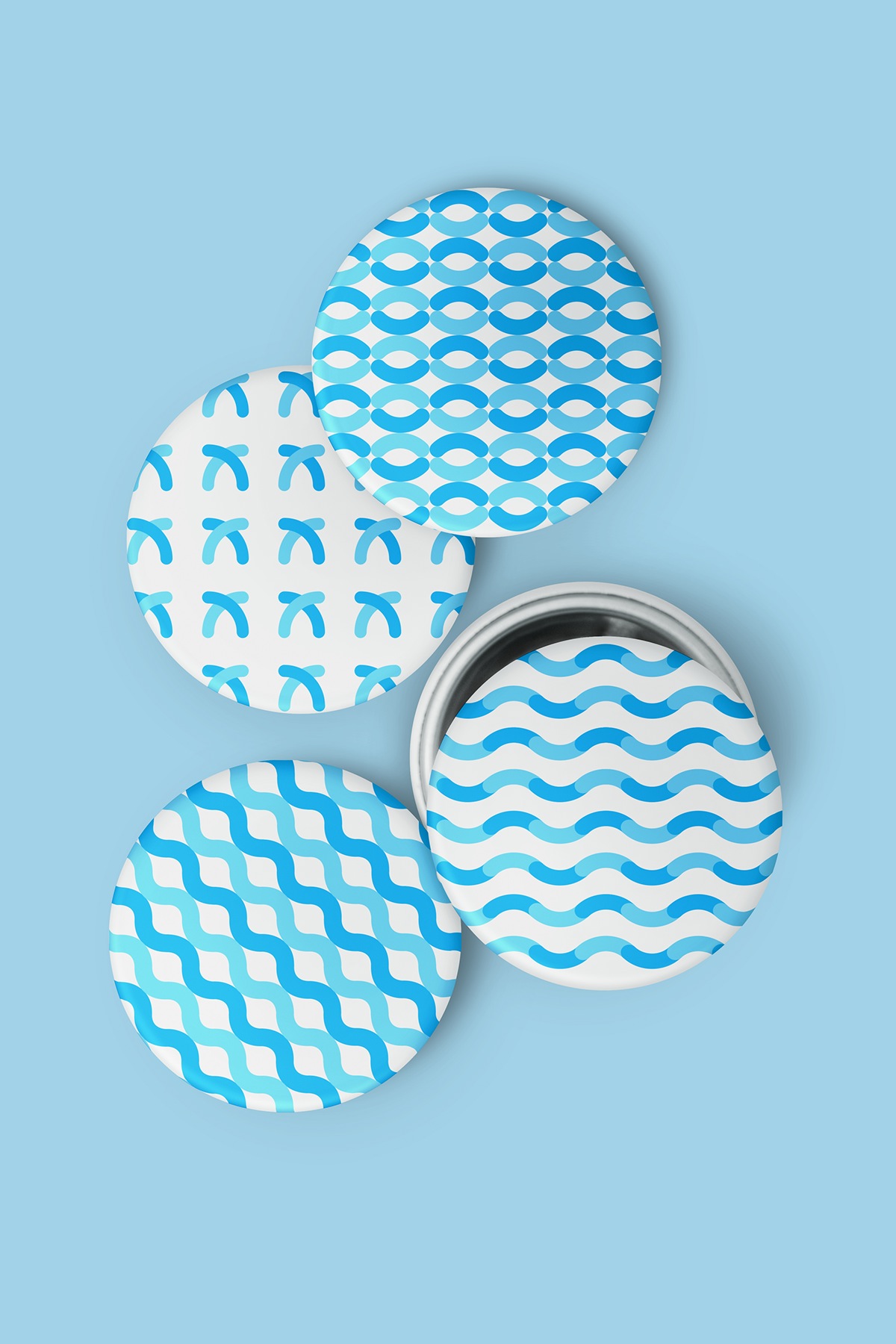
理念
沙坡尾是一個一直深受海洋文化影響的地方,爲了延續和發展沙坡尾海洋文化,沙坡尾品牌形象運用了比較簡約和新穎的圖形與字體結合的方式,“沙”字把沙坡尾避風塢的地貌融入其中,兩撇弧線代表避風塢的轉折口,波浪代表哺育沙坡尾的水,圓圈代表照耀沙坡尾的太陽,繼續傳承著海洋文化。“坡”字把避風塢賴以生存的魚融于其中。“尾”字把避風塢最常見的漁船融入其中,反映出人們的生活。輔助圖形都是由海洋,魚,船,太陽等元素不斷組合而形成,寓意著沙坡尾海洋文化的傳承與發展。
Concept
SHAPOWEI is a ocean city of China,in order to extend and develop SHAPOWEI ocean culture, SHAPOWEI Visual Identity use the simple figure and fonts, "沙" express the SHAPOWEI Haven landscape.The arc of “沙” express the Haven corner,the wavy of “沙” express water,the circle of “沙” express sun. Fish graphics in the "坡" . Boat graphicsin in the “尾”.Extended graphic is composed by the ocean, fish, boat, sun and other elements, meaning the SHAPOWEI ocean culture.