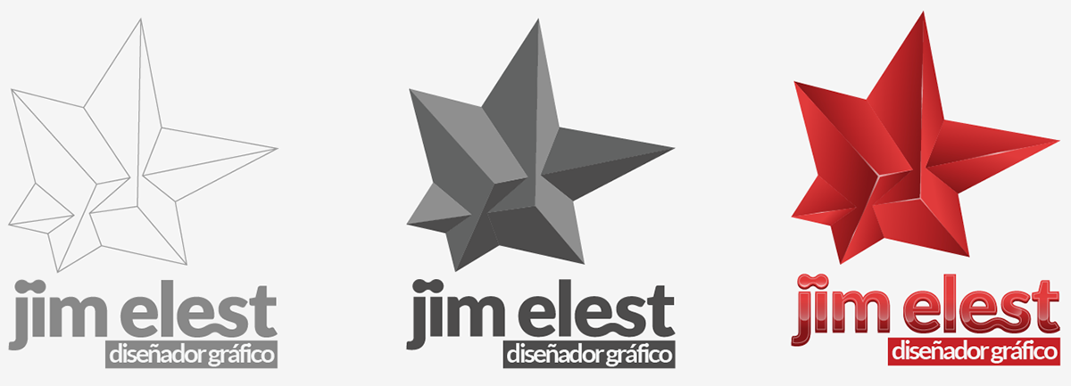
This is my personal logo and brand image, i'm still working on this, but this is the final design, and the process to get to that.
Éste es mi logo personal e imagen de marca, aún está en proceso, pero éste es el diseño final, y el proceso de cómo llegué a él.

This is my old "logo". Is not a logo at all, is just a simple mark i put in my works. It was temporal, until i made the real one.
--
Éste es mi antiguo "logo" Aunque no es para nada un logo, es solo una simple marca que usaba provisionalmente en mis trabajos.

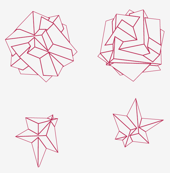
I used as a base figure, the cube, because it's stable, solid, and provides weight to the design. But i didn't wanted to look like a box, with some type on it, so i took 3 cubes, and blend them in one solid figure.
--
Usé un cubo como figura base porque es estable, sólido, y le da peso al diseño. Pero no quería que se viera como una caja cuadrada con un simple texto encima. Así que tomé 3 cubos y lus fusioné en una sola figura.

I started to play with the cubes in Cinema 4D (I didn't made complex renders, with lights, materials and stuff, i only wanted the basic shape, to trace it later in Illustrator)
--
Empecé a jugar con los cubos en Cinema 4D (No hice renders complicados con luces y materiales, solo quería generar la figura básica, para luego poder trazarla en Illustrator)

I selected some shapes, and trace them in Illustrator.
--
Escogí algunas figuras y la tracé en Illustrator.
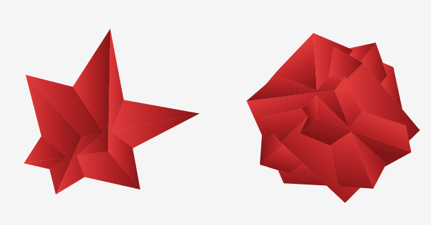
Added some color. I Choosed red, because for me, it represents movement, action, transformation, it's agressive, rude, it hits you in the face, and it's very shocking.
--
Luego añadí algo de color. Escogí el color rojo porque para mí, representa movimiento, acción, transformación; Es agresivo, brusco, te golpea en la cara, y es muy impactante.
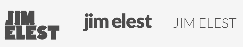
These were my options for the typography. I was looking for something that counteracted the rudeness of the symbol, a smooth type, that relaxed the eye, after watching the edges and angles of the icon. So, i choosed the second one, the Lato font, by Łukasz Dziedzic. Actually, the third one, it's also Lato, but in all caps, it didn't worked for my purposes.
--
Éstas eran mis opciones para la tipografía. estaba buscando algo que contrarrestara la rudeza del símbolo, una tipografía suave, que relajara el ojo luego de mirar los bordes y ángulos del ícono. Así que escogí la segunda opción, la fuente Lato, por Łukasz Dziedzic. De hecho, la tercera opción, también es Lato, pero en mayúscula sostenida, no funcionaba para lo que estaba buscando.

The wordmark after some tweaks and ligatures to make it look more stylized.
--
El texto, luego de algunos ajustes y ligaduras para hacerlo un poco más estilizado.