Werther is a pocket book of 9,5 x 15 cms with a fine french-style dust jacket, which contains hidden messages behind and a foldout poster. Made with love for little surprises.
—
The concept around the editorial design was the contrast between the two sides of the main character: the strong feelings of love & the dramatic suffering caused by it. The book is full of details communicating the idea of broken heart & death.
—
This book appears as a redesign and reinterpretation of an old edition, in homage to one of the most influential stories of Goethe. That’s why some characteristics of the original book remain, like the dark blue, representing the emotional atmosphere.
—
Goethe says in the preface that this book aspires to be a friend to get over pain in the absence of one, I took that as inspiration to decide the size and stylistic features like the fabric cover, to evoke a classic diary.
Inspiration
—
The original book I have (quite old as it looks) & Moleskine (size & colour).
—
The original book I have (quite old as it looks) & Moleskine (size & colour).


The Book
—
Outside look to the hard cover & dust jacket.
—
Outside look to the hard cover & dust jacket.


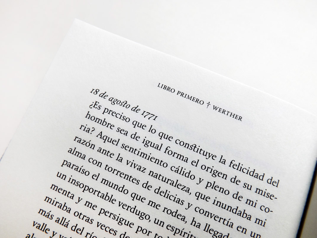
The Text
—
Inside look: Layout, Chapter covers & Typography details.
—
Inside look: Layout, Chapter covers & Typography details.


Colophon
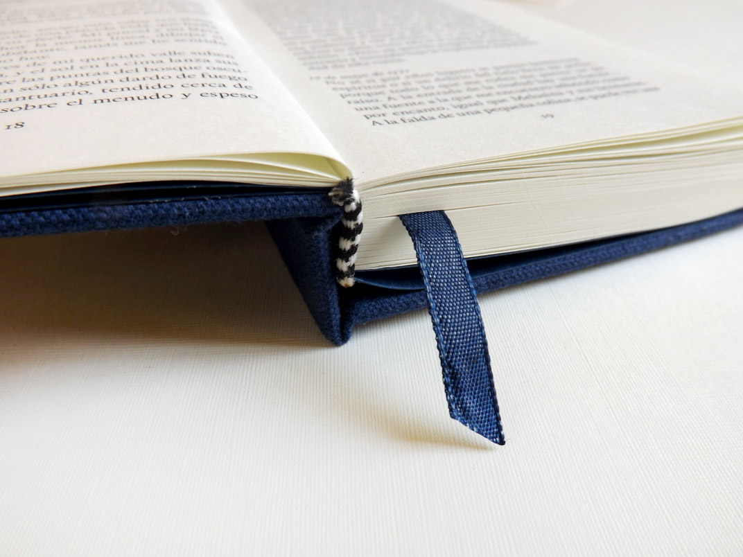
Process
—
A little view to the Binding & Paper selection.
—
A little view to the Binding & Paper selection.
Unfortunately I forgot to take photos of the complete procedure.


Bone / Ivory Bond Paper compared with common white bond. (I used the first)


Copyright:
I don’t own any right about the content of this book.
I used the novel by Johann Wolfgang von Goethe & poems by Gustavo Adolfo Bécquer.
Fonts used: Main - Calendas Plus by @atipo (Highly recommended) / Poster - Salamander Script
–––––––––––––––––––––––––––––––––––––––––––––––––––––––––––––
Thank you for watching!
–––––––––––––––––––––––––––––––––––––––––––––––––––––––––––––
–––––––––––––––––––––––––––––––––––––––––––––––––––––––––––––

