NTUH
VI design 2014
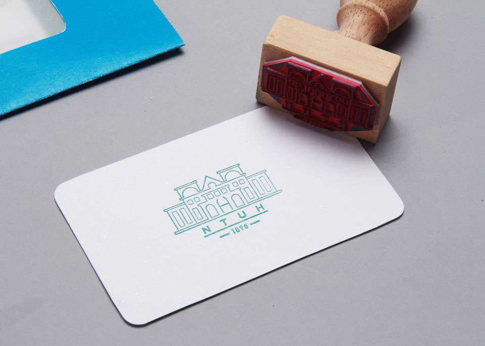
台大醫院是首屈一指的醫院,但是舊院院內的指標不明確,視覺設計的規劃也不統一,所以幫院方重新規劃與設計新的視覺系統,從 Logo 到 Icons,並設計延伸週邊。為了讓台大醫院舊院的特色保留,Logo的設計元素直接取自舊院的日式建築,讓視覺煥然一新,但又不失歷史特色性。最終目的就是把舊院的視覺美化並統一,但同時保留醫院的精神與價值。
National Taiwan University Hospital is one of the top Hospital in Taiwan, but the VI system in the old department hospital is not well organized, so I redesign this new Vi system for the Hospital, from Logo to applications and to the icons and signs.
When designing the Logo, in order to keep the characteristic of the old department, I use the exterior look of the hospital as the elements and combine with the geometry shapes. The reason I do this is because the exterior of the hospital is the Japanese style old architecture, it's unique and historical, makes people recognized easily. I want my design to create a new, fresh visual system and keep the spirit that old hospital have at the same time.
Design: Paian
Photography: Pai-Lin, Nini, Paian
Logo


Typography


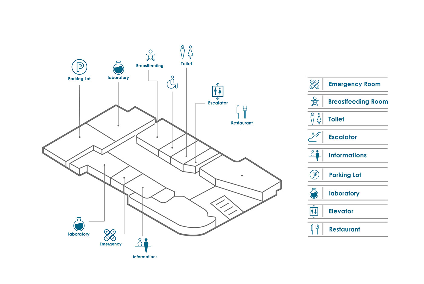
Icons


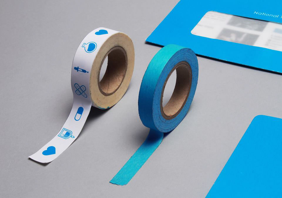
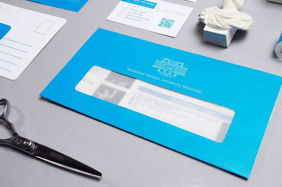
Applications