An identity I'm developing for The Greensboro Symphony repositions them as fun, vibrant, and accessible to the whole community as opposed to a haughty institution that caters to the upper class.

The metallic cover of the 2014 to 2015 season booklet is a clear departure from over crowded photo solutions of the past. It achieves the varnish on metallic effect by using a soft touch aqueous, which added an inviting touchabality.
This piece also introduced the monograms I developed for each of the Symphony programs, Masterworks, Chamber, Pops, and Family.
This piece also introduced the monograms I developed for each of the Symphony programs, Masterworks, Chamber, Pops, and Family.
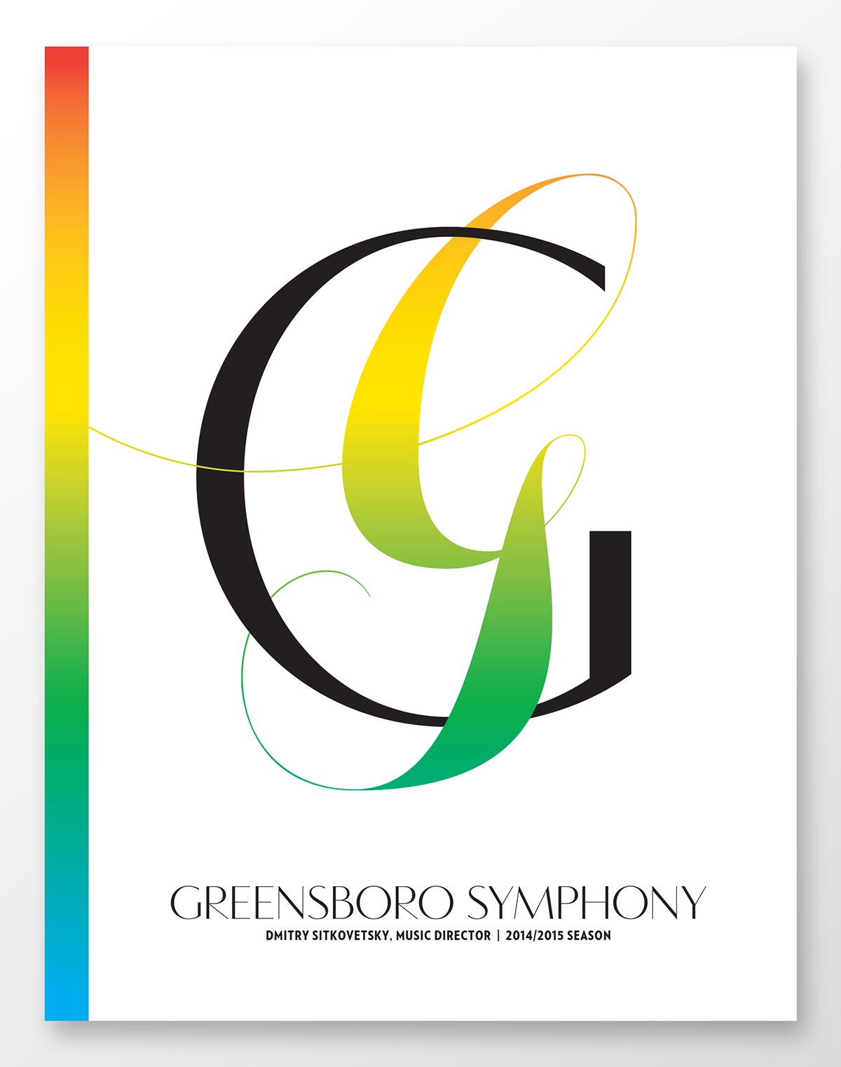
Cover of the new playbill

An ad the doubles as a flyer to be distributed to local schools


The front and back to a New York Times insert.


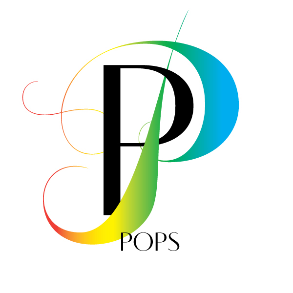
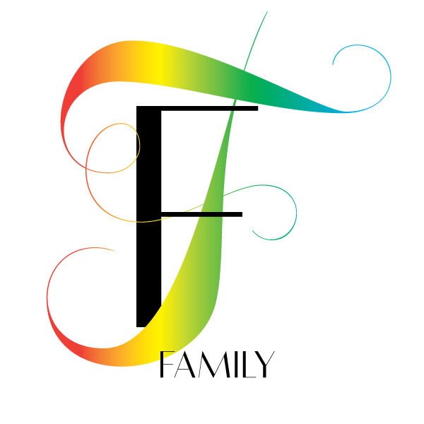
I developed these monograms for each of their programs.


