Графическое оформление выставки «35 лет Академии архитектуры и искусств»
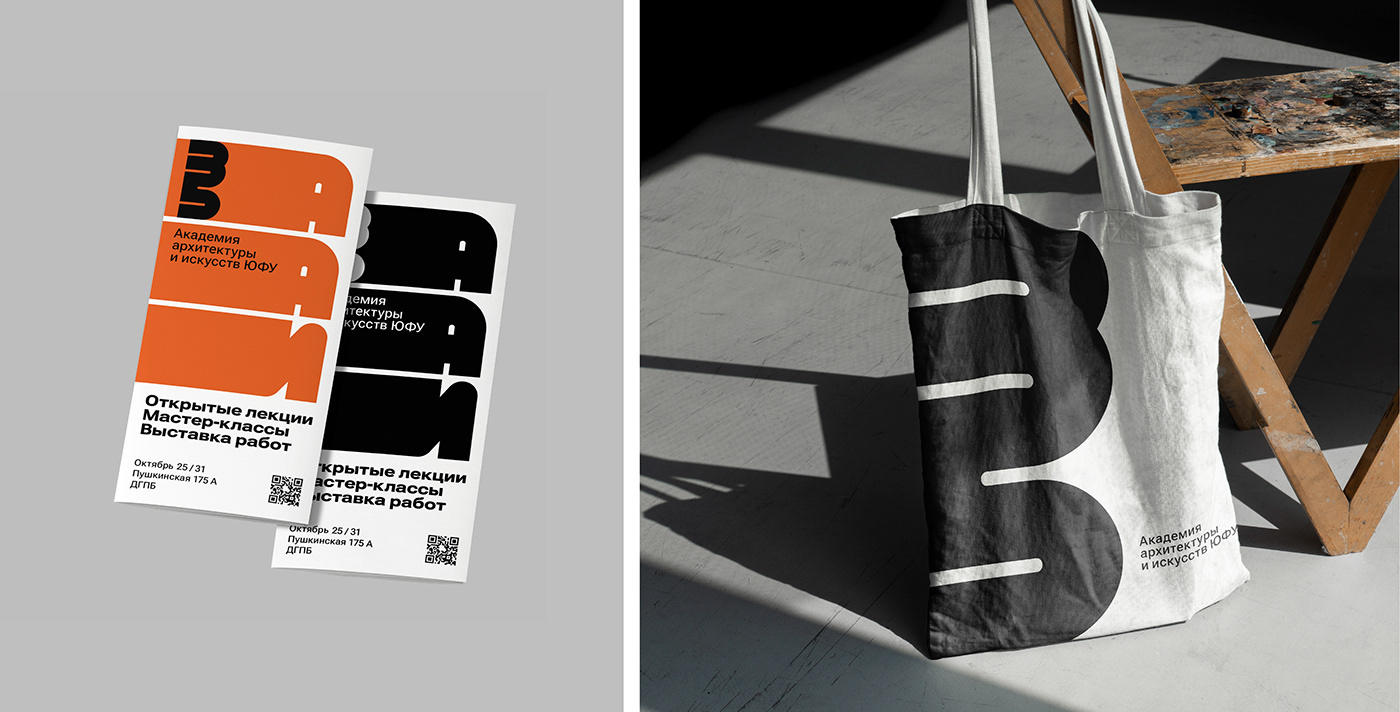
За основу графического оформления выставки была взята плавная геометричность массивных линий, примененная в логотипе, типографике и в средовых объектах. Стремление линии, уходящей за рамки форматов, символизирует богатую историю академии и стремление к дальнейшему развитию.
Акценты в оформлении показаны контрастом чистого фона и массивных графических и шрифтовых элементов, а так же сочетанием глубокого черного тепло-холодной пары цветов.
Design of the exhibition «35th Anniversary of the Academy of Architecture and Arts»
The graphic design of the exhibition was based on the smooth geometricity of the massive lines applied in the logo, typography and environmental objects. The aspiration of the line going beyond formats symbolizes the rich history of the academy and the desire for further development.
Accents in the design are shown by the contrast of clean backgrounds and massive graphic and typographic elements, as well as the combination of deep black warm-cold color pair.