


Neighbours
(ENG)
Case
Neighbours is a luxury boutique real estate agency from Riga. The main value of the brand is people, communication, and building relationships with loyal customers, whose family assets they also manage. For the founder, it's a significant omission that people mostly don't know their neighbours, with whom they've lived for years behind the wall. The goal of the project was to become neighbours who stand out from other real estate agencies — not just to showcase properties for sale, but also to demonstrate openness and become a more personal brand. What also sets them apart is their clear and professional approach. Instead of just stating that a property is excellent based on personal opinion, they provide market analytics based on numbers: what is happening now, what can be expected, which properties might be undervalued and have potential, and which properties might be overvalued but possess unique qualities.
Solution
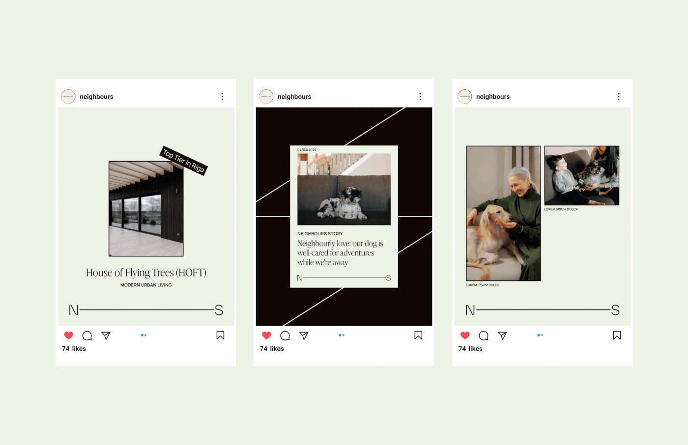
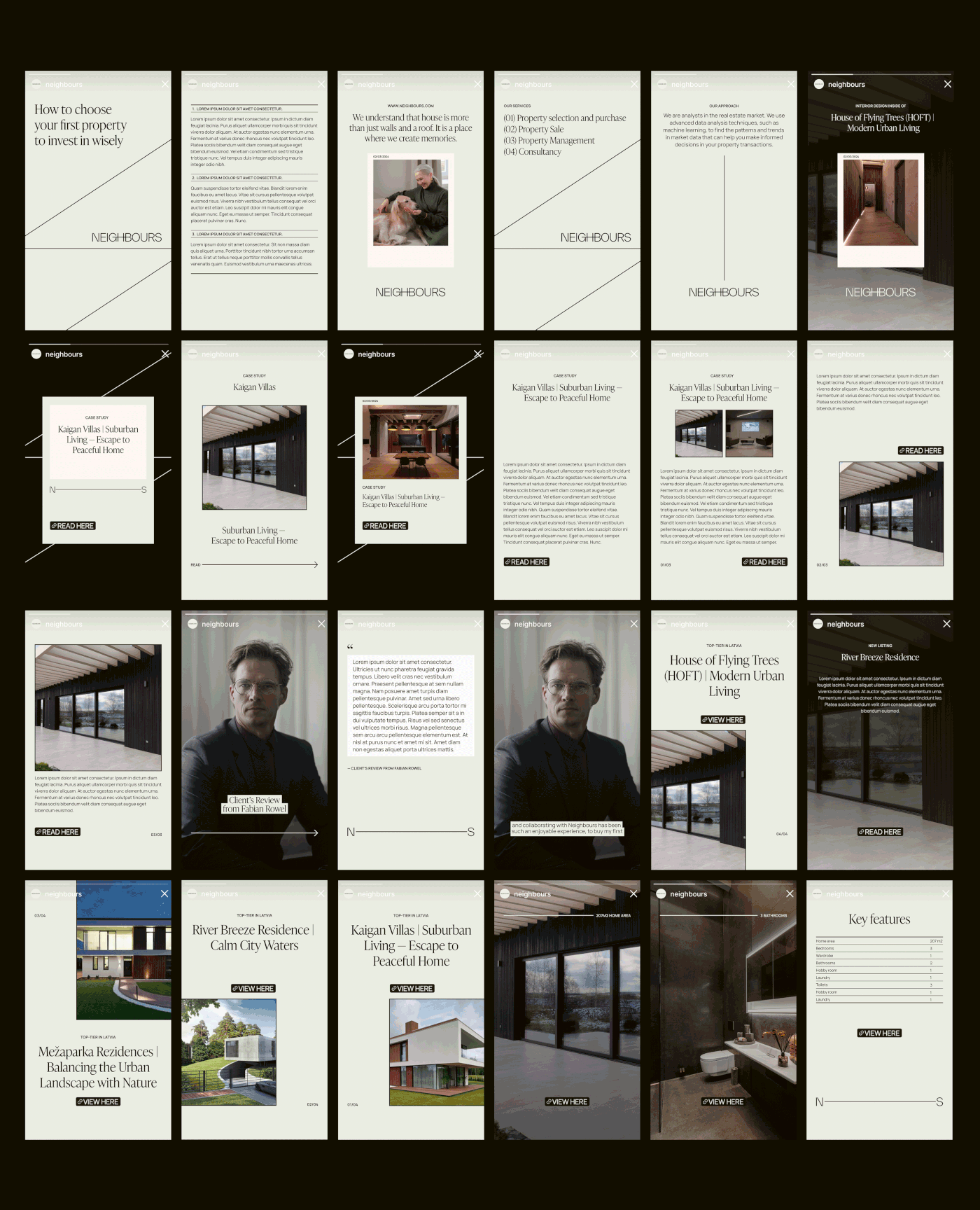
The resulting visual language seeks to convey the brand's philosophy regarding the connection and closeness of neighbours. The logo is designed in a simple, geometric font with rounded shapes to showcase the simplicity, friendliness, and openness of the brand. It serves as a starting point for the metaphor, with lines representing a connector that symbolises the closeness of neighbours and continues as the main graphical element throughout the entire visual identity. The color palette perfectly represents the brand’s character, premium sector, and brands’s unique value propositions of real estate, both in the city and in natural surroundings. The typography, consisting of geometric and simple sans-serif fonts paired with a serif font for headlines, reflects the essence of the brand — its analytical, and professional approach on one hand, and its premium, segmented, and individual approach on the other, demonstrating that Neighbours is an open, friendly brand that values relationships with people.
(RU)
О проекте
Neighbours — luxury бутик агентство недвижимости из Риги. Основная ценность бренда — люди, коммуникация и выстраивание отношений с постоянными клиентами, чьими семейными активами они также управляют. Для основательницы — большое упущение, что люди в основном не знают своих соседей, с которыми они годами живут за стеной. Основательница видит недвижимость как что-то большое как среду и окружение. Цель проекта была стать соседями, которые отличаются от других агентств недвижимости — не просто показывать объекты, которые продаются, а также свою открытость, становиться более личным брендом. Что также делает бренд уникальным — их аналитический подход. Они не говорят, что это хороший объект, потому что они так считают, а предоставляют аналитику рынка на цифрах: что сейчас и что можно ожидать, какой объект может быть недооценен и есть потенциал, какой объект переоценен, но он уникален.
Решение задачи
Получившийся визуальный язык передает философию бренда относительно связи и близости соседей. Логотип выполнен в простом, геометричном шрифте с округлыми формами, чтобы показать простоту соседей, доброжелательность и открытость бренда. Он служит отправной точкой для метафоры в виде линии, которая символизирует коннектор, то есть близость соседей и является основным графическим элементом фирменного стиля. Цветовая палитра идеально отражает характер бренда, премиальный сегмент и УТП бренда с предложением недвижимости как в городе, так и за городом. Типографика, состоящая из геометрических и простых шрифтов без засечек в паре со шрифтом с засечками для заголовков, отражает суть бренда — его четкий, аналитический и профессиональный подход с одной стороны, и премиальный, сегментированный и индивидуальный подход с другой, демонстрируя, что Neighbours — открытый, дружелюбный бренд, ценящий отношения с людьми.


(ENG)
SERVICES
Brand identity design: design strategy, logo suite,
SERVICES
Brand identity design: design strategy, logo suite,
colors, typography, graphics, print design, marketing collateral
Social media design: design content strategy, post/stories/reels templates,
Social media design: design content strategy, post/stories/reels templates,
key visual, highlight covers, avatar, photo/video style guidelines
(RU)
УСЛУГИ
Фирменный стиль: дизайн стратегия, набор логотипов,
цвета, типографика, графика, дизайн макетов для печати
и диджитал носителей
Дизайн социальных сетей: стратегия рубрик контента,
(RU)
УСЛУГИ
Фирменный стиль: дизайн стратегия, набор логотипов,
цвета, типографика, графика, дизайн макетов для печати
и диджитал носителей
Дизайн социальных сетей: стратегия рубрик контента,
графический прием, шаблоны для постов/сторис/рилс, обложки хайлайтс,
фото профиля, гайдлайн стилистики фото/видео контента
Thanks for watching and appreciation! 👀🤍
Do you have a project in mind? Contact me! I can help:
Instagram
www.katyagorbova.com
katherine.gorbova@gmail.com
Thanks for watching and appreciation! 👀🤍
Do you have a project in mind? Contact me! I can help:
www.katyagorbova.com
katherine.gorbova@gmail.com


