Rebranding project for The Shevchenko Foundation


Today, on the 210th birthday of Taras Shevchenko, a cornerstone figure of Ukrainian culture, we are happy to share our project on rebranding The Shevchenko Foundation. This Organisation is a leading nationwide charitable organization dedicated to a flourishing Ukrainian culture, arts education and heritage in Canada.
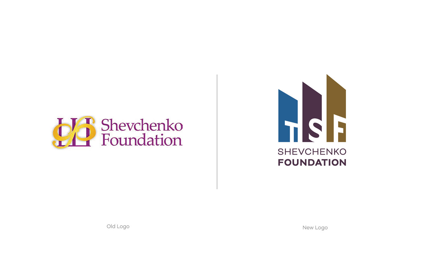
The new corporate logo captures the essence of growth and financial stability, symbolizing the interplay between community strength and artistic creativity in preserving, developing and promoting Ukrainian cultural heritage in Canada. The work of the TSF is guided by the principles of Leadership, Stewardship, and Partnership. The idea was based on envisioning these three pillars, simultaneously creating a visual connection to the first letter of Shevchenko's last name in Ukrainian – Ш.
Choosing the right colours for a brand, especially for a non-profit foundation, involves considering various factors, including cultural significance, emotional impact, and visual appeal. We have meticulously picked those three colours. Northern Blue is often associated with trust, loyalty, and depth. In the context of Ukrainian culture, blue holds special significance. It evokes feelings of calmness, stability, and a sense of community. Dark Olive is a rich, earthy tone that symbolizes growth, harmony, and connection to the land. In the context of Ukrainian culture, it may represent Ukraine's agricultural roots and fertile landscapes. Dark Purple is a colour historically associated with luxury and creativity. In the context of Ukrainian art, it may represent the richness of the cultural heritage and the artistic expression prevalent in Ukrainian traditions. The colours work together to convey a message of cultural richness, community support, and the importance of preserving Ukrainian heritage and art in the Canadian context.
The Wordmark has a modern yet refined style, ensuring high legibility. The selected typeface, Closer Family, harmoniously complements and strikingly balances with the logo. Closer is wider than the average grotesque and features some humanistic shapes; it feels less bland, though still relatively neutral. Crafted by Andriy Konstantynov, a type designer based in Kyiv, Ukraine, the Closer typeface adds a unique visual appeal. It embodies a connection to the Foundation's cultural roots.
Thank you!
