
Distinguished by its unique character, skillfully merging historical richness with a renewed and modern vision. Miranda is the new typeface for the identity and communication of Solo Palacio.
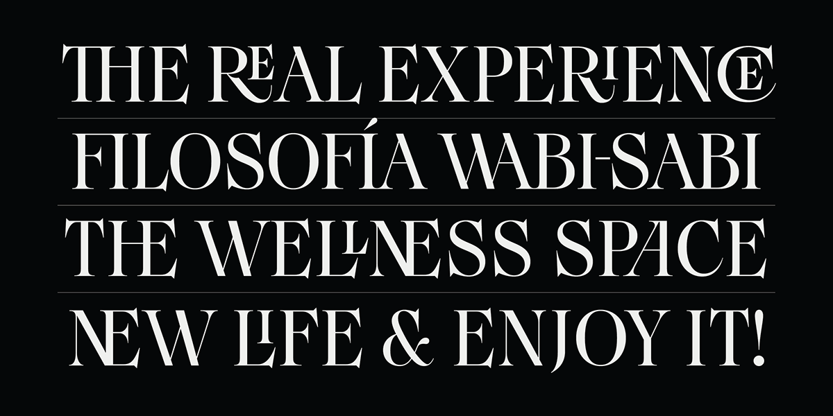
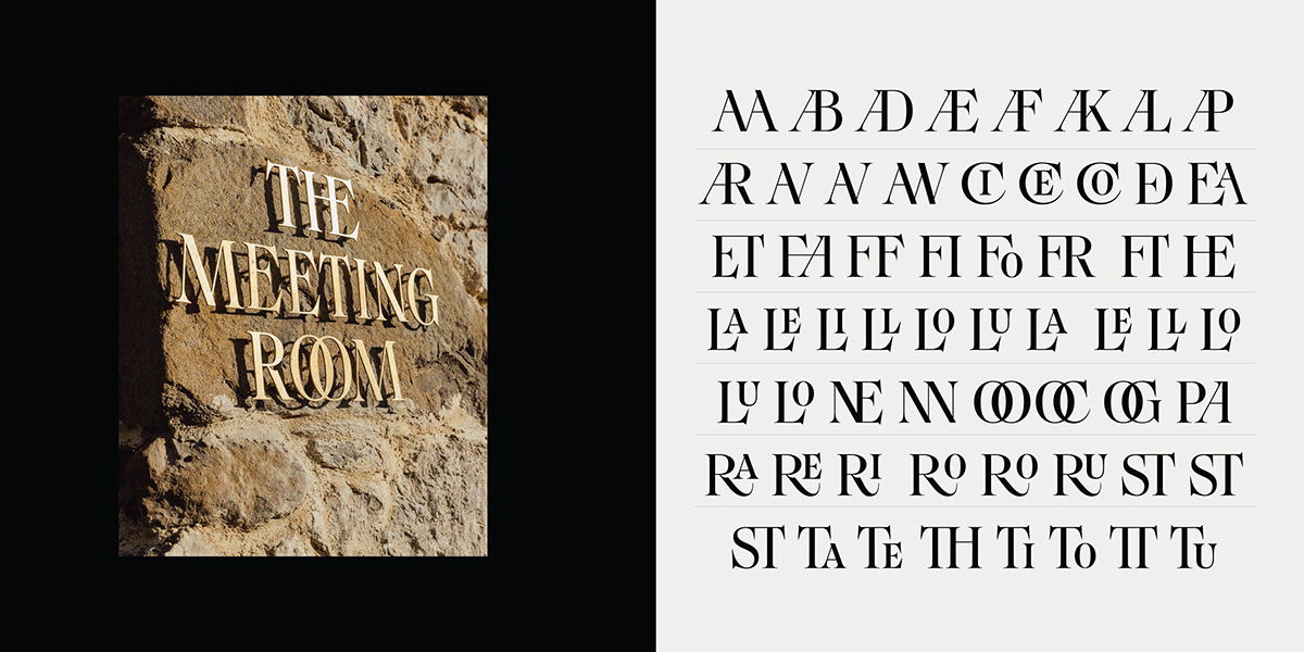
With a structure reminiscent of the old style, Miranda incorporates elements that give it a distinctive identity. Long and sharp terminal serifs, along with fine lines and truncated details, contribute to a uniqueness that doesn't go unnoticed. This modern interpretation of 19th-century typographic genre has been carefully designed to meet current demands, blending the classic with the avant-garde.
Miranda goes beyond being a revival; instead, it is an eloquent and thoughtful nod to late 19th-century typography. Its eccentric spirit intertwines with subtle echoes of the past, creating a typeface that, despite its modernity, evokes a sense of familiarity, elegance, and closeness.
This typeface family is not defined by being solely old or entirely new. Miranda achieves a harmonious synthesis between the classic and the contemporary, a timelessness tradition through a modern lens.


Credits:
Branding & Art direction – Sofía Tejerina Mata
Type Design – Fer Cozzi

