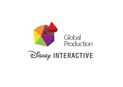
This brand was designed aligned with the new Disney Interactive's rebranding.
In concordance with it geometrical shapes and colors. It demonstrates Production, and a global polygonal sphere that has many faces, as the global team has, making it a unified and diverse team.
This brand was inspired by the Club Penguin style, specially for its typography, colors and vectorial illustration with color strokes. Showing the earth with the same concept for global and world wide.
It merges the concept of global and world wide, with the "production" concept of the team, translated in the symbol of a gear, because the gears symbolizes that workgroup, make an entire mechanism work.

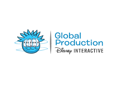
This brand uses an actual CP Puffle, but it inspires the concept of global, because of its lines of rotation that shows movement, and production, in the terms of a proactive team that is always in action.
This brand was designed inspired in the Club Penguin's EPF concept, based in one of its word marks, Operation Blackout, showing the idea of global, technology, and an organized team, a group of highly trained professionals that report for duty and become everyday an Elite Global Production Agent.


