


The ETG Rebranding Journey Beyond Frontiers!
It all started with the corporate culture
Emerging Travel Group has been growing steadily since 2010. Our corporate culture formed organically, building our unique ETG environment and helping us move forward.
At the same time, it made us a great team, where people have worked for years and even decades.
In 2022, facing an incremental growth and expansion of our business – with more than 1,500 employees spread over 60+ countries – we realized that we needed to define and formalize our values, mission, and vision, making them the cornerstone of our business. The executive team was brought together and after having several strategic sessions, they formed the basis of our culture code.
Vision
To simplify travel to help people achieve the freedom to be where they desire,
and to do what they love.
To simplify travel to help people achieve the freedom to be where they desire,
and to do what they love.
Mission
Our mission is to create, distribute, and operate the most convenient travel products.
We constantly innovate and break the rules of the highly complex travel industry to make travel more widely available for individuals, more rewarding for professionals, and simpler for everyone.
Our mission is to create, distribute, and operate the most convenient travel products.
We constantly innovate and break the rules of the highly complex travel industry to make travel more widely available for individuals, more rewarding for professionals, and simpler for everyone.
Values
Values showcase how we approach our goal, how we work with our clients and with each other. Values help us follow our mission and vision. Our values are Love, Trust and Do.
Values showcase how we approach our goal, how we work with our clients and with each other. Values help us follow our mission and vision. Our values are Love, Trust and Do.
We Love what we do, appreciate
our people, and embrace freedom.
Trust: we say it like it is, and build transparency. By Do we mean —
be your own CEO, persevere,
and grow together.
our people, and embrace freedom.
Trust: we say it like it is, and build transparency. By Do we mean —
be your own CEO, persevere,
and grow together.
After completing the culture code exercise, we realized a significant mismatch between our new appearance and our brand's essence. This prompted the marketing team to kick off a rebranding project.
Our main challenge was infusing our culture, vision, and brand essence into the designs, ensuring that they all resonate with the core message of freedom.
Our main challenge was infusing our culture, vision, and brand essence into the designs, ensuring that they all resonate with the core message of freedom.

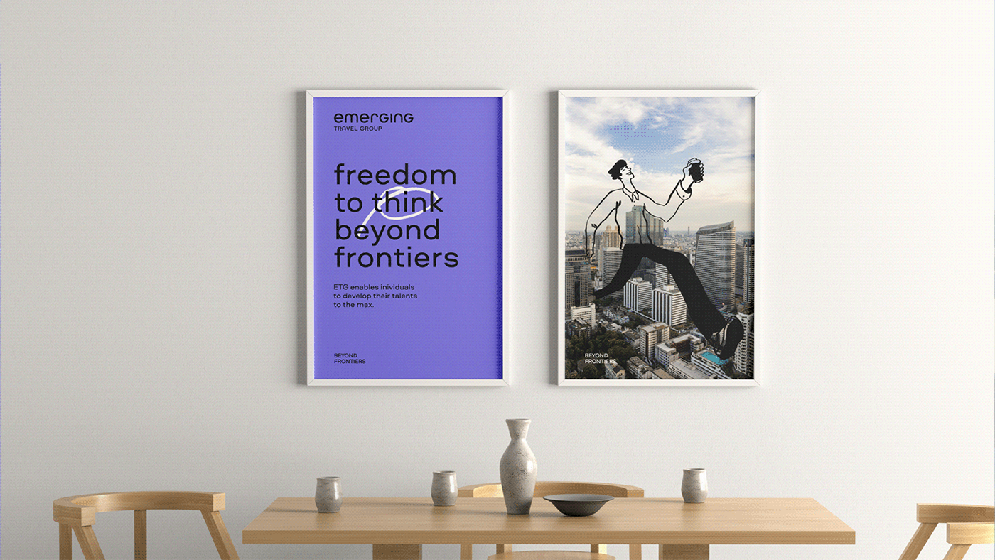
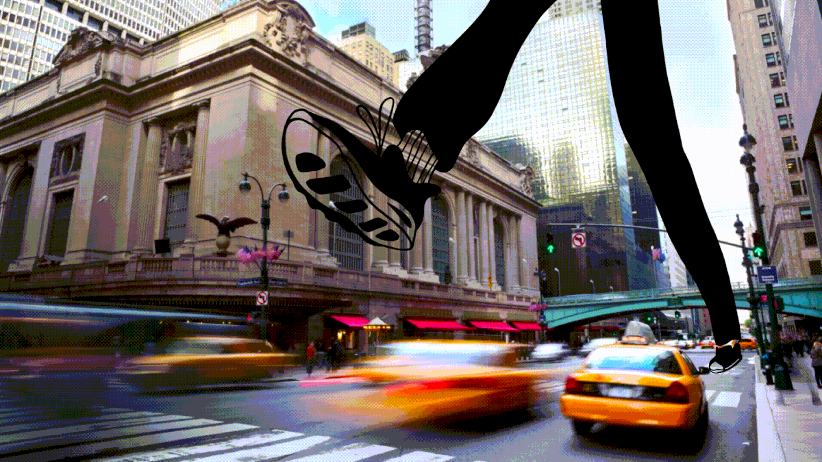
True freedom goes beyond the boundaries of the real world – it's all in our minds.

Brand constants
Color palette
The main accent color of our brand is a bright and vivid violet, which is clearly associated with creativity and imagination. Additional colors are black and white.

Logo
In redesigning the logo, we created a simple geometric lettering, with a new, unique outline and internal rhythm. The new logo inspires the impulse to actively move forward to new horizons and go beyond boundaries.
In redesigning the logo, we created a simple geometric lettering, with a new, unique outline and internal rhythm. The new logo inspires the impulse to actively move forward to new horizons and go beyond boundaries.

Typography
While searching for our new typography style, we strived for a font with an urban feel.
We ended up choosing Aeroport which is a universal geometric neo-grotesque font.
We ended up choosing Aeroport which is a universal geometric neo-grotesque font.
Aeroport offers a wide range of styles that can be applied in different design cases.
In the new branding, the font plays a key role in communications materials, working together with hand-write style doodles.
In the new branding, the font plays a key role in communications materials, working together with hand-write style doodles.


Visual identity
At the heart of the brand's essence, lies a captivating visual story of daring characters, navigating diverse landscapes. This symbol of liberation effortlessly engages with its surroundings, pushing past conventional limits with a spirit of exploration.
The hand-style drawing imitates graphics created with a thin brush over real photos.


Doodles
To stylistically connect the style and the illustrations, we created a bank of doodles
that make our communications more emotional. They have become the second most recognizable element of ETG and play an important role in both internal and external communication, helping us reveal and support the sentiments of our brand in all our designs. Our branded Zoom backgrounds, Instagram masks, and Slack emojis are
very popular and widely used by our employees.


To infinity and beyond
Since we started the rebranding, we have done a lot to fully adopt and introduce the new style in all our materials. And the last but not least was our brand new ETG corporate website – a landing with all the information about the Group, our brands, and partners.
Since we started the rebranding, we have done a lot to fully adopt and introduce the new style in all our materials. And the last but not least was our brand new ETG corporate website – a landing with all the information about the Group, our brands, and partners.

"As we contemplate our transformative journey, our brand embodies the spirit of liberation, epitomized by a wandering character navigating diverse landscapes. From a vivid violet color scheme to a sleek geometric logo and the versatile Aeroport font, every facet mirrors our mission: to simplify travel, granting individuals the freedom to explore their desires. This is ETG's new identity – freedom beyond frontiers."
Sergey Denisov, Director of Brand Marketing
Project Team:
Creative consultant: Lidiya Kapysh
Creative / Art direction / Graphic / layouts / Typography / Logo: Aleksey Pushkarev
Graphic / BB layouts: Artem Veretenko
Illustration: Ivan Might, Roma Manikhin
Animation: Astra production
Client Team:
Director of Brand Marketing: Sergey Denisov
ETG Brand Marketing Lead: Anastasiya Andreeva
Chief Marketing Officer: Anna Kladova
Human Capital Director: Olesya Ezhova
Head of Culture: Polina Lapteva
Year: 2023
www.emergingtravel.com


