Branding | Graphic Design
Luís Simões 75 anos
EN |
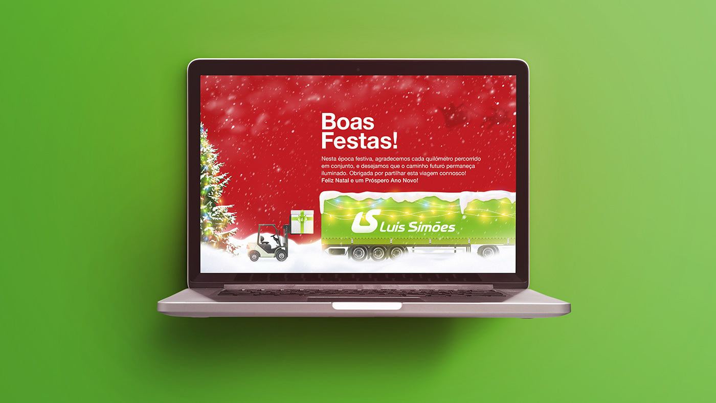
Our agency won Luís Simões’ tender for a symbol that celebrated their 75th anniversary. We designed a minimalist symbol that fits their communication style, illustrates their core business by resembling a highway, and conveys not only the company values, but also growth, assertiveness, sustainability, and a constant focus on evolution. We then prepared the brand guidelines, created a tagline, and designed other marketing materials such as postcards and brochures to be printed and distributed in business magazines. As Luís Simões is one of the largest logistics companies in the Iberian Peninsula, they challenged our imagination by requesting content that would work in both Portuguese and Spanish without requiring major changes.
PT |
A nossa agência ganhou o tender da Luís Simões para um símbolo que celebrasse o seu 75º aniversário. Concebemos um símbolo minimalista que se adequa a qualquer estilo de comunicação e que transmite não só os valores da empresa, como também crescimento, assertividade, sustentabilidade e um foco constante na evolução. Preparámos um manual de normas gráficas, escrevemos um slogan e desenvolvemos outros materiais de apoio como postais, brochuras e cartazes para serem impressos e distribuídos em revistas de negócios. Sendo a Luís Simões uma das maiores empresas de logística da Península Ibérica, a nossa imaginação foi desafiada a desenvolvermos conteúdo que fosse compreendido tanto em Português como em Espanhol.